Button
- Variants
- Primary
- Secondary
- Open an Account
- Opena an Accout Outline
- Light Buttons
- Outline Buttons
- Form Buttons
Buttons allow the user to interact with content, enter data, and navigate the site. Buttons capture the user’s attention to take desired actions. By differentiating primary from secondary buttons, users understand the most important action.
Primary Buttons


Usage
Buttons have multiple uses within a digital experience and can be styled in varying ways. Primary and secondary buttons should be clear and predictable, and positioned in consistent locations in the interface. Control buttons carry less visual weight, but provide functional control within a component. All button elements trigger an event.
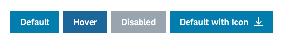
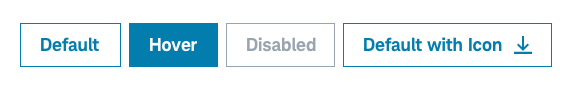
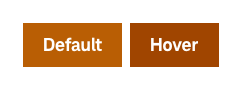
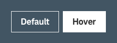
Types of Buttons


Best practices
Do
- Position buttons in consistent locations in the interface for user familiarity.
- Use buttons with discretion. Be mindful of accessibility and interaction implications when using buttons vs. links.
- Ensure that control buttons are sized appropriately to their component.
- Use buttons when there is specific actionable content.
- Use color appropriately and follow brand guidelines.
- Prioritize the most important action (if multiple) by clearly delineating button variations.
- Follow touch affordance best practices (see below).
- Ensure adequate alignment and spacing/margins if using multiple buttons in close proximity.
Don’t
- Overwhelm the user with multiple actions/buttons in a small area on a page.
- Use design embellishments like 3D or shadowing.
- Use a button when a link is more appropriate (e.g. for basic ‘Learn More’ for viewing additional content). Understand when to use links instead.
- Use control buttons outside of their respective components.
Touch affordance
Touch affordance allows the user to select an item on a touch screen interface and is important to ensure users easily understand where they can physically interact with touch targets. Proper touch affordance allows users of all abilities to select the intended target and avoid tapping the wrong element.
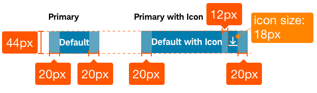
Example: Buttons must be large enough (or far enough away from other buttons/interactive elements) so they are easily clicked or tapped. Buttons should be 44px high/wide when touching/no margin.
Accessibility
Using buttons as they’re intended allows screen-reader users the context they need to understand and interact with your content. Clearly label buttons with descriptive names of the button function. For custom buttons, add additional descriptions and attributes to properly describe user input. This gives keyboard users clarity and prevents attempts to open the wrong element (false links).
Ensure designs meet color/contrast requirements on Color Guidelines and follow Schwab Accessibility guidelines.