Deck
- Variants
- Deck 20
- Deck 25
- Deck 33
- Deck 50
- Deck Full
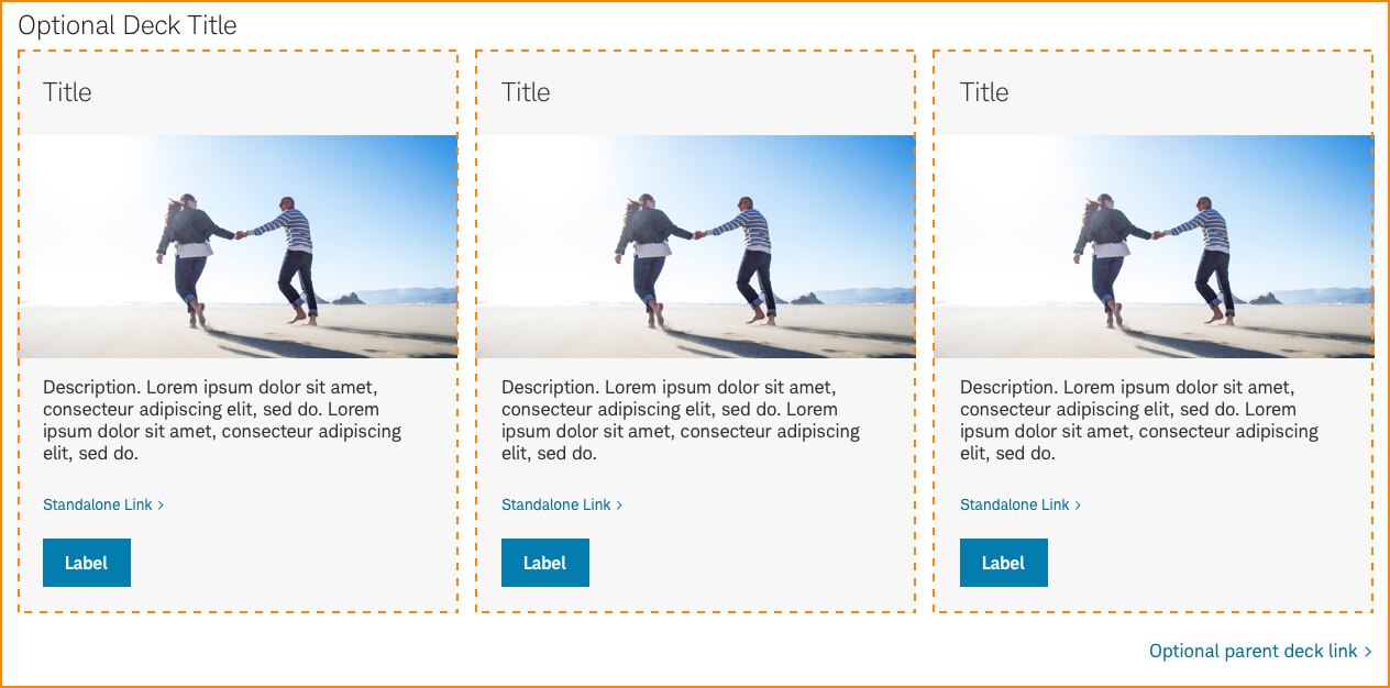
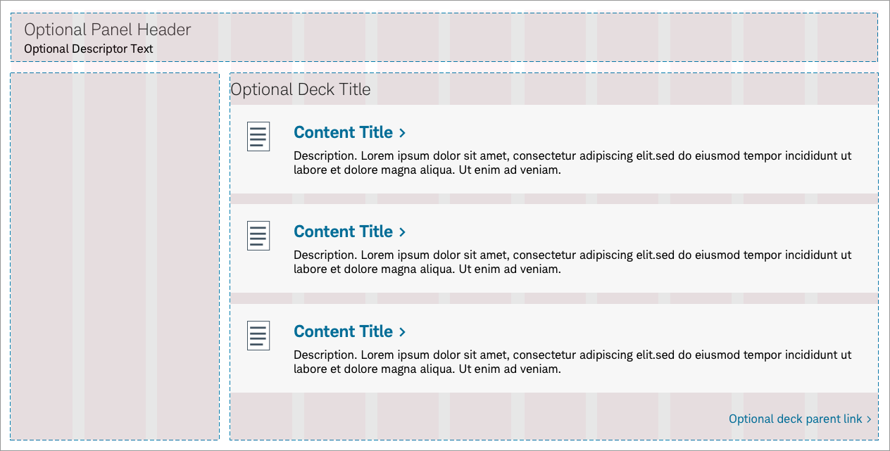
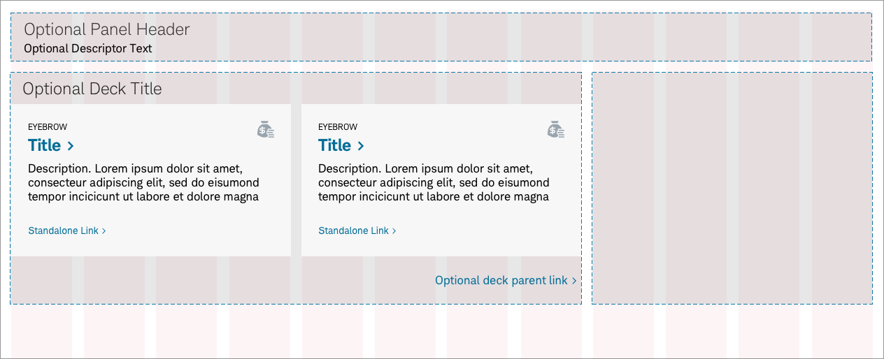
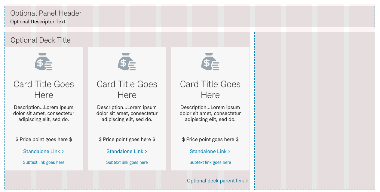
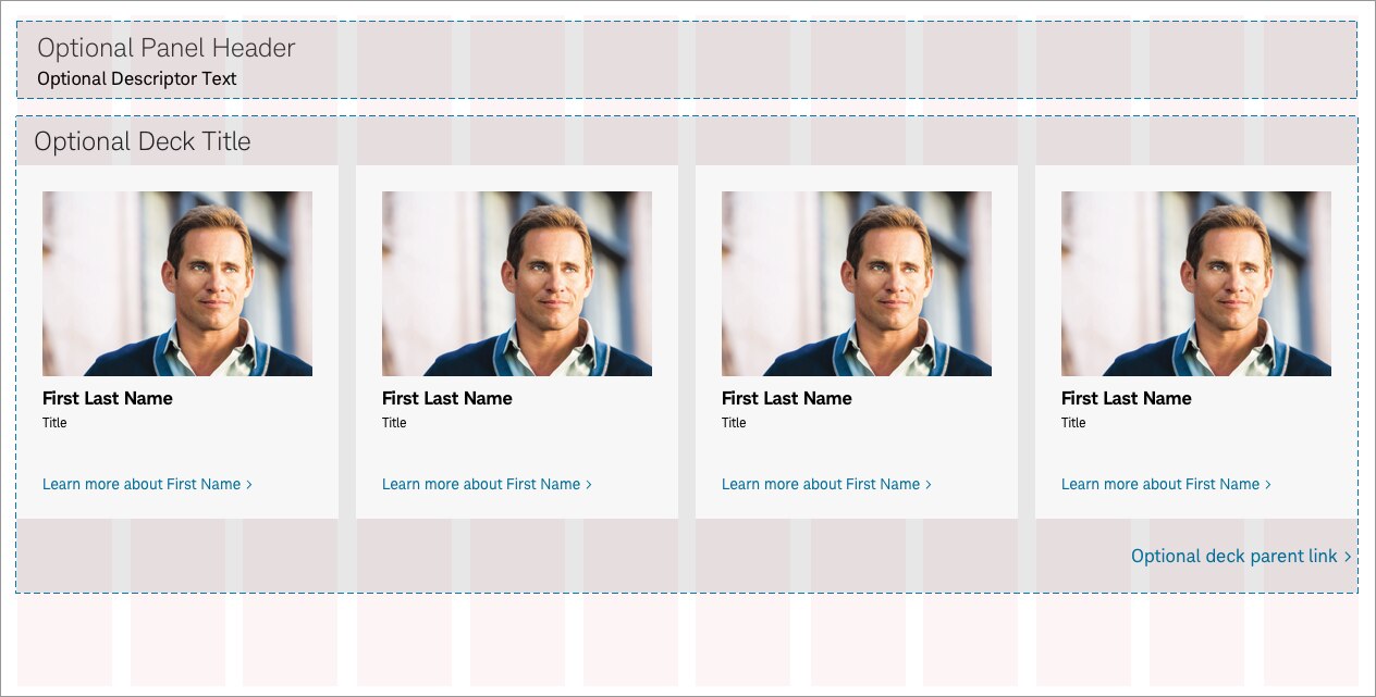
Decks are clear containers within content panels and house component combinations of cards or tiles. A deck’s form and size is contrained by the content panel it is placed into. Cards inside decks are uniformily styled and spaced, with specific fields in logical groups. Uniformily for sets of cards, it is dependent on the deck attributes and the deck helps with organization by restricting the card content to a specific type.
Panel > Deck-33 > Card-Router-Image
Usage
Decks are placed inside content panels and can contain an optional parent deck title and link. The type of deck used will indicate how many cards will fit across within the container. In the instance that cards need to scale to fill the deck (for example, Deck-33), cards must maintain a minimum width of 2 1⁄2 columns, or 253px).
In mobile experiences, the deck transforms into a deck-full with the cards stacking vertically.
Deck Alignment
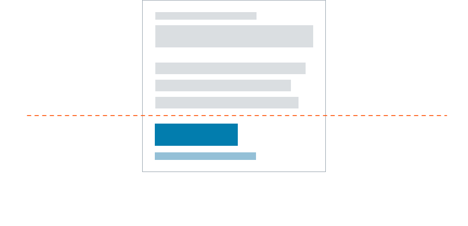
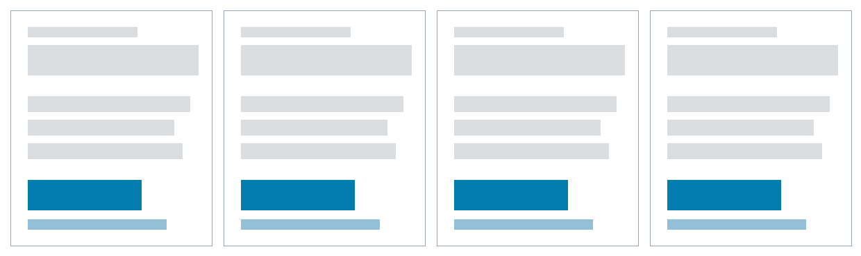
Decks have two zones, the main content area, which aligns to the top of a card, and the CTA area, which aligns to the bottom of a card. All cards in a deck must be the same height and width.
Deck Flex
Cards expand to fill the deck size. If a card is removed, the other cards flex to fill the deck.
Deck Responsiveness
Once cards reach their minimum size of 2 1⁄2 columns, (or 253px), it wraps to the next row and the cards collectively respond to fill the deck. Note that all cards still maintain a uniform height and width.

Best practices
Do
- Keep decks clear. All visual styling and padding are assigned to the panel, card or tile.
- Use a parent deck title and link when needed.
- Maintain a minimum card width of 2 1⁄2 columns when scaled. Tiles maintain a minimum width of 2 columns.
- Maintain a 16px spacing between cards or tiles within the deck.
- Consider mobile experiences. Decks will transform into a deck-full and the cards will stack vertically.
Don’t
- Use cards or tiles that have different heights or widths.
- Place decks within decks.
Accessibility
Design will need to follow color/contrast requirements on Color Guidelines, follow link best practices, and Schwab Accessibility guidelines.