Marquee
- Variants
- 50 Image Right
- Default Image Full
- Text
The Marquee is the dominant hero featured on the top, or at the introduction, of a web page or digital experience. It’s used to connect with the user, pique their interests, set a desired tone, and draw them deeper into the content.
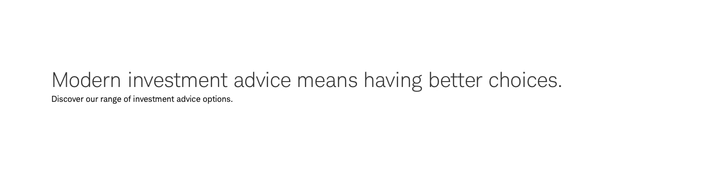
Marquee-Default-Image-Full

Copy can be either light or dark depending on image.

Usage
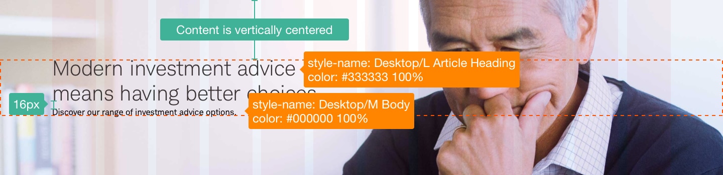
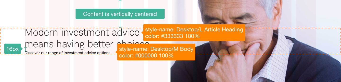
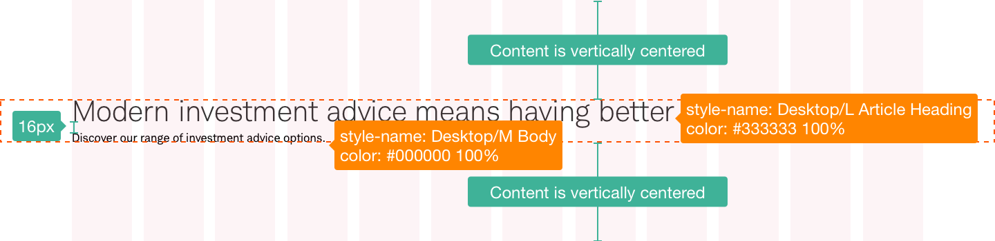
The Marquee is used to quickly inform users about page content. It should have at minimum the page H1. It can also include an eyebrow, a small amount of body copy, and a CTA.
Design Specifications
Marquee-Default-Image-Full
Best practices
Do
- Full bleed images and backgrounds are allowed.
- If using a background image, test text at various screen widths (or use specific images for key screen breakpoints to ensure content remains legible).
- Left align or center the copy.
- When applying gradients, ensure copy is still legible and gradients aren’t drastic and distort the natural look of the image.
- Ensure Marquee includes an H1.
- Test at various breakpoints.
- Ensure any clickable elements have an ad-hoc tagging field so publishers can add data-track attributes.
Don’t
- Use dark overlay treatment on images without applying gradients.
- Use extreme gradients that degrade or distort the image.
- Use a right-aligned CTA.
- Use more than one marquee on a page.
Accessibility
When using full image with copy, the image will need to follow color/contrast and placement best practices for accessibility. Ensure screen reader announces alt tag if applicable. Any text inside the marquee should be read by screen readers. Use gradients if they help ensure copy is accessible. Follow guidelines on Color and Schwab Accessibility guidelines.