Divider
- Variants
- Horizontal
- Vertical
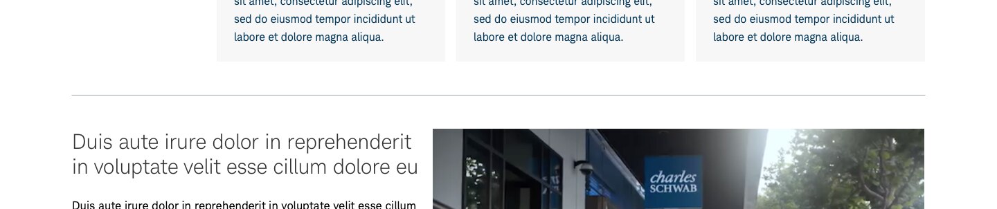
A divider is a thin line that seperates content in layouts to create groupings.
Horizontal Divider
Usage
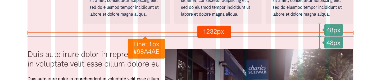
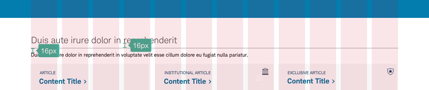
Dividers separate content into clear groups with a 1px line in either a horizontal or vertical orientation. They can also be combined with H2s to provide a clear demarkation of where a new section of content begins. Dividers should adhere to the 12-column grid and not bleed past.
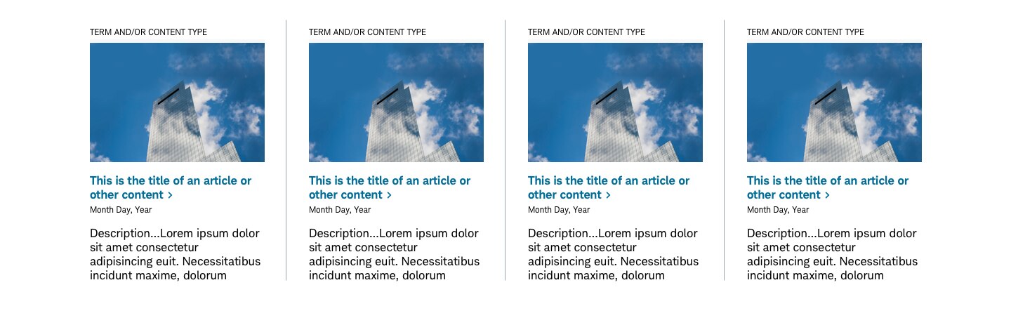
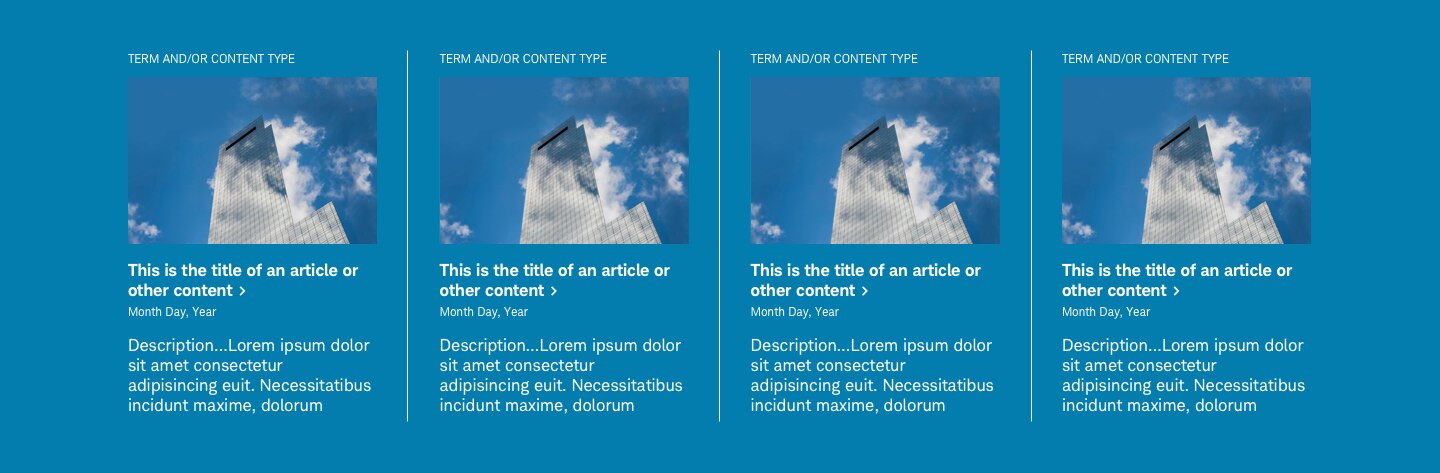
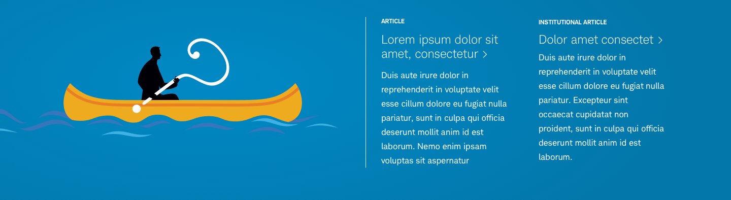
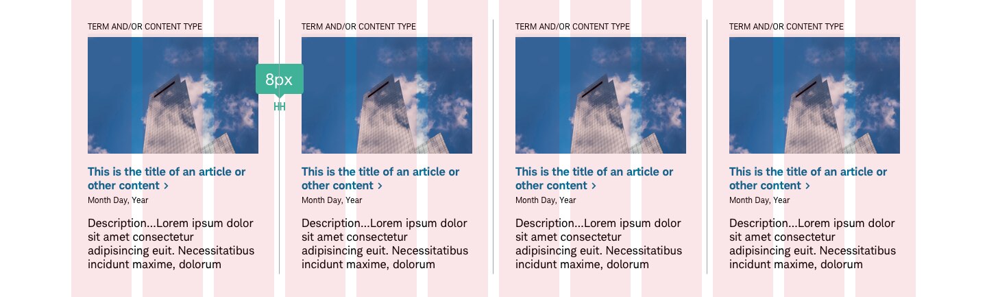
Vertical dividers should be placed equidistant from items within a deck or panel, often splitting the gutter equally. When used in a deck, the cards must have a “clear” background, not filled with any color.
Design Specifications
Best Practices
Do
- Make dividers noticeable in a layout, but not jarring.
- Use dividers sparingly, to create separate items.
- Keep the vertical spacing even around a divider. Accomodate for components with their own padding.
- Optionally, pair dividers with H2s to help define content groupings.
- Use dividers to seperate cards with a clear background.
- Use dividers to deperate dropzones within a panel.
Don’t
- Use dividers to create other components like charts and graphs.
- Use vertical dividers to seperate cards or tiles with background color. The card itself should be clear, with the color atribute residing with the panel.
- Allow a divider to exceed the width of the grid.
- Overwhelm users with too many dividers.