Link
- Variants
- Inline
- Standalone
- Standalone Icon
Links help users take desired actions such as opening a web page or document and navigating to additional content.
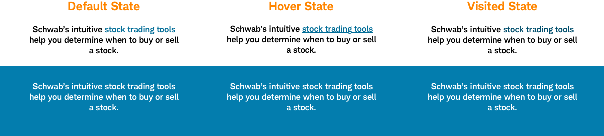
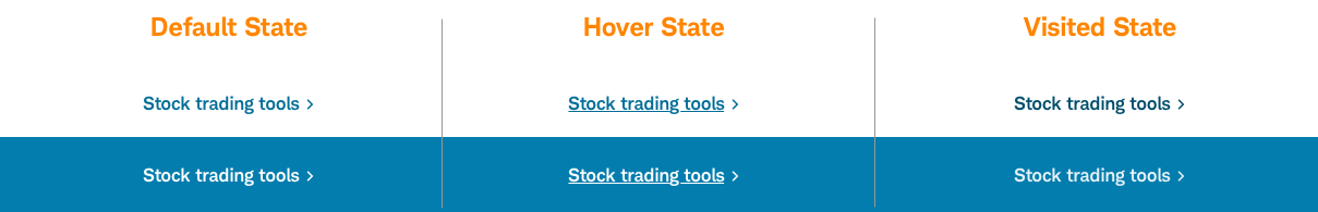
Link-Inline
Links within body copy.
Usage
Use links to help users navigate to pages or locations within a page. Links should also be used for CTAs such as a ‘Learn more about ETFs’, where a user isn’t affecting the website itself (either back or front-end). Unlike buttons, links can be opened in a new tab, copied, and bookmarked.
Important interaction considerations: Buttons are designed to be triggered by using the space key, while links are triggered by the enter key.
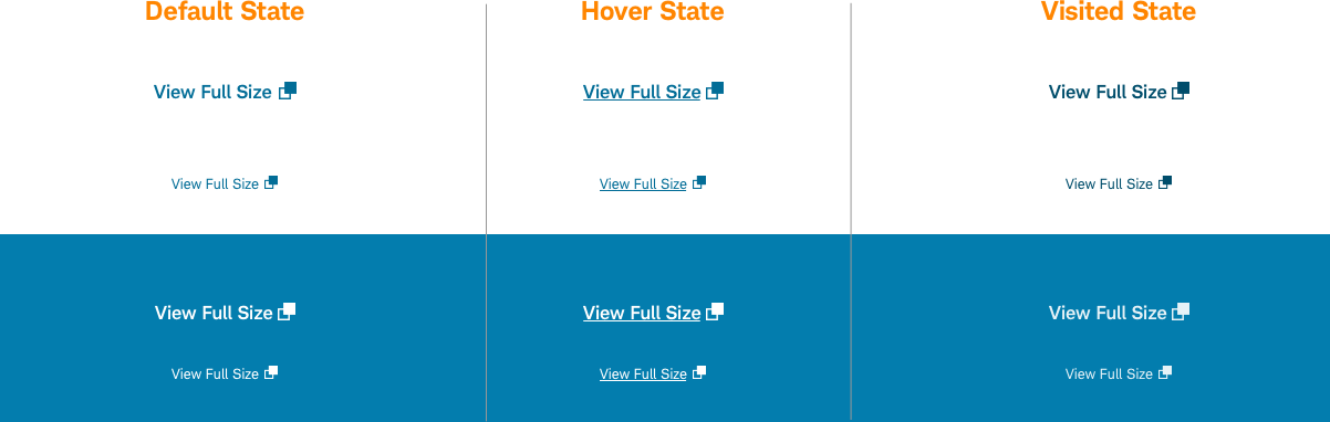
Using Icons
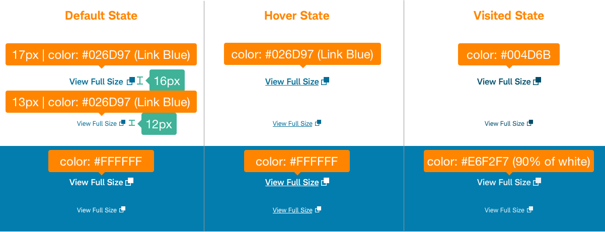
- Icons on link text that are 16 pts or larger should 16px tall (24pts using the Schwab-Icon-Font)
- Icons on link text that are smaller than 16 pts should be 12px tall (17pts using the Schwab-Icon-Font)
- Icons should be aligned to the baseline.
Design Specifications
Link-Inline
Best practices
Do
- Use links for ‘Learn more about X’ CTAs.
- Use links to give users access to deeper content not easily found via the main navigation.
- Use descriptive link text that clearly relays where the user is navigating to with the name of the action or page. Text should answer: ‘Where am I going? Why am I doing this? Is it safe?’
- Keep link text to 6-8 words and under 55 characters.
- Use a meaningful descriptive label that matches the destination name.
- Use proper labeling to clarify “button-link” and “button-control”.
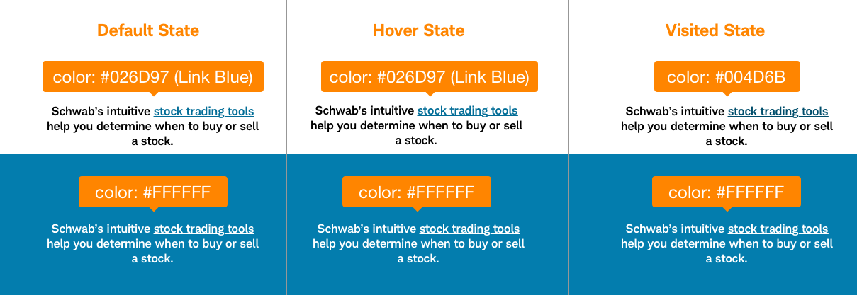
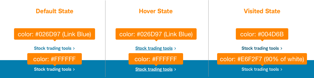
- Use the new link blue
#026D97for Schwab content. Use link blue#0066CCfor log-in experiences only. Use white#FFFFFFon dark backgrounds only. - Links should include a visual indicator. Use carets or other symbols relevant to the link type.
Don’t
- Use links to initiate actions where users affect the interface (adding, changing or deleting data); use buttons instead.
- Use links for sales conversion or important CTAs.
- Use links with input fields.
- Use duplicate or unnecessary links.
Touch affordance
Touch affordance allows the user to select an item on a touch-screen interface. Users need where they can physically interact with the touch targets and avoid tapping unintended nearby elements/links. This is especially important when multiple links are located in close proximity and anytime on mobile devices. Links should have a minimum touch affordance of 44px height.

Accessibility
Think of screen readers and how to describe input. Design to support a range or majority of screen readers. Device independence: Users must be able to access and activate the control without any required device (mouse, keyboard). Ensure link designs meet color/contrast requirements on Color guidelines and follow Schwab Accessibility guidelines.