Accordion
- Variants
- Default
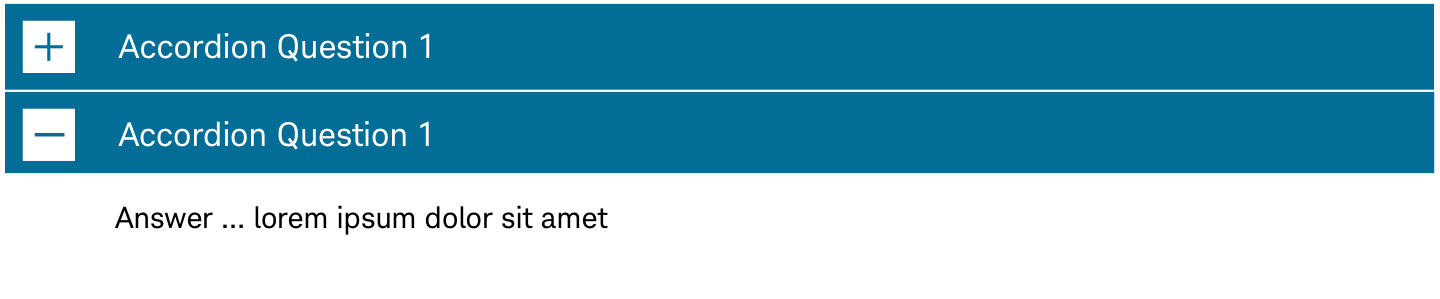
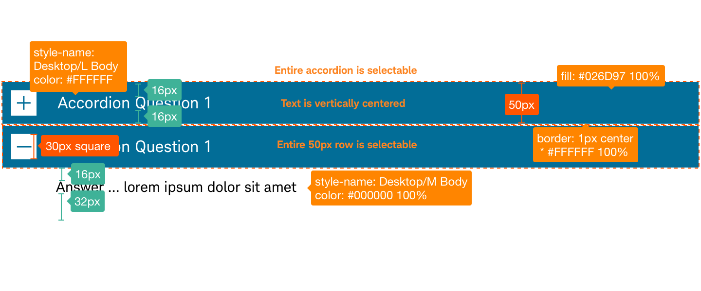
- Default Dark
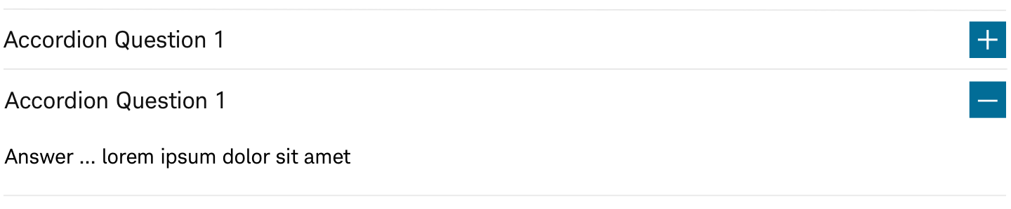
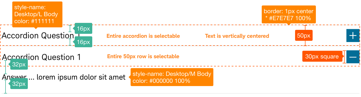
- Right
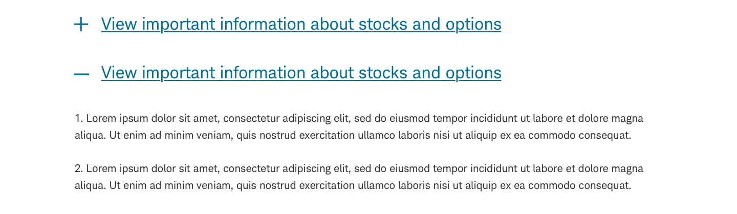
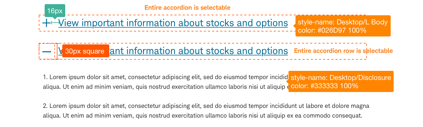
- Basic
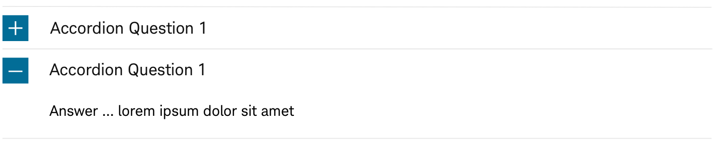
Accordions enable users to expand and collapse sections of content.
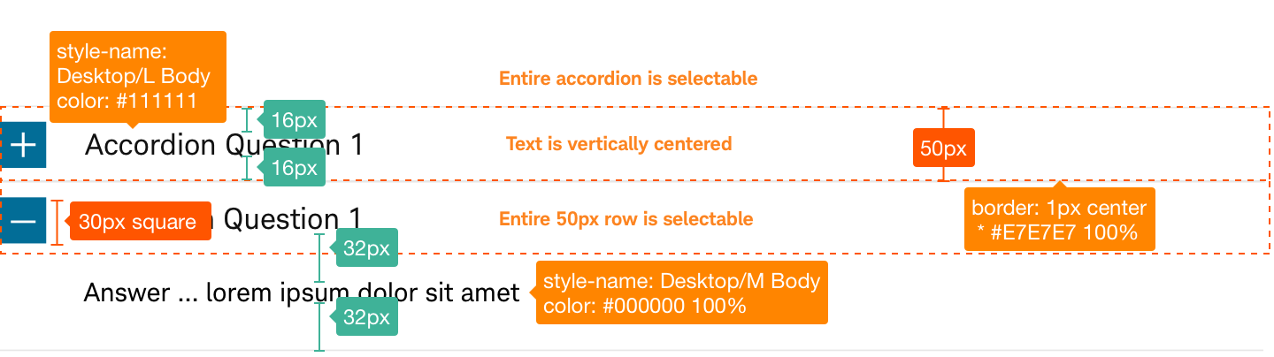
Accordion-Default
Usage
Use accordions when there is a large amount of content that can be effectively collapsed and when users should see primary content first and then expand to see secondary or non-critical information (e.g. answer details or progressive disclosures). This allows users to control the user interface and the amount of content they want to view. The touch target (+/- visual indicators) should conform to standard accordion styles and Beacon touch target standards (e.g. button touch. targets are 44px by 44px physical size).
Design Specifications
Accordion-Default
Code
<div class="acc1-group-accordion-wrapper container contextual-region">
    <h3 class="acc1-group-headline text-align--left">Section Label</h3>
    <dl class="acc1-group-accordion" id="acc1-group-501">
        <dt class="acc1-control-wrapper acc1-scheme--default acc1-ver--simple acc1--in" id="acc1-1736" tabindex="0" role="heading"
            aria-expanded="false" aria-controls="acc1-content-1736">
            <a class="" id="acc1-btn-1736" type="button">
                <span class="acc1-icon sch-plus"></span>
            </a>
            <span class="acc1-headline">View important information about how we make our money </span>
        </dt>
        <dd class="acc1-content-wrapper hidden" id="acc1-content-1736" role="answer" tabindex="0" style="display: none;">
            <p>
                <span>
                    <span>
                        <span lang="EN" xml:lang="EN">
                            <span>
                                <span>
                                    Schwab Intelligent Advisory charges no commissions or account service fees. Schwab affiliates do earn revenue from the underlying assets in Schwab Intelligent Portfolios® accounts.
                                </span>
                            </span>
                        </span>
                    </span>
                </span>
            </p>
        </dd>
    </dl>
</div>
Best practices
Do
- Use to hide secondary content that isn’t critical/primary.
- Use when vertical space is limited.
- Use when there’s enough content to condense.
- Use when you want to simplify a process.
- Keep labels brief while still being descriptive.
- Use sentence case for labels (e.g., “Show less” and “Show more”).
- Use the +/- indicators consistently and keep indicators near the accordion label.
Don’t
- Use to hide an action if the user can easily do it without additional input.
- Use to hide primary actions on the page.
- Show content that isn’t relevant to the user’s input.
- Nest too many layers (don’t place accordions within accordions).
Accessibility
Accordions should have the correct size for visuals and copy to meet Schwab’s accessibility guidelines and a design that proactively supports most screen readers. Clearly describe input for users who might have visual limitations. Use appropriate text and code labels to allow quick orientation and movement between toggles.