Alert
- Variants
- Information
- Confirmation
- Warning
- Error
Alerts communicate system-level messages that are relevant to the user and their current activity. Alerts are persistent and more important than overlays. Notifications contain visual feedback and content that’s relevant to the user and is often actionable. Messages appear at the top of a page (in-line above the main content area), or within a form. Form alerts follow validation logic via form element error messages.
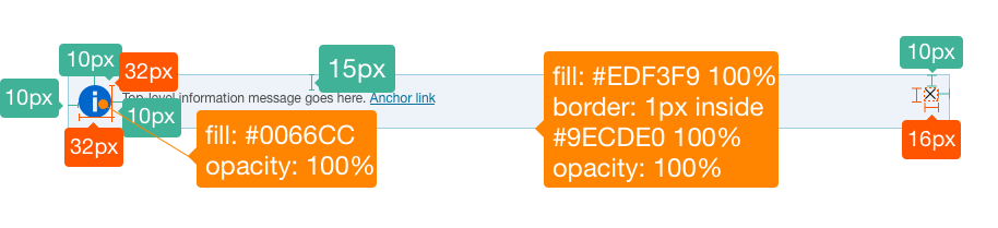
Alert-Information

Blue, with circle/icon visual indicator.


Usage
Alert messages correspond to the type of information being provided and should clearly convey hierarchy of messages. Alerts include a container/content panel (such as a banner), visual indicator, message (copy, CTA), validation error on a page. Use anchor links where possible to help users easily navigate directly to the page section related to the alert.
Types of Alerts: Alerts follow a hierarchy of severity from informational that requires no user action, to error messages that require user input to correct errors before moving on.
Blue- informational message- indicates conditions where a user isn’t required to take any action, e.g. system maintenance, etc.
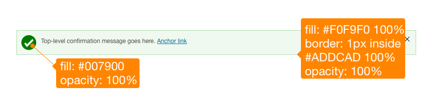
Green- confirmation message- used only when showing a user-initiated process has successfully completed (such as “your submission is complete”).
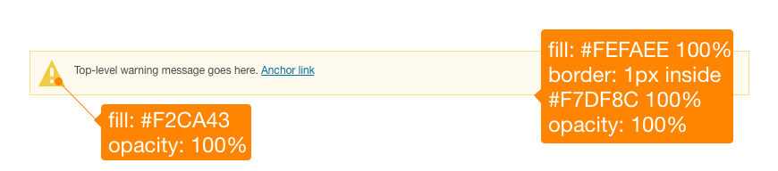
Yellow- warning message- warns user of potential issues, e.g. an outdated browser. The user can continue with a task, but is notified of any actions to take.
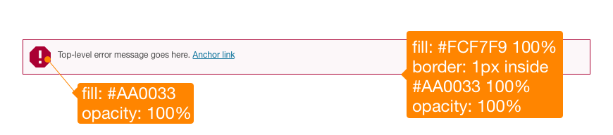
Red- error message- tells the user they can’t proceed until something on the page is corrected. When used within a form, the summary of form element errors is displayed in the Top Error Message Box.
Design Specifications
Best Practices
Do
- Use alerts sparingly.
- Include in-line validation in addition to any top error message, especially for long pages.
- Use anchor links where appropriate.
- Include visual indicators to alert users, not just copy or color.
- Alert titles should be informative and descriptive.
- Include clear and concise messages that can fit into one or two sentences, when possible. Use sentence case for copy.
- Include only one CTA message within an alert when possible (except in a top-level summary box).
- Include anchor links so users can jump directly to the content section for more detail.
- Follow best practices on Forms.
Don’t
- Use only color for the alert message.
- Use articles (the, a, an) where possible.
- Overwhelm users with too many alerts or too much copy.
Accessibility
- Use the ARIA role=“alert” to inform assistive technologies of a time-sensitive and important message that is not interactive. If the message is interactive, use the alertdialog role instead.
- Do not visually hide alert messages on the page and then make them visible when they are needed. Users of older assistive technologies may still be able to perceive the alert messages even if they are not currently applicable.
Ensure designs meet color/contrast requirements on Color Guidelines, follow link guidelines, and Schwab Accessibility guidelines.