Card
- Variants
- Article
- Article Bleed Ledge Clear
- Article Image Bleed Ledge Clear
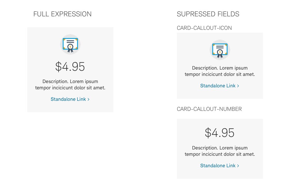
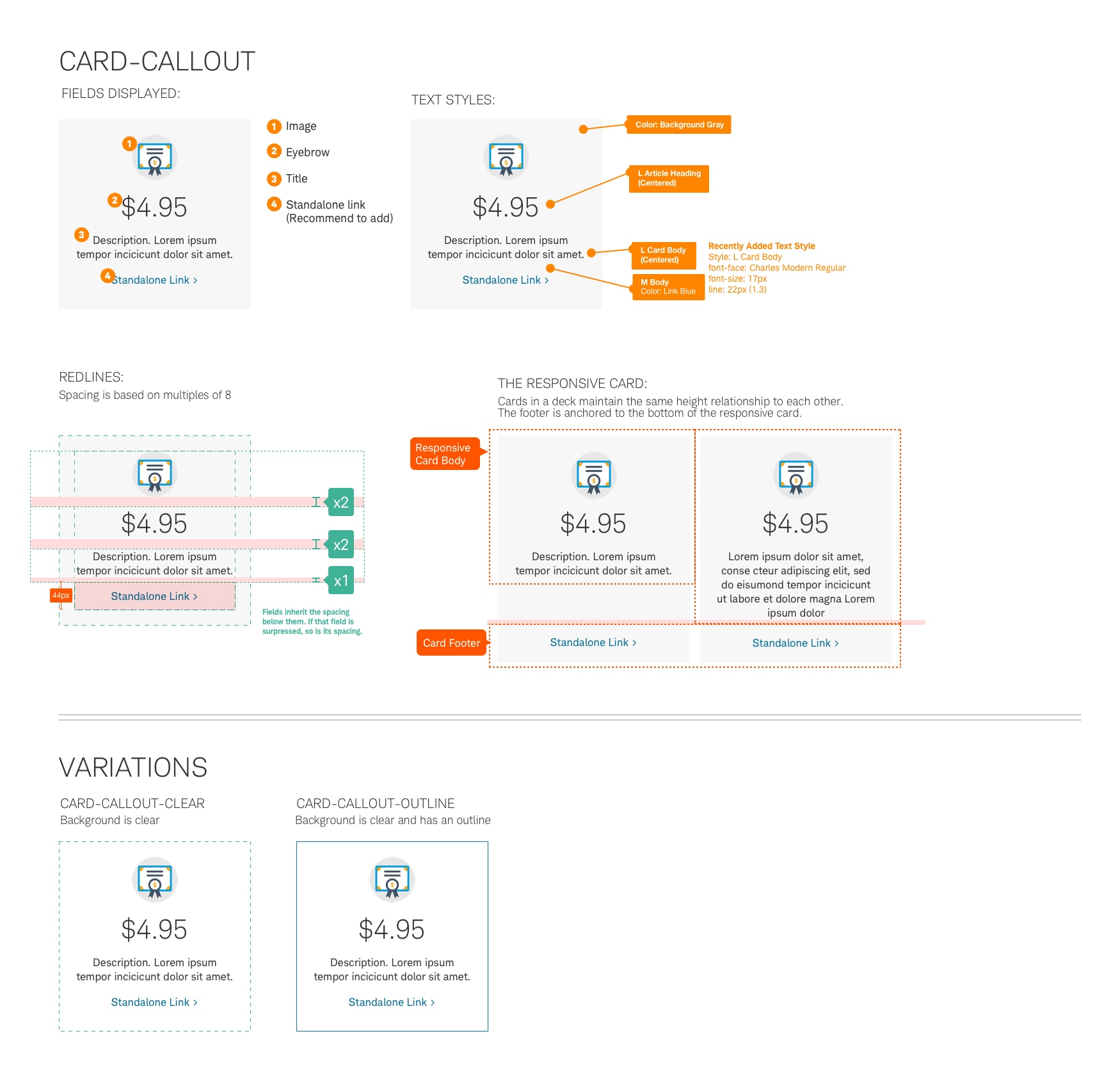
- Callout Icon
- Callout Text
- Default
- Default Clear
- Default Icon
- Icon
- Icon Center
- Icon Center Clear
- Icon Center No Inset Clear
- Image Bleed
- Image Bleed Center
- Image Bleed Center Clear
- Image Lower
- Image Lower Bleed
- Image Lower Bleed Ledge Clear| Dice
- Landscape Icon
- Landscape Icon Clear
- Landscape Icon Ledge Clear
- Landscape Image
- Landscape Image Clear
- Person
- Person Landscape Bleed Left
- Person Landscape Image Bleed Left
- Product
- Product Spotlight
- Router
- Router Cross Link
- Router Image Bleed
- Router Outline Blue
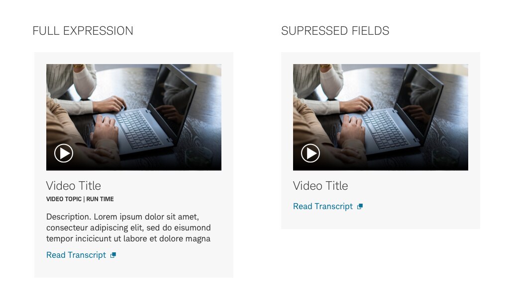
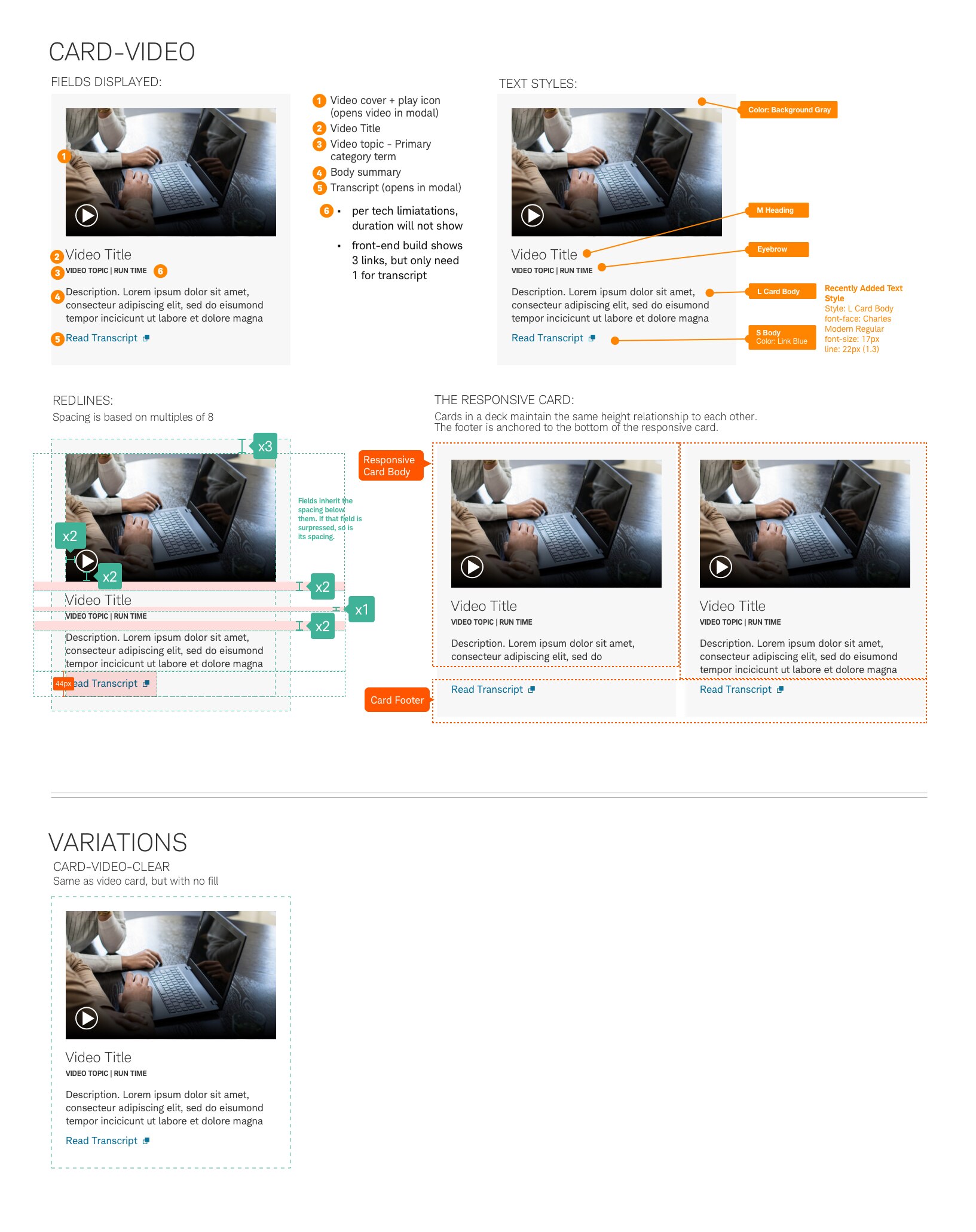
- Video
- Person Landscape Image Right
Cards organize and present a related grouping of summary content inside a container that users can easily scan and interact with. Cards can be grouped together to form multiple cards called a deck.
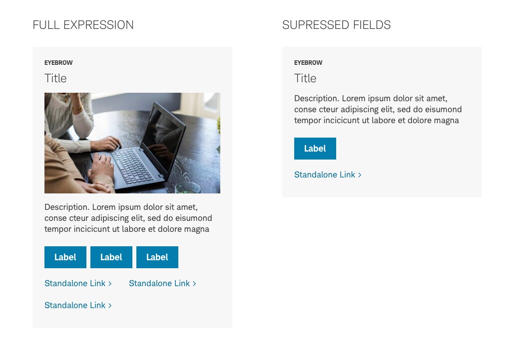
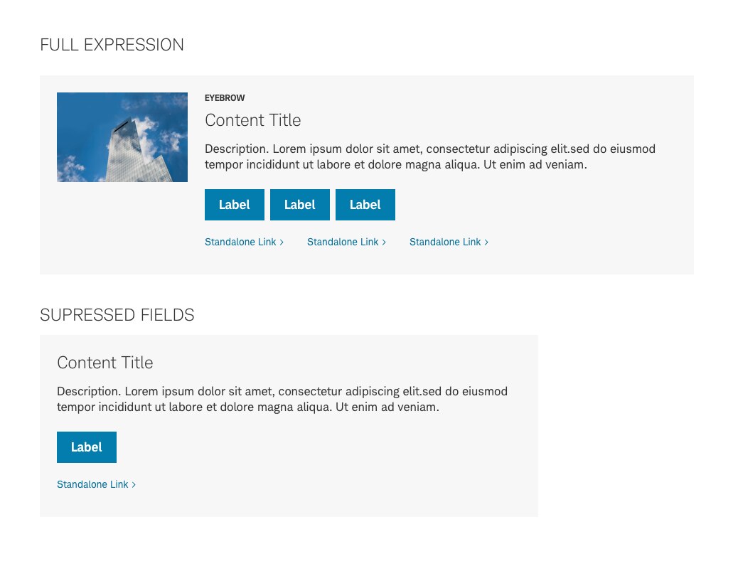
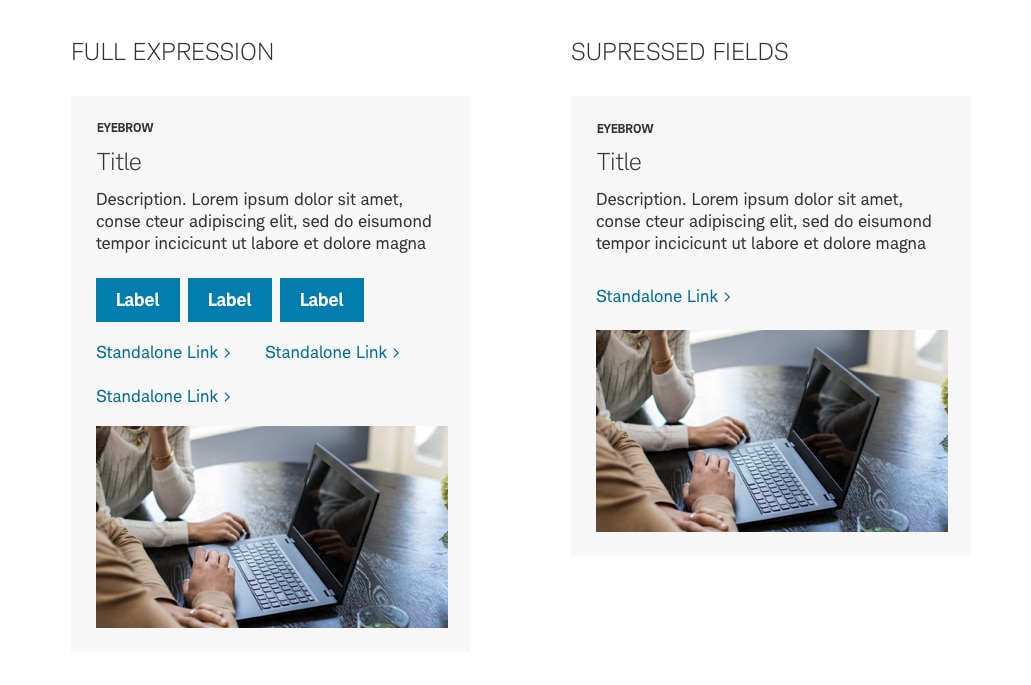
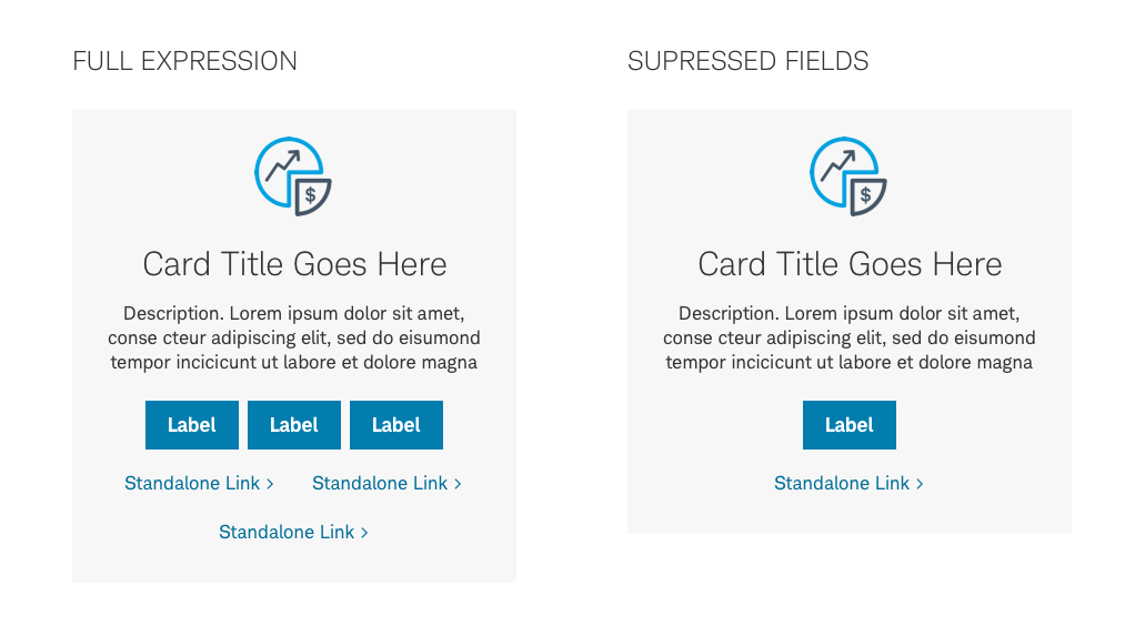
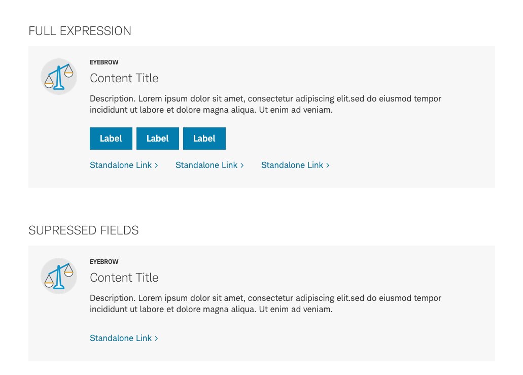
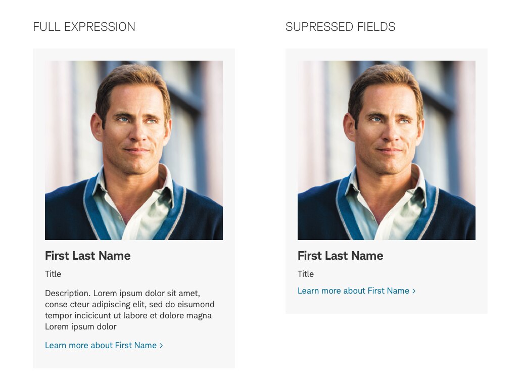
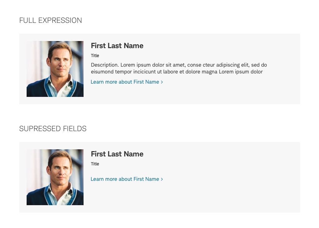
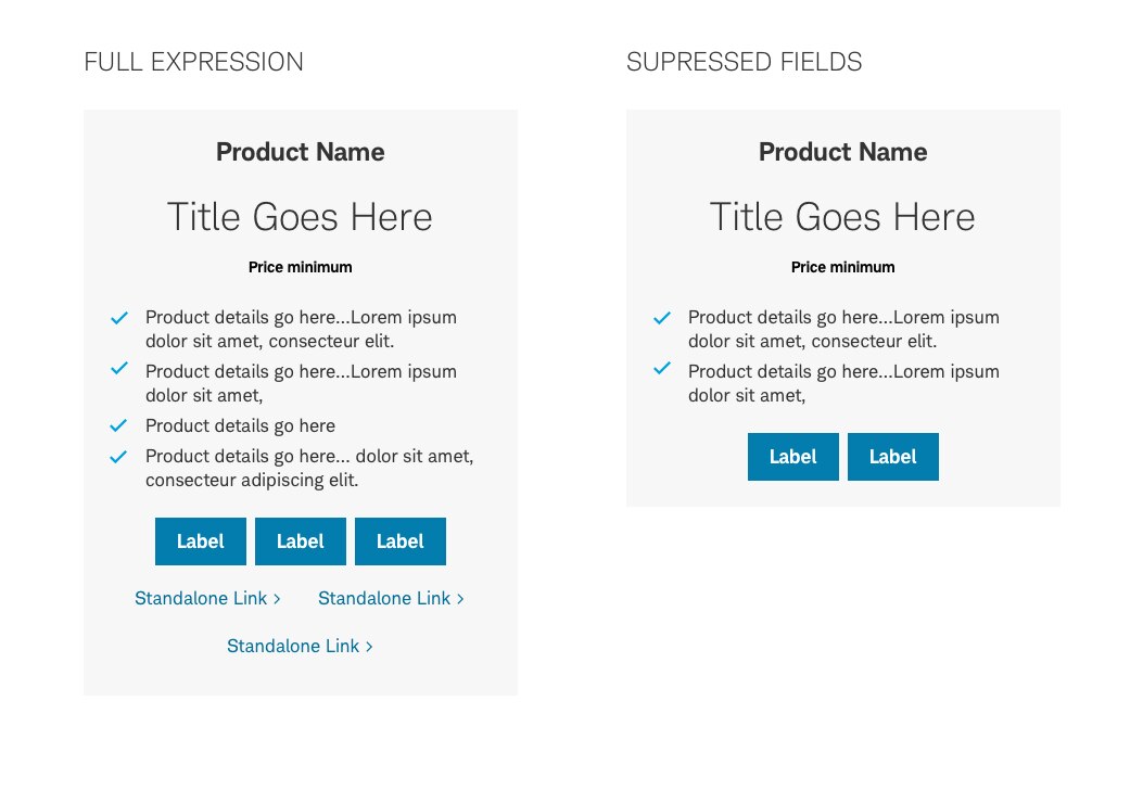
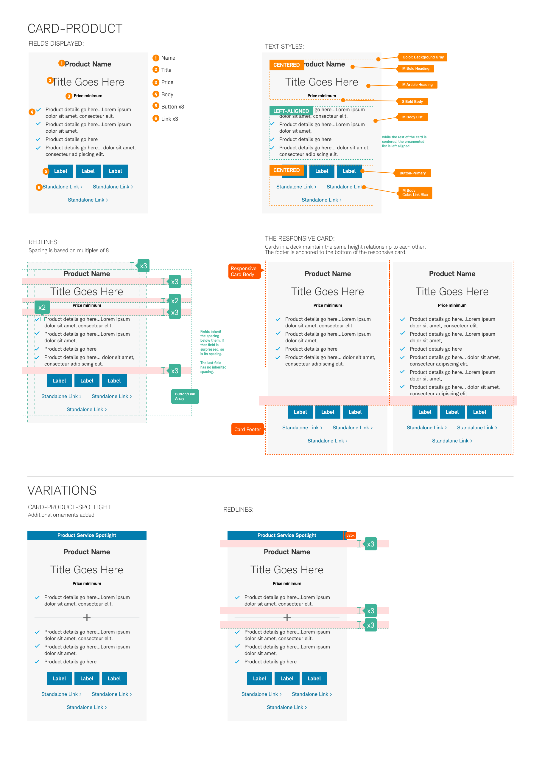
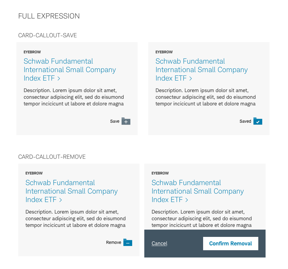
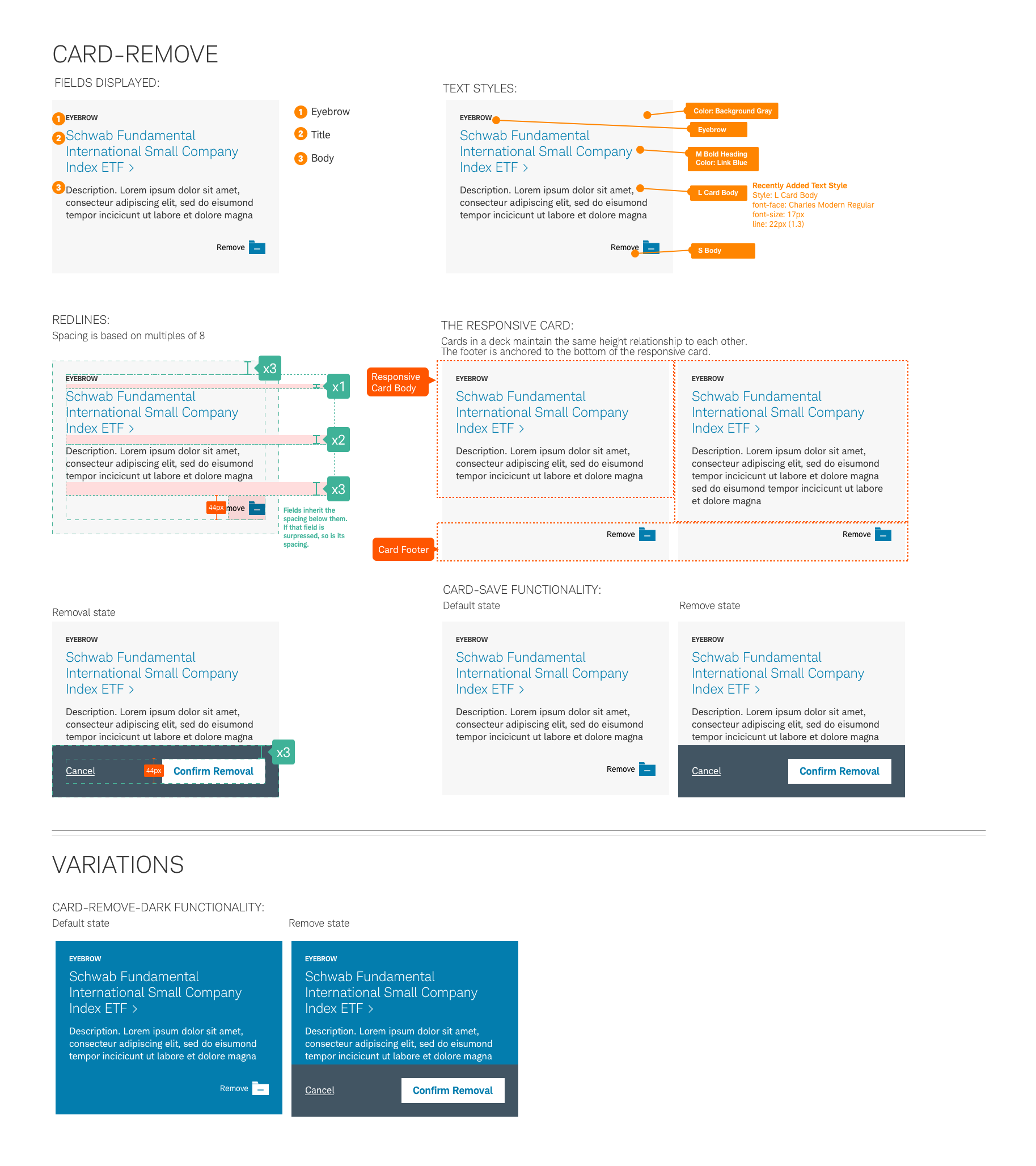
These specifications for the Beacon card represent the ‘full expression” of a component. This simply means that it includes an optimal collection of content fields (some repeating) and graphic elements that are needed to provide flexibility in the everyday use. In most cases the title field is only required field, with all other fields suppressible. Keep in mind that cards are designed to be uniform in their anatomy and the content fields used in a deck should help establish this common relationship.
Card-Default

Card-Landscape

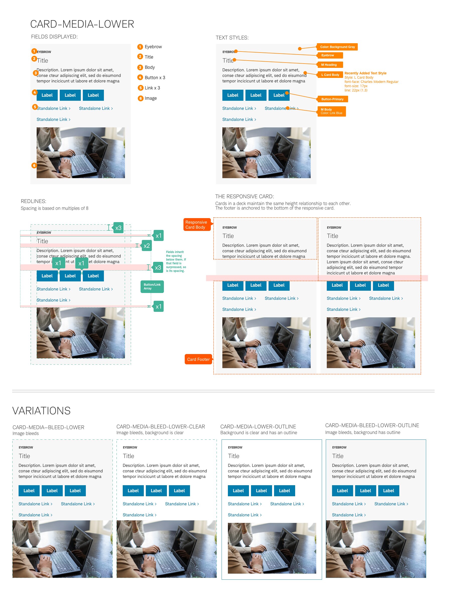
Card-Media-Lower
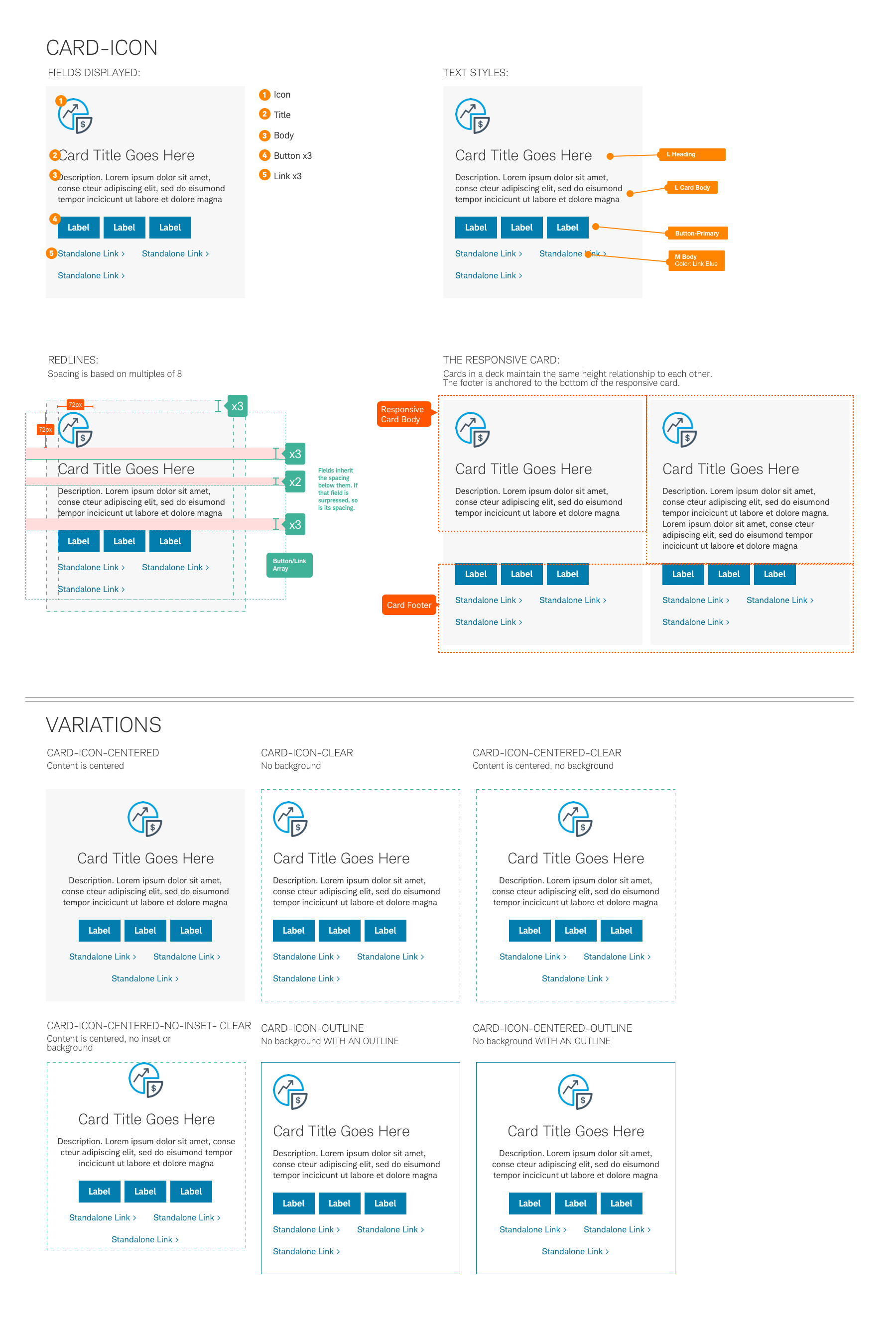
Card-Icon
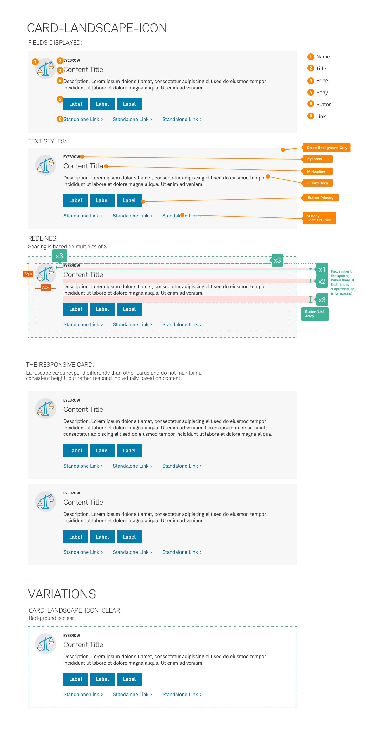
Card-Landscape-Icon
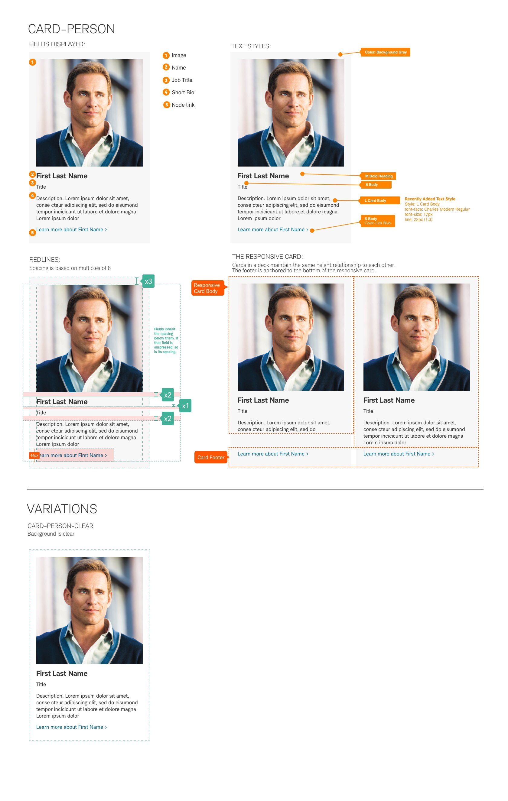
Card-Person
Card-Landscape-Person

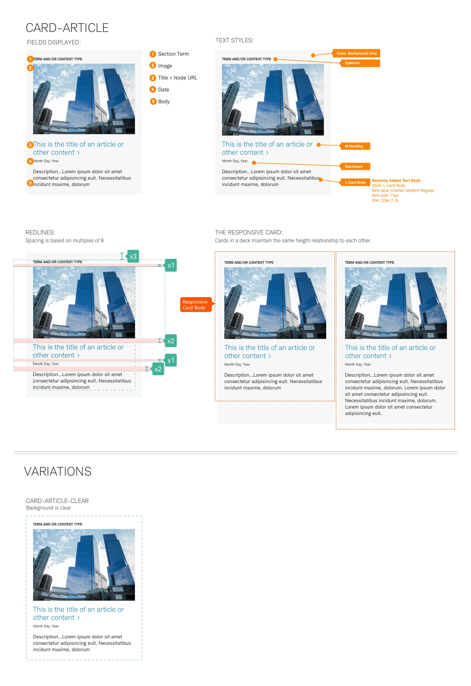
Card-Article

Card-Video
Card-Callout
Card-Product
Card-Save
Usage
The flexibility of card placement inside and adjacent to other patterns within the system is a key aspect of this component. Like a web page, it has a head, body and footer, and can sometimes include a link to more detail. Cards can appear within a background-filled container, or as a clear container, primarily within the body of a web page or web experience.
Default
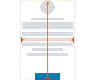
By default, all cards maintain a 24px inset on all edges.
No-Inset
When applying a no-inset attribute to a card, the 24px inset on both the top/bottom and right/left sides is removed and the text runs the full width of the card. A card with no-inset will have tighter space between components when arranged within a deck of cards.
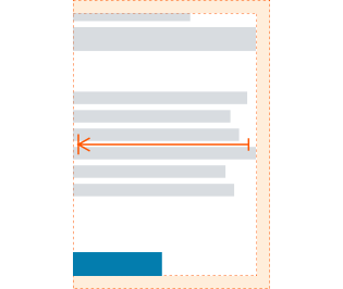
Ledge
The ‘ledge’, or left-edge, refers to the text inset on the left side of a card. In the instance of a clear card, the structure of the content can remove the padding on the ledge so that it visually aligns to the grid while still maintaining the 24px inset on the top, bottom and right sides. This ensures that multiple cards arranged in a deck will display a comfortable amount of space between each card component.
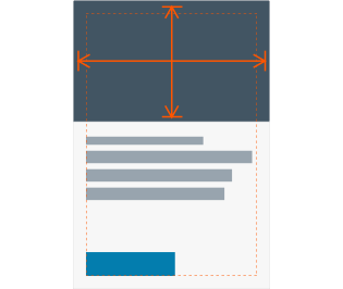
Bleed
The bleed of an image within a card refers to the image constraints extending past the 24px padding and taking up the full width of the card container. You may have an image with bleed and default text inset in the same card. Image bleed is not dependent on the text inset or ledge within a card.
All terminology is provisional and will be factored in future development.
Best Practices
Do
- Use uppercase for eyebrows. (Example: INSTITUTIONAL ARTICLE)
- Keep copy clear and concise for titles and body descriptions.
- Maintain a 24px padded border inside each card. When using a clear variation, text and images may follow the no-inset, ledge and bleed attributes.
- Use uniform card heights within a deck.
- Include a link to view more information (Example: Learn more about First Name).
Don’t
- Vary the height of cards if the content across the deck is varied in size. Maintain uniformity across all cards, using the longest card as the base point.
- Use a single card in a deck. Must include at least 2.
- Use shadowing or 3D effects.
Accessibility
Ensure designs meet color/contrast requirements on Color Guidelines, follow link guidelines, and Schwab Accessibility guidelines.