Carousel
- Variants
- 33 > Card Media
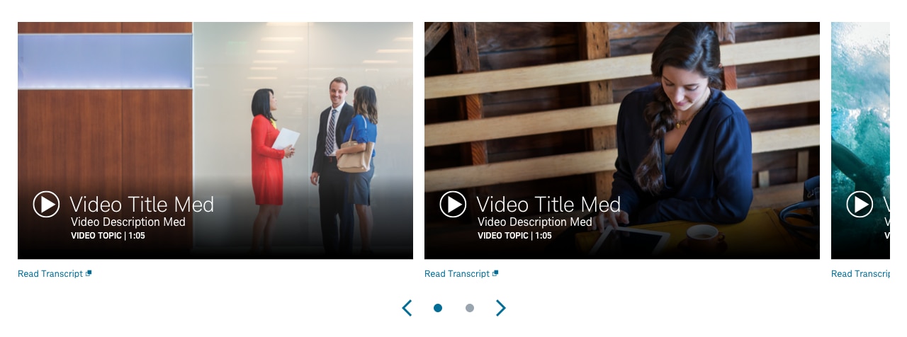
- 50 > Peek Card Video
The carousel is a dynamic container that is made up of rotating cards filled with customizable content (e.g. images, video, copy), plus animation controls. Users are given control of the interface and can advance or reverse direction of the carousel scenes.
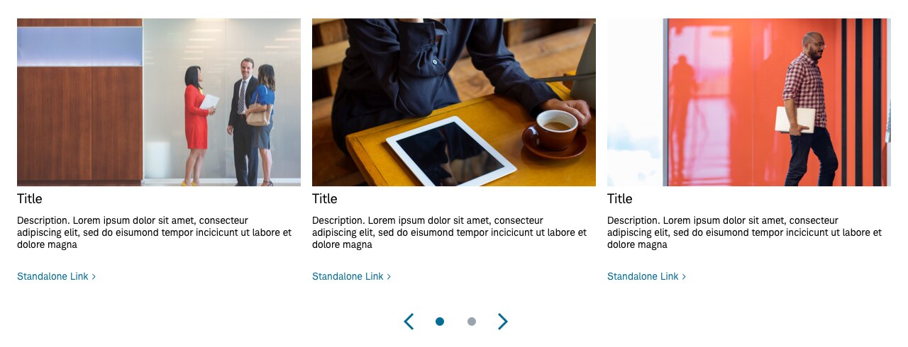
Panel > Carousel-33 > Card-Media
Usage
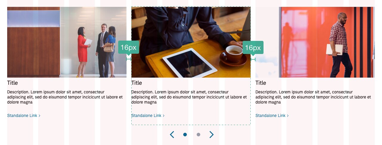
Use when there’s a volume of content that exceeds what layout provides space for in terms of a horizontal pattern. The carousel is made up of a collection of cards that have standard placement, uniform dimensions and standardized data fields. The total number of cards is varied and based on number of page scenes. The content within a carousel’s card collection is customizable but must be relatively uniform. A single view state, with multiple cards visible, is a ‘scene’ and shifts left or right based on user interaction. Single card advancement moves one card left or right at one time.
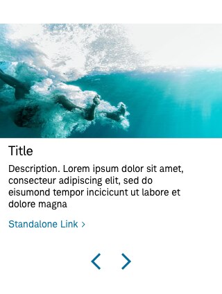
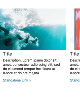
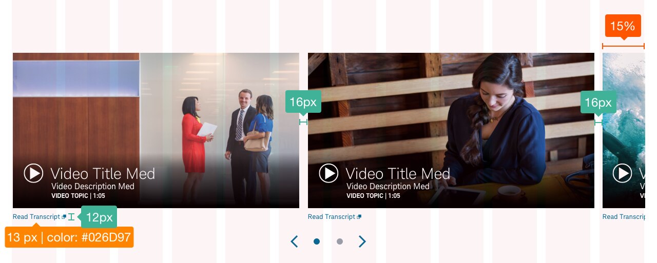
Carousels can be placed almost anywhere on the page, except global header, footer, and forms. They can be placed in marquee, body, and modals, etc. Optionally the carousel can include a ‘peek’ scene option that hides a part of the right-hand card. The ‘peek’ option is a touch friendly affordance that signals touch-based users that the component is swipeable.
Responsive Behavior
Consider how a card deck will transform from desktop (full layout, not in carousel) to a collapsed carousel state in mobile screen sizes. Determine whether a deck will transform into a ‘magic’ carousel or if the cards will stack in the layout. A ‘magic’ carousel is only visible in smaller screen sizes and must be factored into the build of the component at all sizes.
Controls
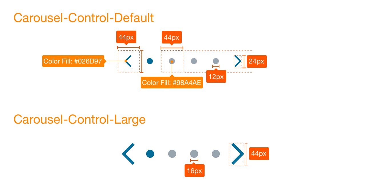
Cheverons and counter icons function as control buttons and allow you to advance the content. Counters indicate how many total cards or scenes are included in the carousel.
• Place controls below the container and centered.
• Include carousel navigation controls. At minimum, right and left cheverons must be represented. Carousels, by default, should advance by scene with an option to force single card advancement. Keep in mind the 44px touch affordance between each control.
Carousel Controls

Best practices
Do
- Consider performance and page loading when using carousels-delay loading of non-visible carousel cards.
- Ensure proper, or default speed of carousel scene advance.
- Show the most important content in the first few slides/cards, and follow order of hierarchy of content.
- Design carousels that consist of content grouped in cards/tiles. Cards/tiles must maintain a uniform size and height within the carousel deck container.
- Consider scene advancement, by default, with the option to force single card advancement.
- Consider dual direction (left or right) advancement with the carousel controls as the default state. The choice to force next only advancement in the first view (for example, a stepped progress carousel) is the non-default option.
- Recommend the default max of 12 or less cards per carousel (for example 3 scenes consisting of 4 cards per scene), keeping in mind the number of counters for a compact navigation control component.
- Recognize that the scene advancement is dynamic and based on responsive screen reductions. The controls/counters will dynamically change as the content transforms.
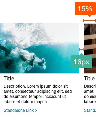
- Consider full view or peek variations. If using a peek-a-boo, the partially shown card is relegated to a percentage of visibility.
- Use a peek variation to allow for a visual indication of swipable content. The controls can be dropped in this instance at the designer’s discretion.
- Include swipable/click/slide interaction and motion for both desktop and mobile variations. The swipe intensity can dictate the speed of advancement (faster swipe motions for scene advancement, and slower swipe motions for single card advancement.)
- Rotate cards in a continuous loop with the primary direction reading left to right.
- Include a transcript link for a modal overlay for all video cards within a carousel.
- Implement tab indexing for accessibility. For ease of navigation, the primary selected state starts at the navigation controls and then secondarily cycles through each card in the carousel deck. Use accessible alt text for images and videos.
Don’t
- Allow for auto rotate/advance through cards.
- Use inconsistent sized tiles or cards within the carousel deck container, keep them all the same size for uniformity (e.g. square 1 to 1 ratio).
- Mix multiple media types within one carousel (for example, video and article cards together).
- Leave out navigation controls if the carousel does not have a visual indication for more content, such as a peek variation.
- Place in footer, global header, or forms.
- Attempt to stack more than one row of cards in a carousel.
- Add ornamental button styling around the carousel controls.
- Use numbers for pagination indicators.
- Place controls on sides of carousel.
- Duplicate H1s in card if placing at top of a page.
- Use animation within the cards.
Accessibility
Ensure the focus order and task flow makes sense to the screen reader user. Ensure each section advancement relays the section to the screen reader user. Ensure all controls have an intuitive accessible label that can be read by a screen reader user. Ensure all the content and controls in each component area carousel are accessible.
Ensure all controls are keyboard focusable and operable and:
- Ensure all controls are recognized by assistive technologies
- Use native controls whenever possible
- Custom controls should mimic the equivalent native control’s interactions.
- Custom controls may need the following attributes: index=”0”, assistive tech recognition, and aria-labeledby labeling.
If a control has a selected state, ensure that it is visually and programmatically relayed, and ensure the screen reader user is able to identify a selected state. Ensure the control’s text and background colors meet contrast compliance (be sure to refer to the UX standards for hex color references).
DEV NOTES:
- Use
<ul>unordered<li>lists to structure the carousel. - Use properly tagged headings that match the meaning of the content for each slide
<li>list item. - Have a defined control type. Native
<button> / <a href>or accessible role=”” (button/link).
Design will need to follow color/contrast requirements on Beacon color guidelines, follow link guidelines, and follow Schwab Accessibility requirements.