Chart
- Variants
- Line Chart
- Area Chart
- Bar Chart
- Stacked Bar Chart
- Pie Chart
- Donut Chart
Charts are often used to ease understanding of large quantities of data and the relationships between parts of the data. Charts can usually be read more quickly than the raw data. They are used in a wide variety of fields.
Line Chart
Line charts are commonly used to track continuous data over time and to visualize multiple data sets at once. Line charts assist with showing trends or correlations between data sets.
Line Chart Best Practices:
- Limit line colors to darker options.
- Use a variety of icons for the data points to help identify the different lines.
- Use patterns to distiguish between the different lines, especially if there are many lines, or if the lines overlap.
- To emphasize main data points, use a small outline circle with a transparent fill.
- Use a strong baseline, as it allows the reader to understand chart orientation at a glance.

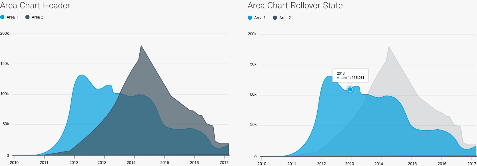
Area Chart
A variation of a line chart, the area chart helps emphasize the volume being shown. A layered area chart further helps to show overlapping data sets by using a percentage of opacity so that all data is visible and can be selected for more information.
Area Chart Best Practices:
- Areas should be filled with 70% color.
- Inactive area becomes 25% opaque.
- Use a strong baseline, as it allows the reader to understand chart orientation at a glance.
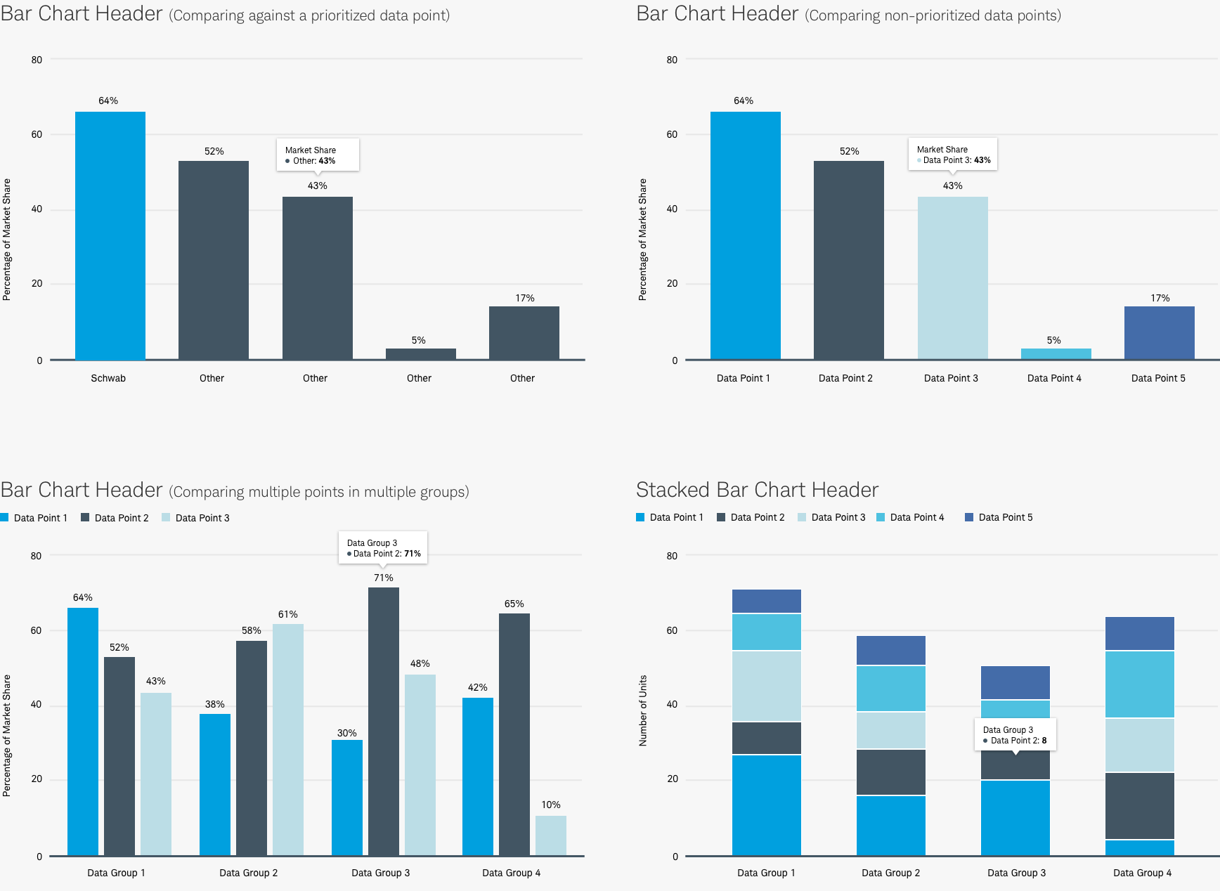
Bar Chart
Bar charts appear horizontally and vertically. They are commonly used to show comparisons, rankings, time series, part-to-whole relationships, and correlation. Stacked bar charts are commonly used to compare multiple part-to-whole relationships with several variables. They can be used alone or in multiples.
Bar Chart Best Practices:
- Bar charts should start at a zero baseline.
- Stacked bar charts should use a 2px white outline to break up each portion to promote readability.
- Use consistently-sized bars and tight spacing, making the values easier to interpret.
- Use a strong baseline, as it allows the reader to understand chart orientation at a glance.
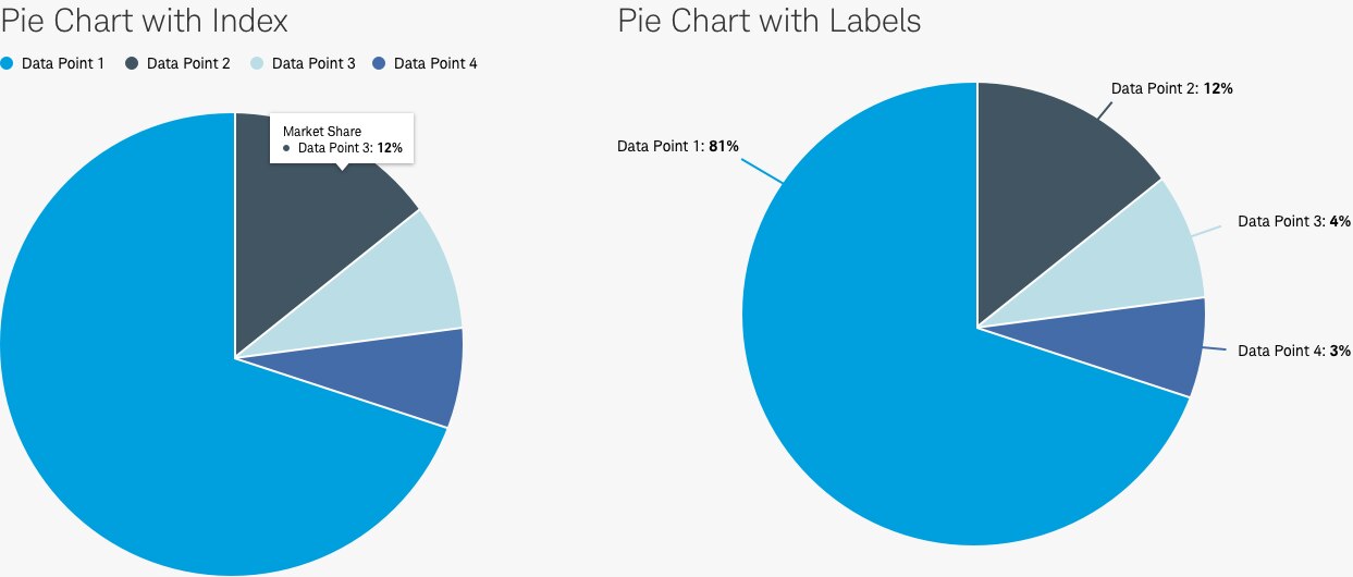
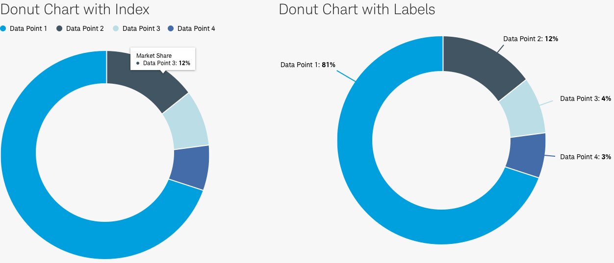
Pie charts
Pie and donut charts are used to display part-to-whole relationships.
Pie Chart Best Practices:
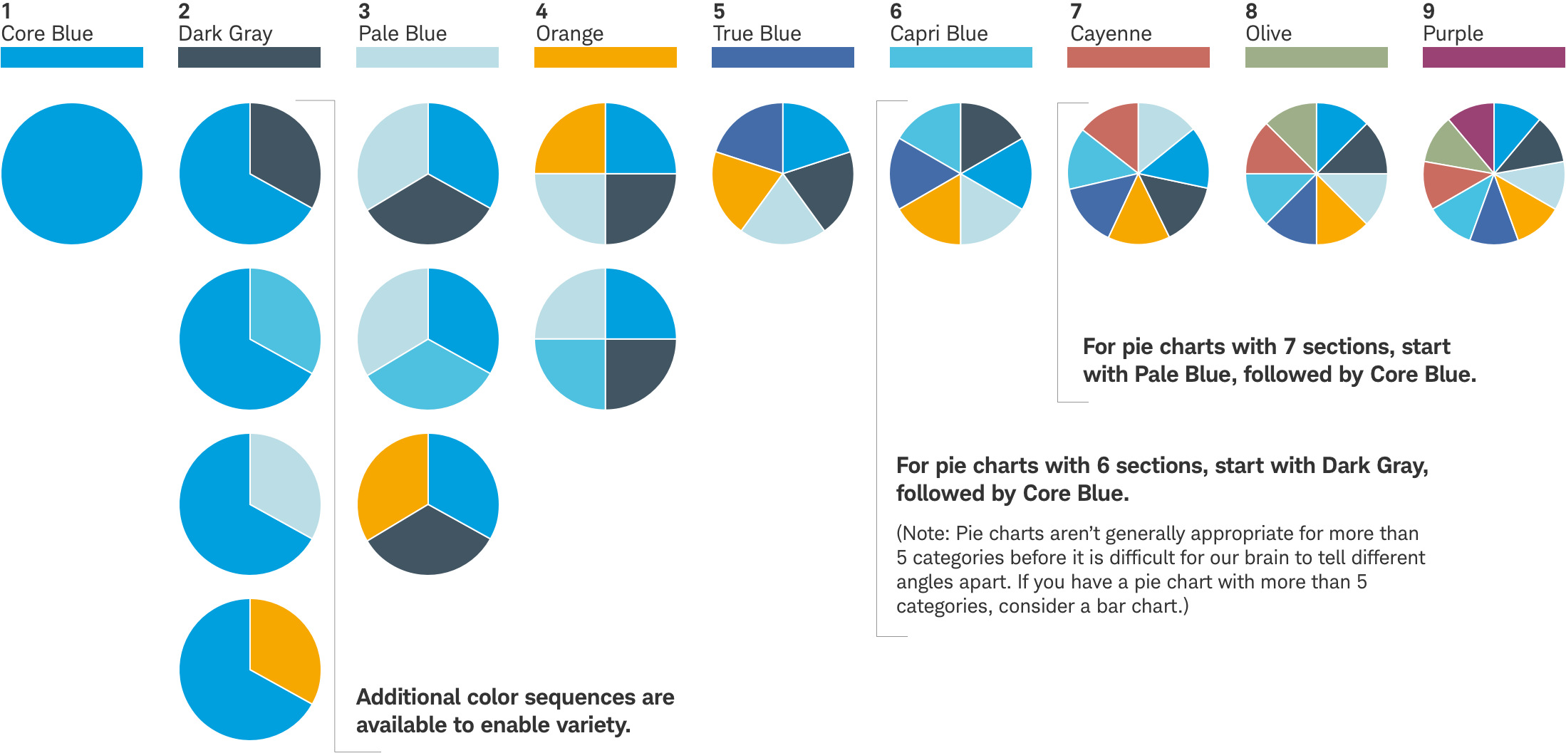
- Pie charts are easier to understand if they contain five or fewer categories.
- If you need to include more than five categories, consider using a bar chart.
- Pieces are placed clockwise starting at the 12 o’clock position moving from the largest to smallest portion and follow color hierarchy.
- If space permits, labeling each pie segment provides the best user experience.
- All pieces should be separated by 2 pixel stroke to help with users with color-contrast issues.
Color palette
Schwab has a color sequence for use in charts, graphs, tables and infographics. The order has taken into account contrast for color blindness and grayscale applications. An effective color sequence when creating pie, bar, or area charts is essential for appropriate legibility in print, video or digital applications. The first, largest, or highlighted segment should always be Core Blue.
- Use the colors of the palette in the sequence described below. Additional tints are available below.
- Color should be used sparingly to emphasize data.
NOTE: The same color principles should be applied to both static and interactive charts. To meet online accessibility standards, please use the color specifications of our digital color palette for online applications where copy is on a colored background.
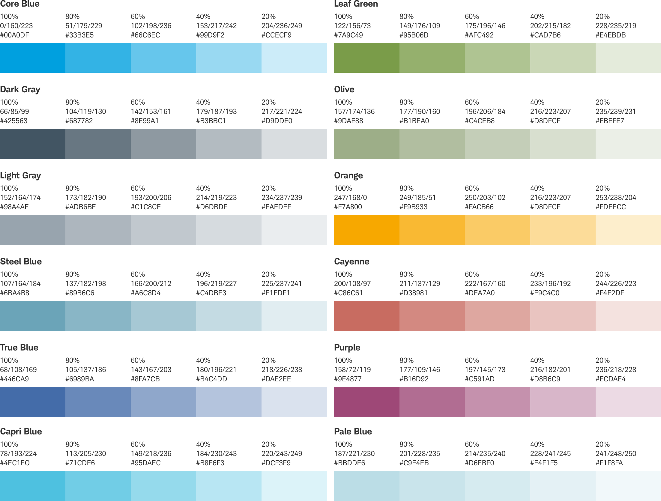
Tints
To accommodate larger data sets, or data that is more nuanced, the tints below can be used, if needed.
Usage
In addition to meeting Schwab’s basic design criteria, when information is presented visually, it should be accurate, insightful, and clear. Typography should not be overly stylized or draw attention away from the chart, graph or data. The subhead should provide additional details to help the reader understand the content.
- Accurate – The data should be factual and displayed in a form that is not misleading.
- Insightful – Prior to building a chart or graphic, ensure the key insight is known and the end result reflects it without distortion.
- Clear – The point of the graphic should quickly be evident to the user. In cases where the data and concepts are exceptionally complex, consider using multiple charts or graphs, animation or interactivity to clearly illustrate the principle.
A good reference for chart and graph principles is The Wall Street Journal Guide to Information Graphics by Dona M. Wong.
Overall Best practices
Do
- Use color sparingly to emphasize data. Using the same color to represent the same variable allows the user to focus on comparing the data and allows you to highlight the focal point clearly.
- Place the legend before the data, ideally under the chart title. Alternatively, it can appear in the chart, if space allows.
- Make sure that labels are readable and outside of shapes.
- Allow for an on-focus tooltip style.
- Use lines between segments to keep them divided.
- Display the whole number on each axis, but if space is constrained, fully define the first number and abbreviate any following numbers.
- Use simple lines and clear labeling to minimize guesswork.
- Include a downloadable version.
Don’t
- Use gradients, shadows, 3D effects or other design embellishments.
- Use colors aoutside of the Schwab brand Pallet.
- Avoid using type at an angle.
Accessibility
Color contrast is of the upmost importance in making charts readable. Design will need to follow color/contrast requirements on Beacon color guidelines, follow link guidelines, and follow Schwab Accessibility requirements.