CTA Panel
- Variants
- 33 Light, Dark-Grey, Light
- 50, CTA Default, Image
- 50 Centered, Light, Light Grey
- 50 Default
- 50 Default, Light, Dark Blue
- Basic
- Basic Ornament
- Centered
- Default
- Deck 33 > Card Callout
- 50, CTA Centered, Image
- 50, Image, CTA Centered
- 50, Image, CTA Default
- 50 Centered
- Centered Dark Blue
- Centered Dark Grey
- Centered Light Grey
- Default Dark Blue
- Default Dark Grey
- Default Light Grey
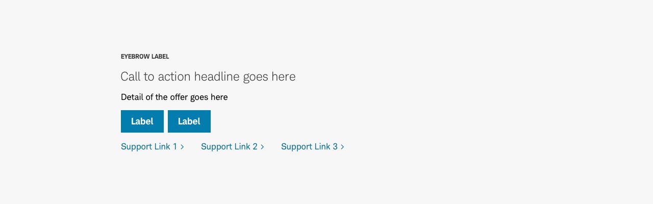
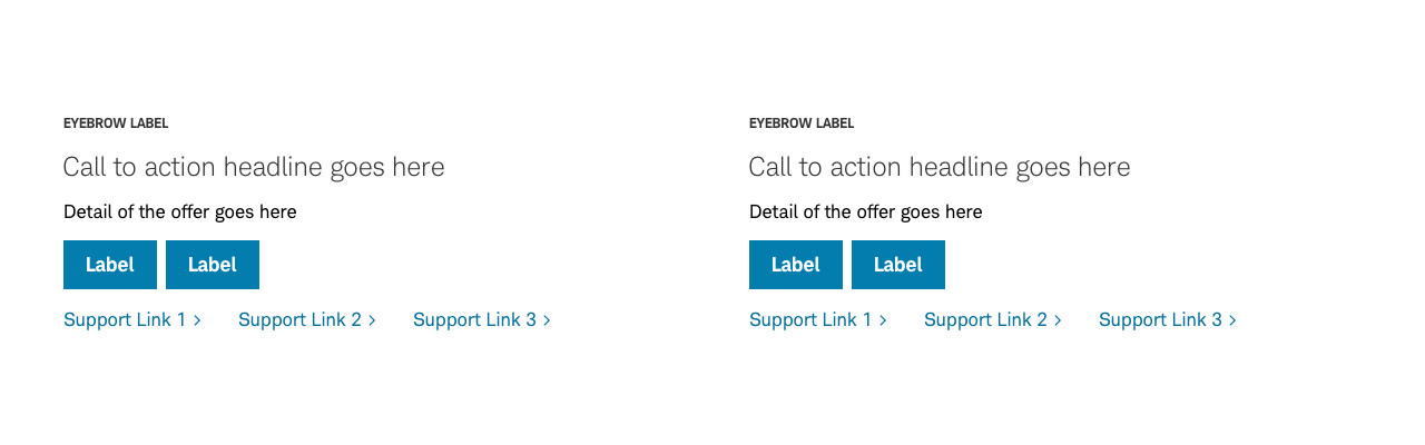
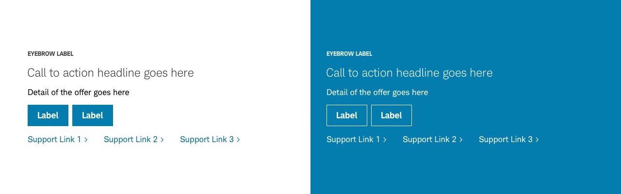
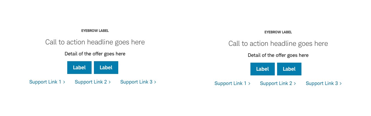
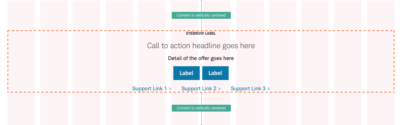
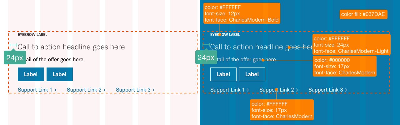
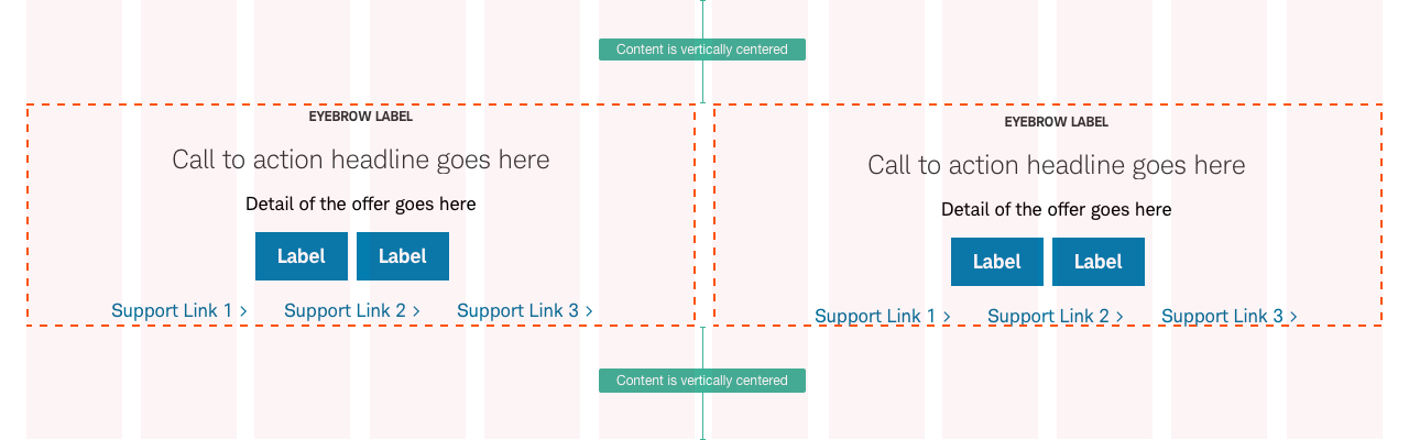
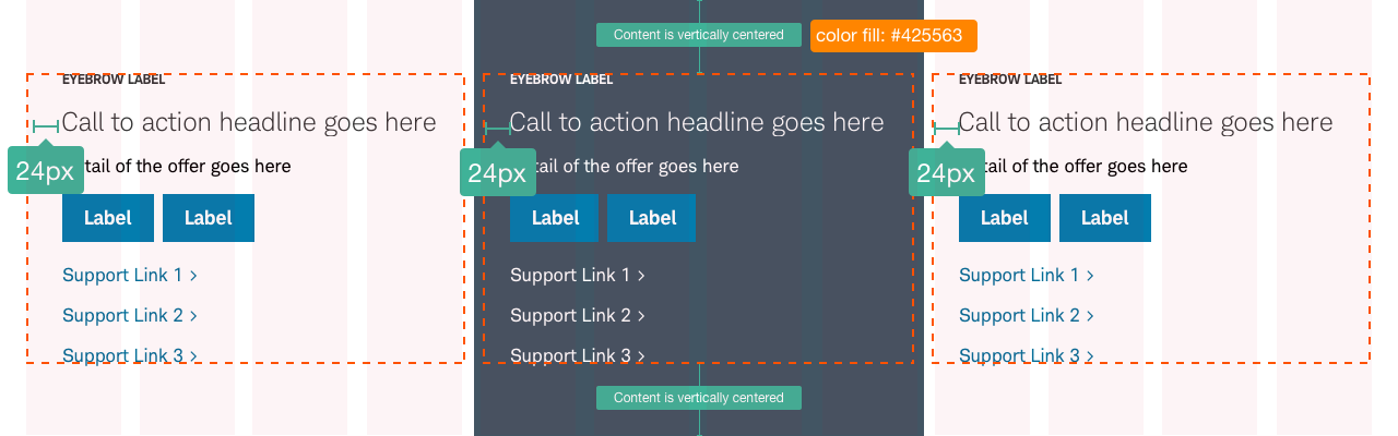
The Call to Action (CTA) panel is a simple and clear visual component asking the user to take a specific action. CTA panels will vary based on grid alignment, number of CTAs, and use of images.
CTA-Panel-Default


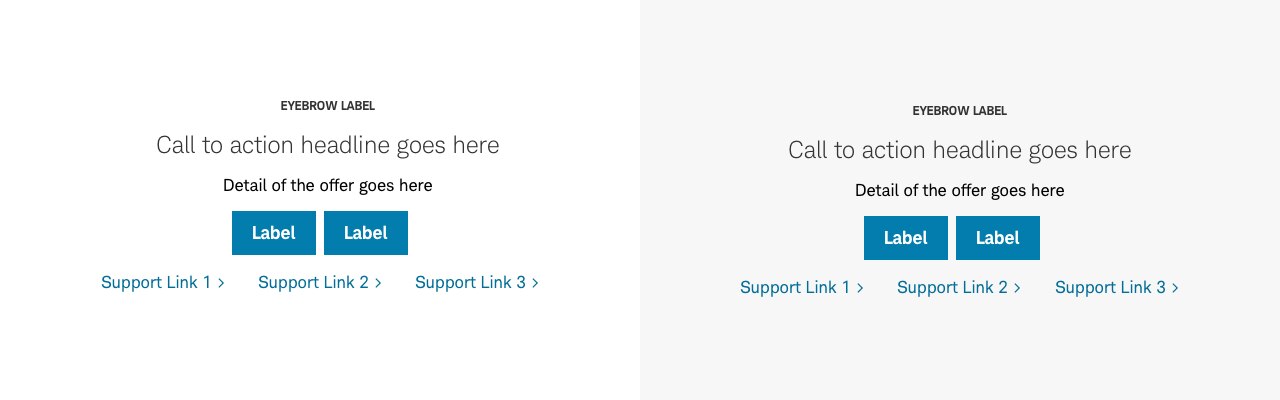
CTA-Panel-Centered


CTA-Panel-50-Default


CTA-Panel-50-Centered


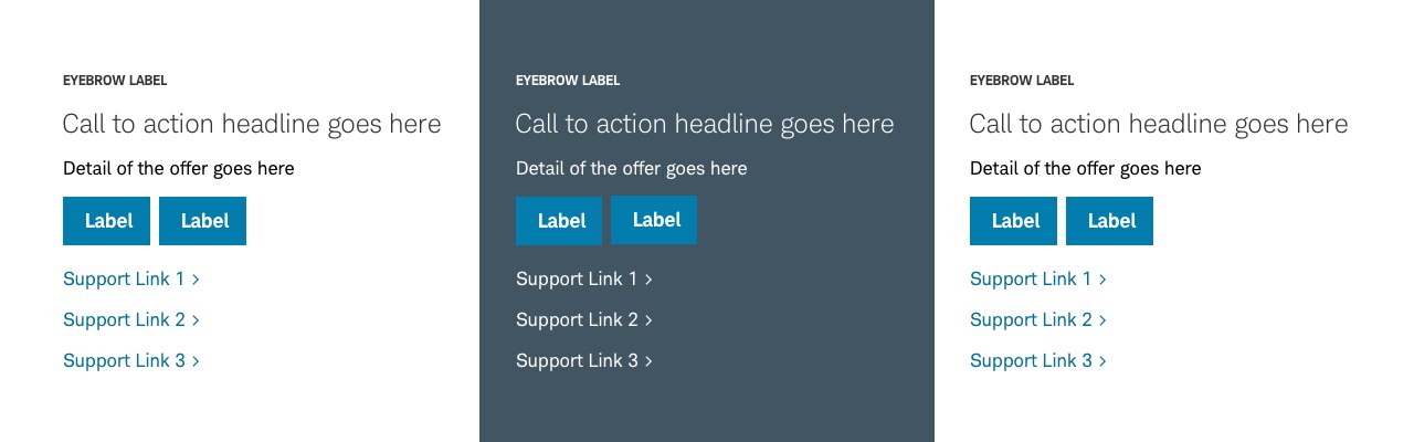
CTA-Panel-33

CTA-Panel-Basic


Usage
A CTA panel is a component added at, or near, the bottom of the page so users clearly understand next steps for interaction with the content. CTA panels consist of a title, copy, and a link or button, at minimum. The specific CTA copy can be modified (e.g. for conversion or additional information), depending on where the user is in the journey.
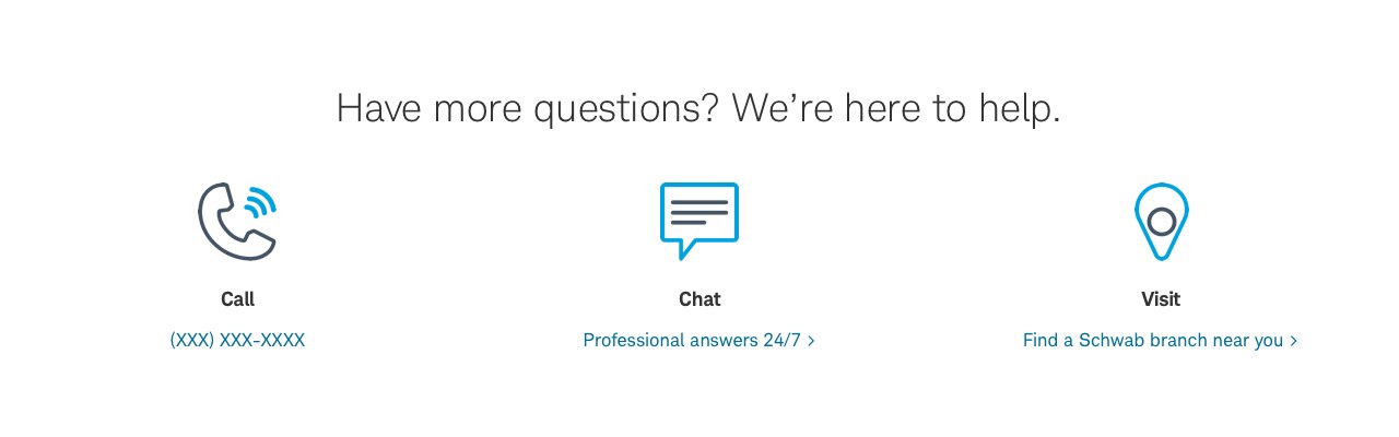
A Mini CTA can go anywhere on a page and takes up less space than the CTA panel. It’s used primarily when you want to give the user an option to take the desired action, while being less disruptive to the user flow. Unlike the CTA panel, you can have more than one on a page. The Mini CTA will have copy and a button only.
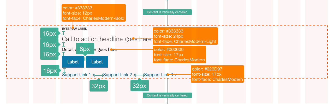
Design Specifications
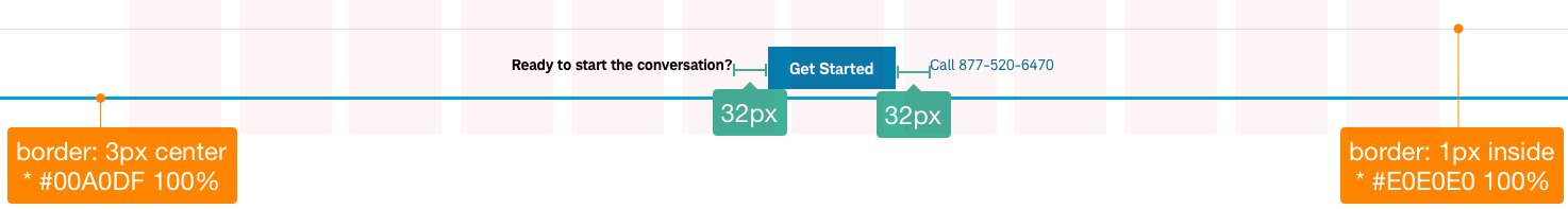
CTA-Panel-Default

Best Practices
Do
- Design CTA block that quickly clarifies user action.
- Keep copy short, clear, and concise. Use minimal word count.
- Lead with a strong action verb like ‘Start’ or ‘Download’. Write in active voice (directive).
- Ensure copy clearly describes what will happen when the user clicks the link or touches the button.
- Use buttons and links appropriately, based on intended user actions.
- CTA link and button labels should be descriptive and unique to each CTA (not “Learn more” on each).
Don’t
- Overwhelm users with options.
- Use unnecessary words or lengthy word count.
- Use vague descriptions for links or buttons.
- Place too many Mini CTAs in close proximity.
Accessibility
CTA panels should be detailed and labeled properly to include for screen readers. For example, instead of “Learn More”, use “Learn More about Schwab ETF’s”. The CTA should meet all color/contrast requirements on Color Guidelines and Schwab Accessibility guidelines.