Footer
- Variants
- Default
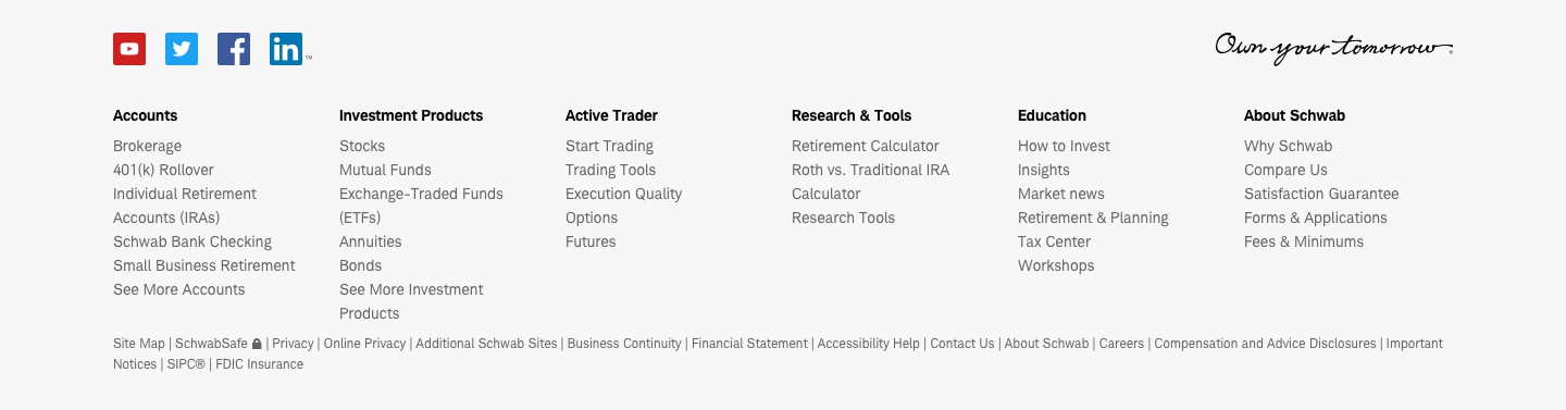
Footers are a common design pattern used consistently at the bottom of each page to serve as page termination, site map/navigation to deeper content, and social media sharing.
Footer-Default
Usage
Footers are always placed at the bottom of the page below disclosures as a visual end point for page content. This provides users with an easy way to navigate to new pages or back to sections on the current page without having to scroll to get back to the top nav. Including a consistent footer on every page provides familiarity and gives users clear options to further navigate the site and explore more content.
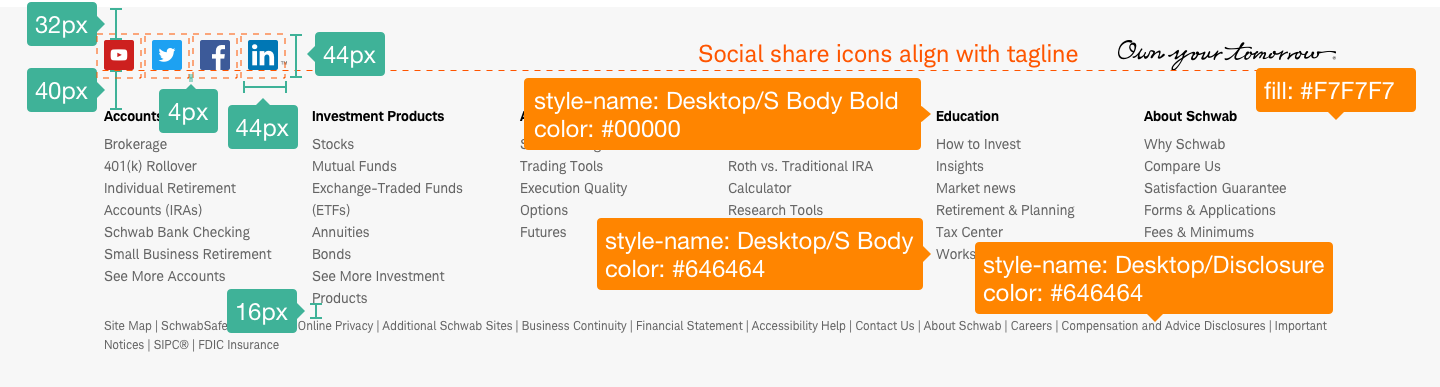
Design Specifications
Footer-Default
Best practices
Do
- Use a footer design that improves freedom of movement and site navigation.
- Create page-wide footers and proper alignment.
- Ensure the footer is present and consistent on all pages.
- Be mindful that the footer condenses into an accordion on mobile.
- Organize links into clearly labeled categories that make sense and provide clear structure and order.
- Follow touch affordance best practices when grouping multiple links in close proximity.
- Ensure links have ad-hoc tagging fields, so publishers can add data-track attributes.
Don’t
- Customize the design or embellish the footer since this is a global pattern.
- Use a home page footer on any other pages.
- Use more than one row of links for site-wide footers.
- Overwhelm the user with too many links that aren’t clearly organized by topic.
- Add links unless they minimize user effort, help users navigate, or improve the user experience.
Accessibility
Page Structure: Use the correct semantic element of <footer> but if it must live in a <div>, then use role=“contentinfo” to provide context to the screen reader.
Links and form controls:
Ensure links are keyboard operable and keyboard focusable (custom control links need a tabindex=“0”). Have a visible focus, which can be the browser’s native visible focus treatment on interactive elements. Have a native or accessible label and ensure the label is descriptive, intuitive, and not ambiguous (“Click here”). Relay any states if applicable to the control.
Ensure links meet color/contrast requirements on Color Guidelines, follow link best practices, and Schwab Accessibility guidelines.