Header
- Variants
- Default
The header provides access to the meganav and utility navigation. It’s positioned at the top of the page, is responsive, and collapses into a compact navigation at smaller screen sizes.
Header-Dark


Usage
The header has 3 distinct uses: identity, primary navigation, and utility navigation.
- The logo reinforces that the user is in the correct location
- The L1 labels trigger the main navigation or meganav
- The utility navigation guides users to persistent, but secondary tasks like search and log in.
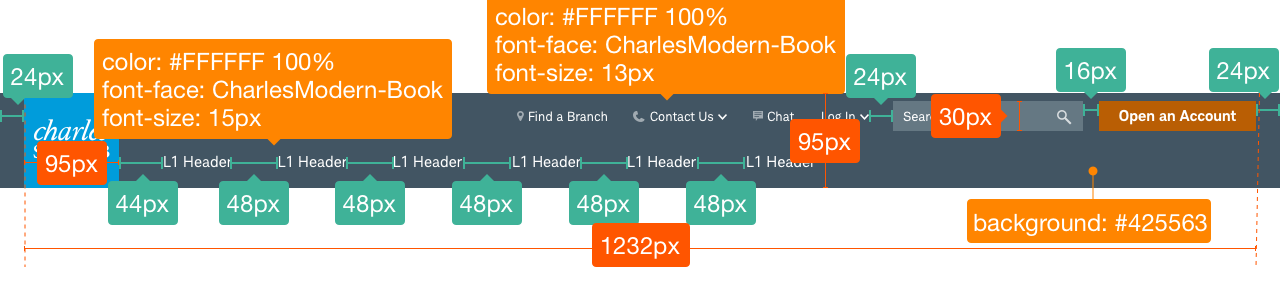
Design Specifications
Header-Dark


Best practices
Do
- Use concise heading labels and clearly describe the category.
- Left-align the L1s in the main navigation.
- Right-align the utility navigation.
- Limit L1s to one or two words.
- Consider how the nav will transform on mobile.
- Aim for content balance and consistency between L1s.
Don’t
- Allow L1s to wrap
- Allow the utility nav to encroach upon the Brand Signatures
Accessibility
The header should have the correct size for visuals and copy to meet Schwab’s accessibility guidelines and a design that proactively supports most screen readers. Clearly describe input for users who might have visual limitations. Use appropriate text and code labels to allow quick orientation and movement between toggles.