Modal
- Variants
- Default
A modal is a box/container triggered by the user that overlays the main window and focuses the user on a specific action. It disables the main window, keeping it visible in the background, and often requires the user to interact with the modal in order to return to the main window. The modal has black tinting that clearly distinguishes it visually from the page content. Examples include dialogue boxes, videos, and alerts.
For an in-depth look at using video in modals, see the Video Player Page.
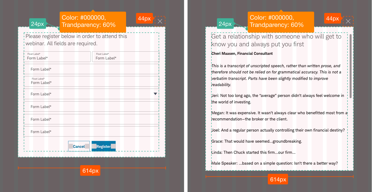
Modal-Default-Active
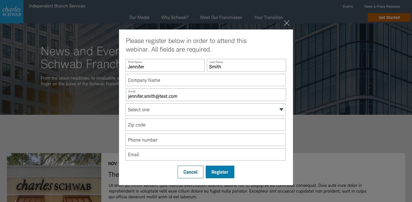
Modals should be centered horizontally on the page. Active modals require user interaction for a specified task.
Usage
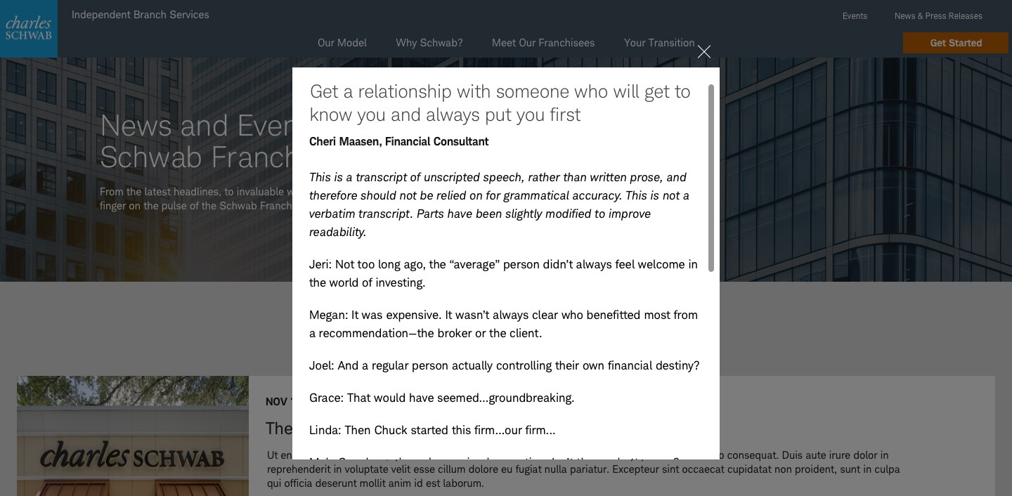
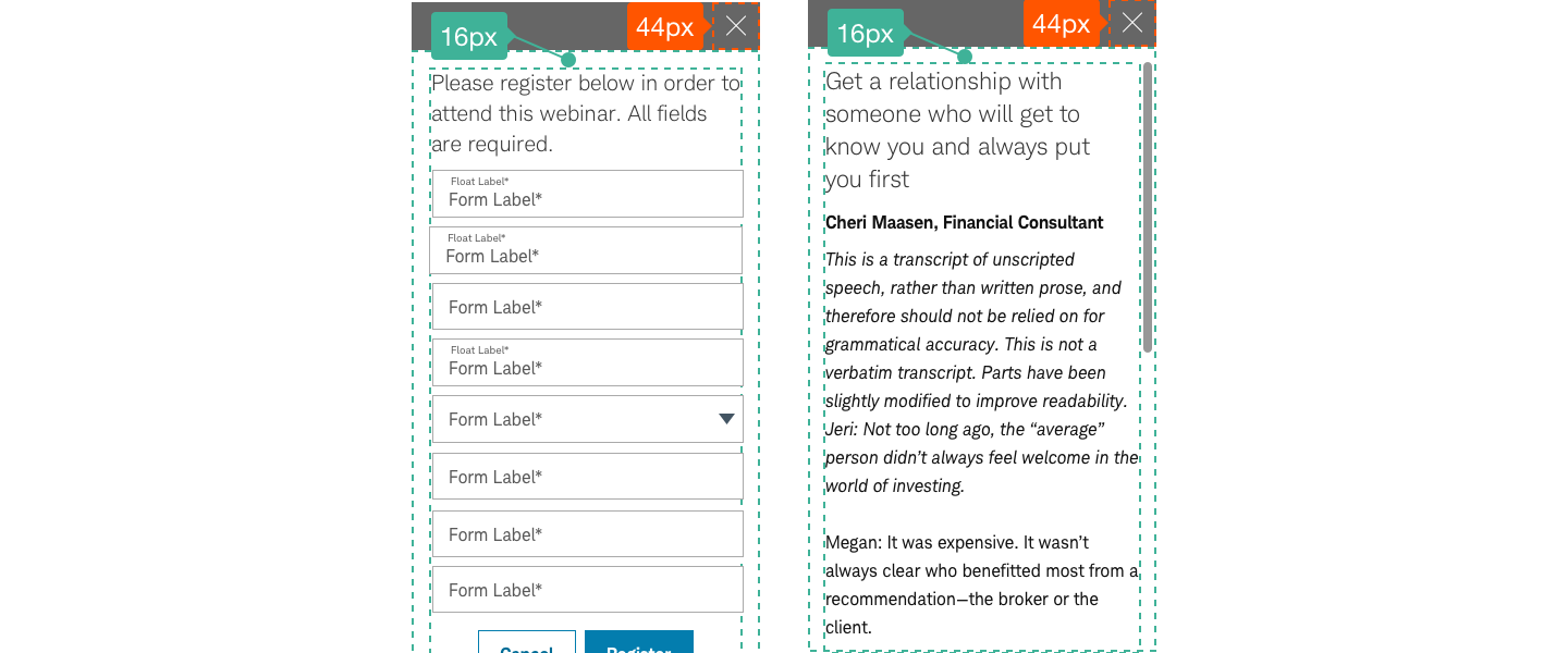
Use modals to display information or content without taking the user out of their current experience. At a minimum, modals should include a title, body copy or media asset, and “Close X”. For active modals, include buttons or links. When content exceeds the modal dimensions, a special scroll will be provided. The screen dimensions of modals shouldn’t exceed the current screen size. Modals aren’t manually moveable.
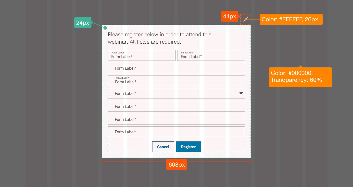
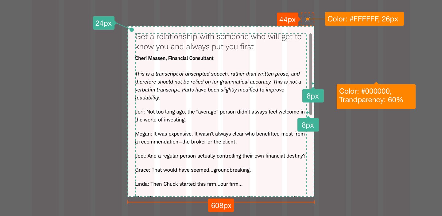
Design Specifications
Best practices
Do
- Use modals sparingly since they are disruptive to user flow.
- Keep content clear and concise.
- Use sentence case for the title bar.
- Use a title or button that succinctly describes the modal’s purpose, and give button labels have actionable names.
- Ensure the background is fixed and inactive while the modal is active.
- Ensure users can’t manually move the modal.
- Use auto play when triggering video within a modal.
- Have video stop when the modal is closed.
- Use scrolling sparingly for things like video transcripts and forms. For long-content forms, consider having a dedicated page instead of a modal.
- Follow video best practices when using videos in modals.
Don’t
- Use if there is no clear need.
- Overwhelm users with too much content.
- Allow modal to open automatically-i.e. without user triggering the modal.
- Use more than one modal on the page at one time.
- Use modals when a pop-up window in new tab is needed.
- Include third-party sites, PDF’s, or complex information (e.g., tables, long content, complicated decisions, complex components such as accordions).
- Rely heavily on modals for mobile experience, as viewing content can be difficult, given the screen size and user interface.
Accessibility
Follow these modal accessibility guidelines:
- Ensure there is a clear beginning and end of modal content.
- Only the content within the modal should be visible to assistive technologies (not the content in the background) to avoid confusing users.
- The modal should be easily dismissed by a control (button/link) or the ESC key, or by clicking on the background.
- Direct focus to first containing block element upon modal opening.
- When the modal is closed, the screen focus should be directed to the initiating trigger element where user left off.
- When using the Tab key, the order should follow the natural order sequence and go back to the beginning of modal content after reaching the end of the modal content (and not take user to background content until the modal is closed). The tab order should follow the order of focusable elements like buttons, links, and dropdowns. All focusable elements, including links, should be keyboard operable.
- The modal container should include a role=”dialog” command, a descriptive modal title, as well as an ‘aria-labeledby’ to titles.
- Follow Schwab Accessibility guidelines.
Performance considerations
All modal content (images, code, text) should be loaded after page interactive so as not to block anything on the critical-rendering path. Avoid obstructing the user’s critical path, or line of sight, with extraneous content or interactions. When appropriate, use accordions and modals to align the display of such information with the user’s need.