Pinned Navigation
- Variants
- Default
- Default Dark
The pinned navigation, or fixed in-page navigation, anchors to the top of the page as the user scrolls through page content sections.
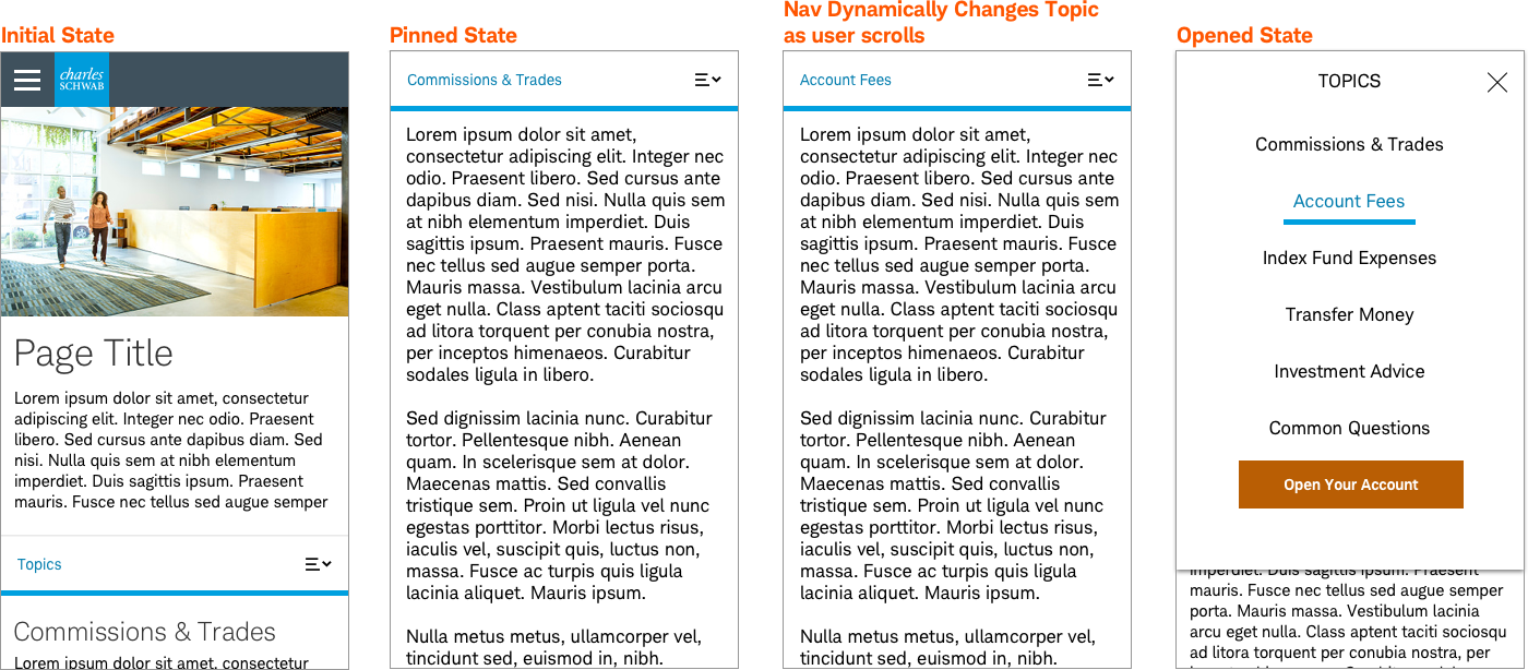
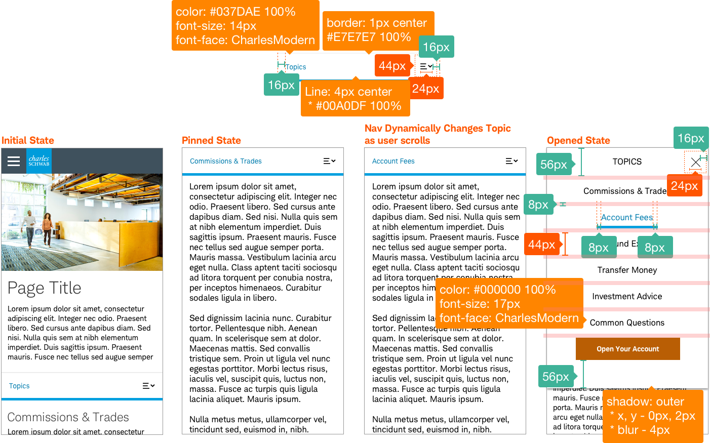
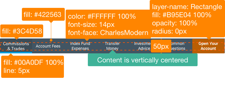
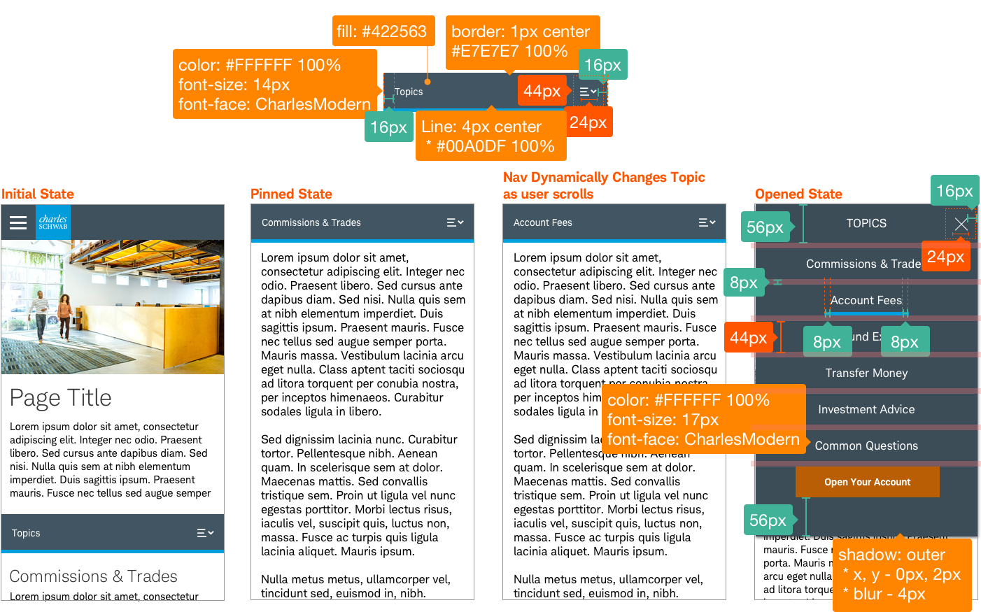
Pinned-Nav-Default


Usage
Pinned navigation is used for long content pages that have clearly defined categories or sections. Providing a clear view of page content sections as fixed, ‘pinned navigation’ allows the user to easily navigate and jump to sections to explore more content. This saves the user time and affords them more control and confidence to find what they want.
Desktop & Tablet
If the page utilizes a section nav, the pinned nav does not pin, but rather it scrolls with the rest of the in-page content. It will, however, pin in mobile view once the section nav is absorbed into the hamburger nav.
Mobile
On smaller screens the pinned nav collapses into a single-section view. A dropdown can be triggered and another selection can be made.
Design Specifications
Pinned-Nav-Default
Best practices
Do
- Use for long pages of three to seven sections of content that require a lot of scrolling.
- Use when jumping to sections improves the user experience.
- Use on pages where this pattern will improve usability.
- Design for mobile with appropriate breakpoints, so that the nav doesn’t take up the entire screen and provides plenty of room for content.
- Each link should have ad-hoc tagging fields so publishers can add data-track attributes to elements.
- Add an optional “Open and Account” button when needed.
Don’t
- Use more than seven sections on a page.
- Add styling or change the design (except for light/dark variations).
- Use for shorter pages or if all the page content can be viewed/scrolled easily without it.
Accessibility
Structure:
The pinned nav should maintain its original order with in the DOM structure so it should not change its order as the page scrolls.
- The navigation container div can be defined as either a
<nav>or using an ARIArole="navigation". - Use semantic
<ul> <li>to structure navigation content.
Keyboard focusable and Operable:
- Navigation items need to be keyboard focusable and operable for screen readers and other assistive technologies.
- Pinned/Sticky nav must be discoverable by screen reader.
- Ensure all menu items are focusable by assistive technologies.
Visual Focus:
- All navigational links should have a visible focus when tabbing through the menu.
- Many browsers have a default focus, which is fine.
- Do not remove the visual focus with CSS.
Defined Control Type:
The control type (navigation) needs to be defined in order to be recognized by screen readers and other assistive technologies.
- Ensure all navigation items are recognized by assistive technologies.
- This can be a native
<button>or link<a href>or an accessiblerole=”button“/role=”link”.
Label:
All controls need to have an accessible label. Use either a native label <button>Label</button> / <a href>Label</a>or an aria-label / aria-labelledby.
The design will need to follow both color/contrast requirements in the color guidelines and Schwab’s accessibility guidelines.