Section Navigation
- Variants
- Nav Default
Section navigation works in conjunction with the meganav and is an extension of the main navigation. Section navigation is used to access lower levels in a site’s structure below the main navigation pages.
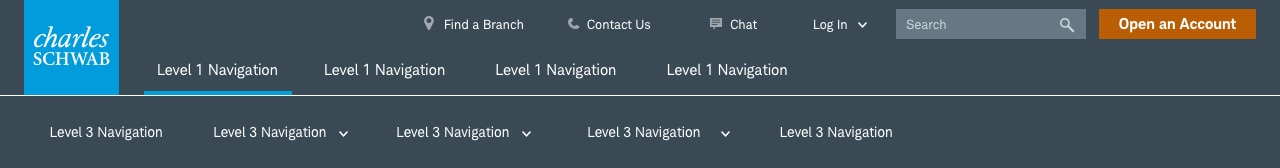
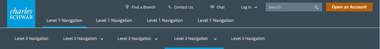
Section-Nav-Sibling
Displayed only after the user has selected a topic from the meganav, the Section-Nav-Sibling displays links at the same level, in this case, L3.
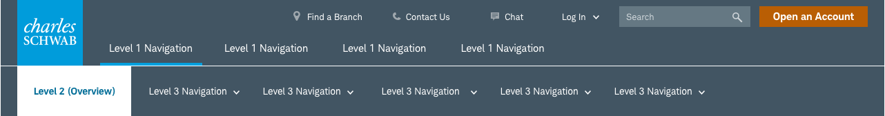
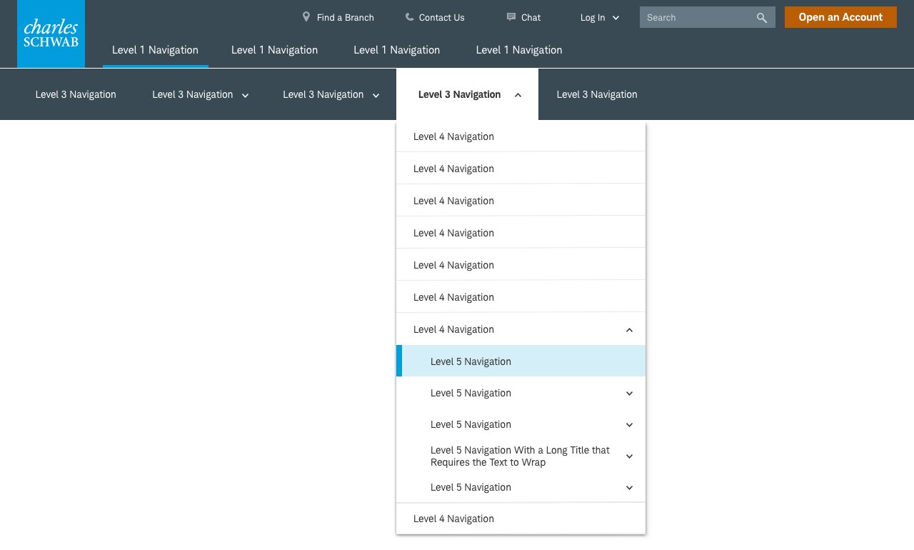
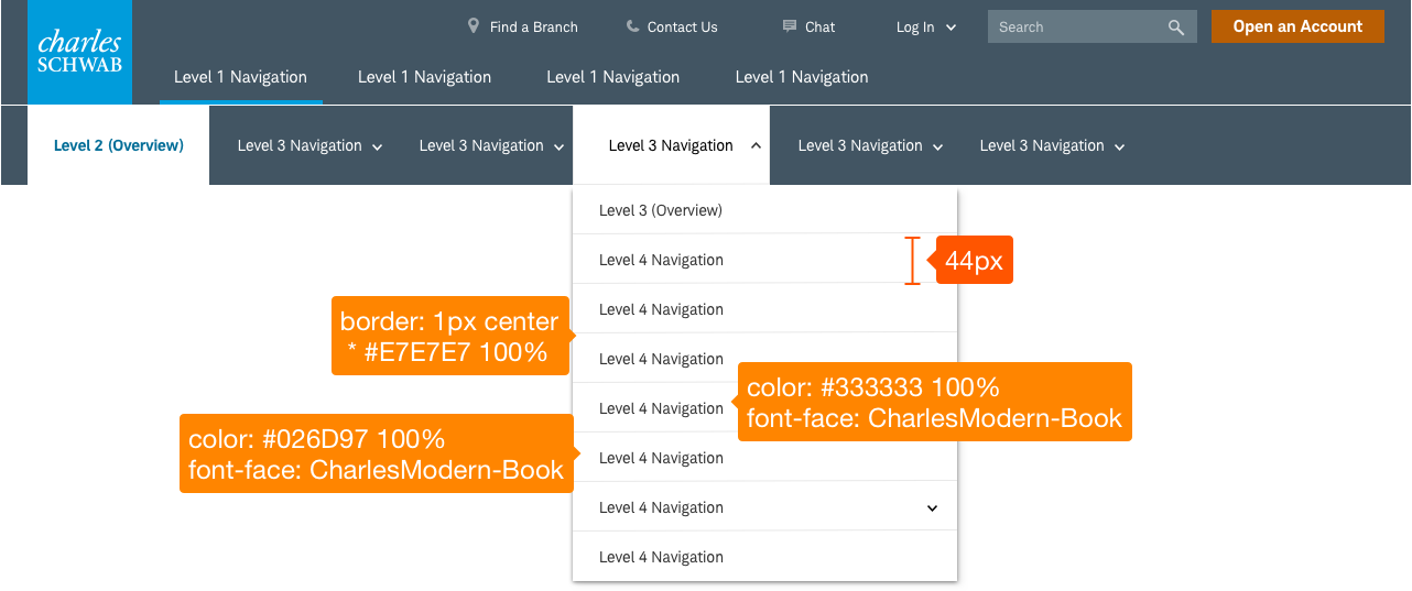
Section-Nav-Parent-Child
Displayed only after the user has selected a topic from the meganav, the overview for that section is displayed on the leftmost position, with it’s level 3 children sections and pages displayed to the right.

Usage
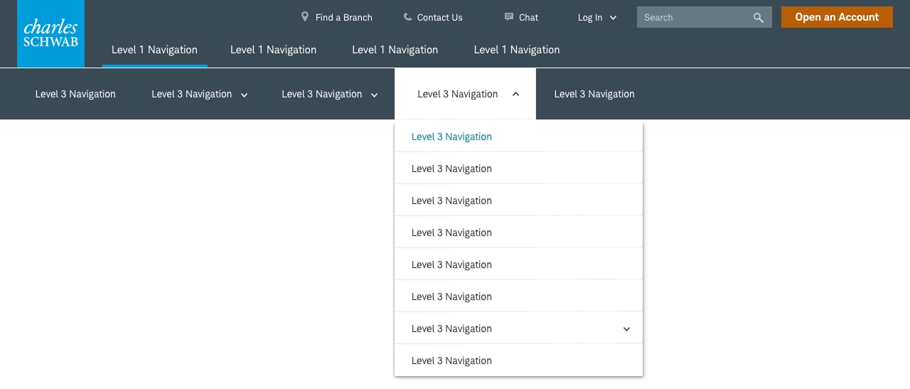
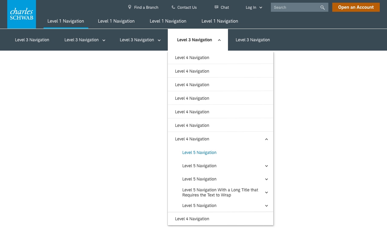
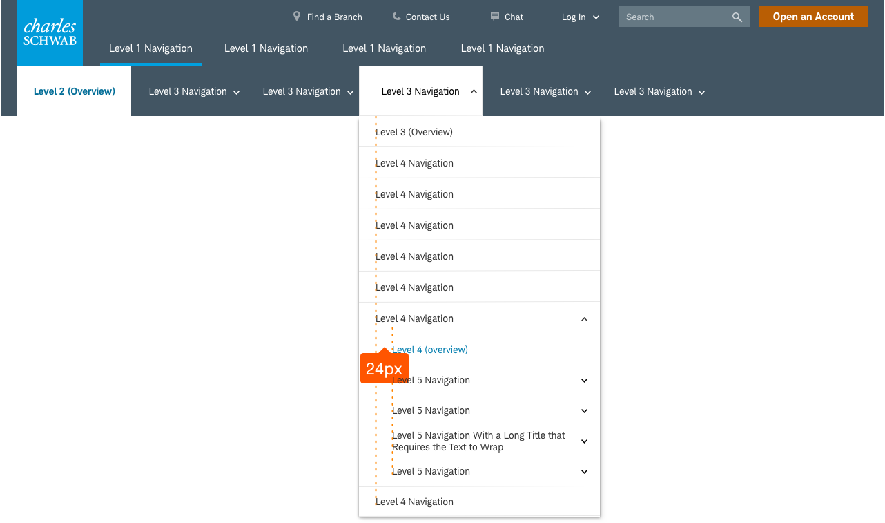
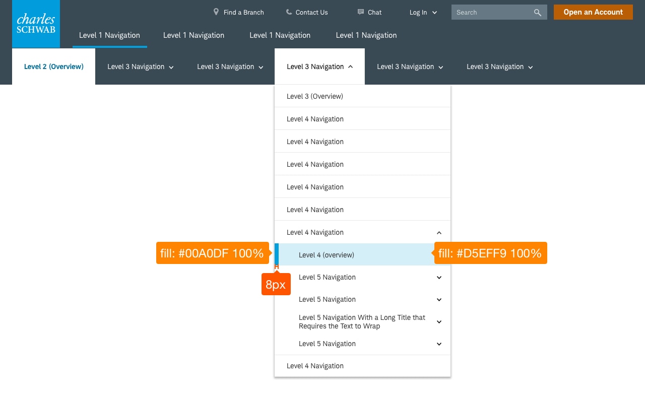
Section navigation is displayed when browsing deeper levels of the site. Section navigation displays other options at the third (L3) level of a hierarchy, and drop-down menus show a nested list of options below the L3 items as well and where the user is within the section.
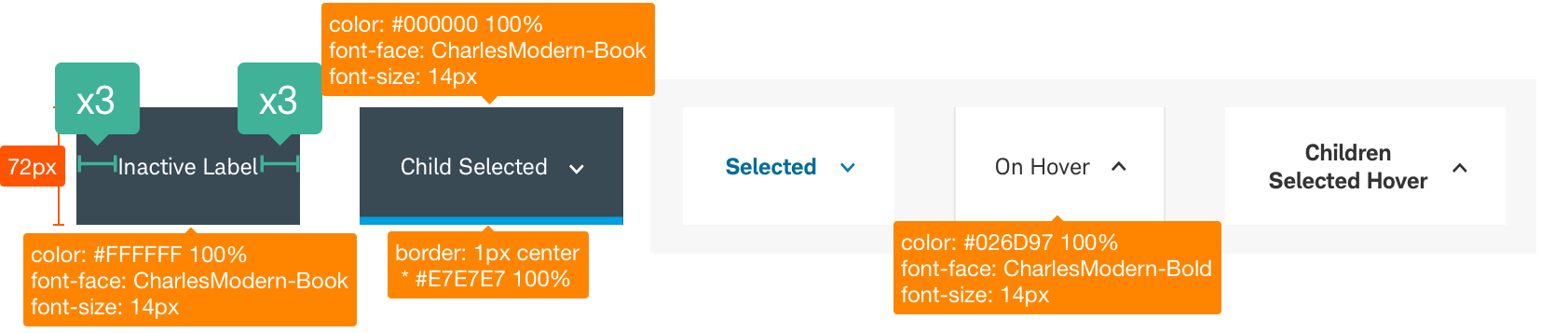
Design Specifications
Label Variations

Best practices
Do
- Use title case for all labels.
- L2s and L3s should limit to 3 words if possible. L1 one or two words with a character count for labels to < 30 characters.
- Use concise heading labels and clearly describe the category. Links should clearly describe where the user is going if they click the link.
- Allow text to wrap in the case of long page titles.
- Left align all tiles within the Section Navigation.
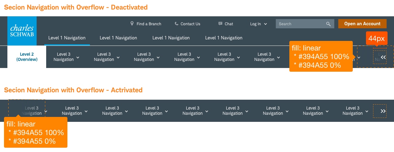
- Limit the navigation to 8 or 9 labels, depending on length.
- Use the overflow pattern if the navigation exceeds the space alotted.
- Organize the content hierarchy - position the most important content at the top of the lists.
- Consider how the navigation will transform on mobile.
Don’t
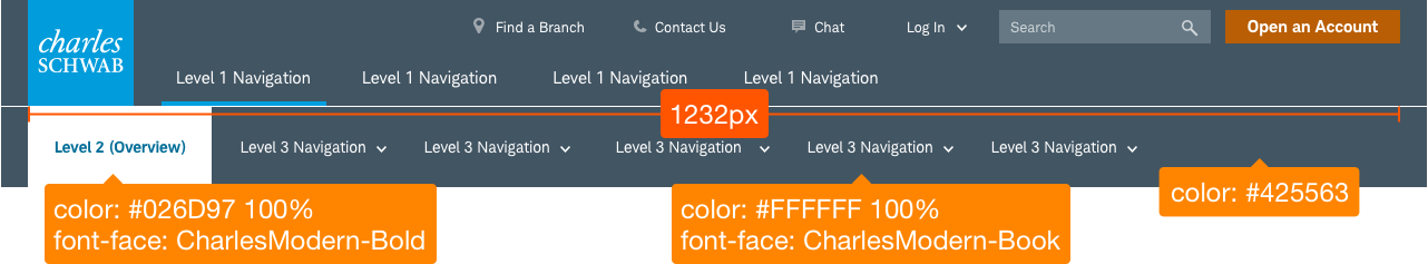
- Exceed the 1232 width for desktop layouts.
- Use overly long titles.
Touch Affordance
Touch affordance allows the user to select an item on a touch screen interface and is important to ensure users easily understand where they can physically interact with touch targets. Proper touch affordance allows users of all abilities to select the intended target and avoid tapping the wrong element.
Example: Buttons must be large enough (or far enough away from other buttons/interactive elements) so they are easily clicked or tapped. Buttons should have a minimum 40px high/wide and 4px spacing between buttons (or 44px high/wide when touching/no margin).
Accessibility
- Ensure a proper intuitive programmatic focus/tabbing order exists following the visual flow.
- Ensure all controls are keyboard focusable and operable. If a custom control is used, ensure it mimics the equivalent native control’s interactions.
- Ensure labels are visible, meet contrast compliance, and accessible to screen reader users.
- Ensure state is relayed to screen reader users. Use native controls when possible. Add a role attribute when necessary.
Ensure all label states meet color/contrast requirements on Color Guidelines, and Schwab Accessibility guidelines.