Spinner
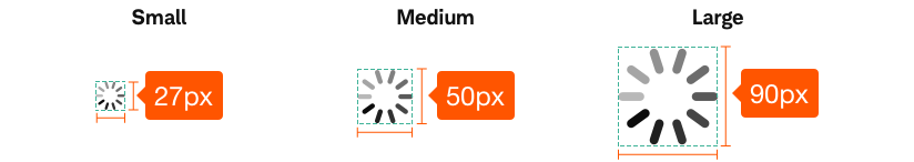
- Variants
- Default
- Large
- Small
A loading spinner is a type of progress indicator that informs users about the status of processes, such as submitting a form, or saving updates. They include an animated visual indicator that page content is loading (or information is being retrieved), and is used to inform the user that something on the page is happening/working and it prevents additional actions from occurring until the information is validated.
Spinner-Default


Usage
The Spinner component is used to show something in progress of loading, such as a video, or page/item content. It should include the visual representation (spinning wheel), white overlay, and functionality. If a page will take a noticeably long time to render, it should be shown in parts, rather than waiting for the whole page to display. Major parts of the page, like the top navigation, can be loaded first and displayed before other content elements. The spinner should be centered on the container view (or in immediate proximity to the view that requires a progress status).
Submit Information-When a button submits information to be validated, a spinner, with a white transparent overlay, prevents additional actions from taking place before the information can be validated. Once the information has been validated, the spinner and white overlay are removed and the system continues as normal (either displaying errors on the current page or navigating to the next page.).
Code
Markup
<div class="sch-css ng-scope">
  <div class="sch-spinner" style="100%; height:100%">
    <div></div>
    <div></div>
    <div></div>
    <div></div>
    <div></div>
    <div></div>
    <div></div>
    <div></div>
    <div></div>
    <div></div>
  </div>
</div>
CSS
<style type="text/css">
  @keyframes sch-spinner {
    0% {
      opacity: 1;
    }
    100% {
      opacity: 0;
    }
  }

  @-webkit-keyframes sch-spinner {
    0% {
      opacity: 1;
    }
    100% {
      opacity: 0;
    }
  }

  .sch-spinner {
    position: relative;
  }

  .sch-spinner div {
    left: 93px;
    top: 23px;
    position: absolute;
    -webkit-animation: sch-spinner linear 0.6s infinite;
    animation: sch-spinner linear 0.6s infinite;
    background: #000;
    width: 14px;
    height: 42px;
    border-radius: 78%;
    -webkit-transform-origin: 7px 77px;
    transform-origin: 7px 77px;
  }

  .sch-spinner div:nth-child(1) {
    -webkit-transform: rotate(0deg);
    transform: rotate(0deg);
    -webkit-animation-delay: -0.54s;
    animation-delay: -0.54s;
  }

  .sch-spinner div:nth-child(2) {
    -webkit-transform: rotate(36deg);
    transform: rotate(36deg);
    -webkit-animation-delay: -0.48s;
    animation-delay: -0.48s;
  }

  .sch-spinner div:nth-child(3) {
    -webkit-transform: rotate(72deg);
    transform: rotate(72deg);
    -webkit-animation-delay: -0.42s;
    animation-delay: -0.42s;
  }

  .sch-spinner div:nth-child(4) {
    -webkit-transform: rotate(108deg);
    transform: rotate(108deg);
    -webkit-animation-delay: -0.36s;
    animation-delay: -0.36s;
  }

  .sch-spinner div:nth-child(5) {
    -webkit-transform: rotate(144deg);
    transform: rotate(144deg);
    -webkit-animation-delay: -0.3s;
    animation-delay: -0.3s;
  }

  .sch-spinner div:nth-child(6) {
    -webkit-transform: rotate(180deg);
    transform: rotate(180deg);
    -webkit-animation-delay: -0.24s;
    animation-delay: -0.24s;
  }

  .sch-spinner div:nth-child(7) {
    -webkit-transform: rotate(216deg);
    transform: rotate(216deg);
    -webkit-animation-delay: -0.18s;
    animation-delay: -0.18s;
  }

  .sch-spinner div:nth-child(8) {
    -webkit-transform: rotate(252deg);
    transform: rotate(252deg);
    -webkit-animation-delay: -0.12s;
    animation-delay: -0.12s;
  }

  .sch-spinner div:nth-child(9) {
    -webkit-transform: rotate(288deg);
    transform: rotate(288deg);
    -webkit-animation-delay: -0.06s;
    animation-delay: -0.06s;
  }

  .sch-spinner div:nth-child(10) {
    -webkit-transform: rotate(324deg);
    transform: rotate(324deg);
    -webkit-animation-delay: 0s;
    animation-delay: 0s;
  }

  .sch-spinner {
    width: 50px !important;
    height: 50px !important;
    -webkit-transform: translate(-25px, -25px) scale(0.25) translate(25px, 25px);
    transform: translate(-25px, -25px) scale(0.25) translate(25px, 25px);
  }
</style>
Best Practices
Do
- Show parts of a page first, if the entire page will take a (perceivable) long time to render.
- Use only a white transparent overlay.
- Consider mobile, and how much animated status indicator provides an important cue for content that might take more time to load on mobile devices.
- Use spinner to give users immediate feedback about what’s happening on the page.
- Use a progress indicator for any action that takes longer than one second to load.
- Center the overlay/container on the screen.
- Use for short activities (between 2-5 seconds).
Don’t
- If a section of a page can’t be read or used without context, don’t have that section load separately.
- Avoid multiple layers of spinners, where one is shown on a mostly blank page which is then replaced by loading modules.
- Avoid using multiple times on a page.
- Embellish the spinner or change overlay color.
- Combine types of spinners in one loading instance.
Accessibility
- Ensure any visual information indicating content loading is also relayed programmatically to the screen reader user.
- The verbiage relayed to the screen reader user should be descriptive about the specific content loading.
- Any spinner that displays percentage loading should also relay this to the screen reader user in reasonable increments.
- Ensure text and background colors meet contrast compliance on Beacon’s Color guidelines. (Be sure to refer to the UX standards for hex color references).
- Any text as part of the spinner should be read by screen readers.
- Follow best practices on Beacon typography.
- Follow Schwab’s Accessibility guidelines.