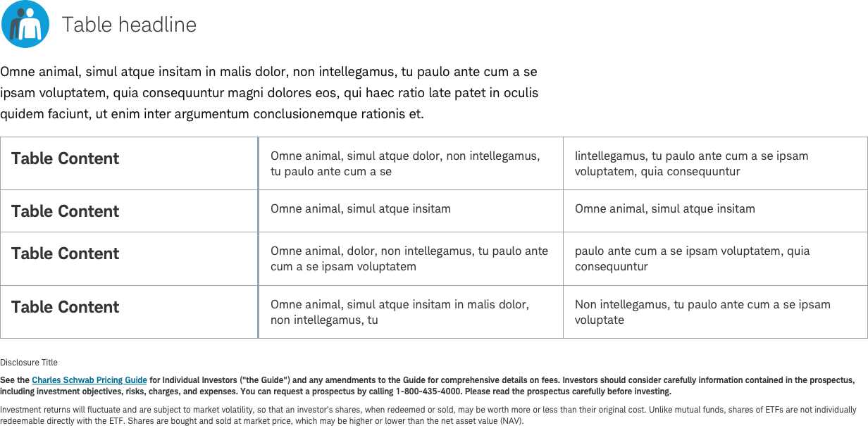
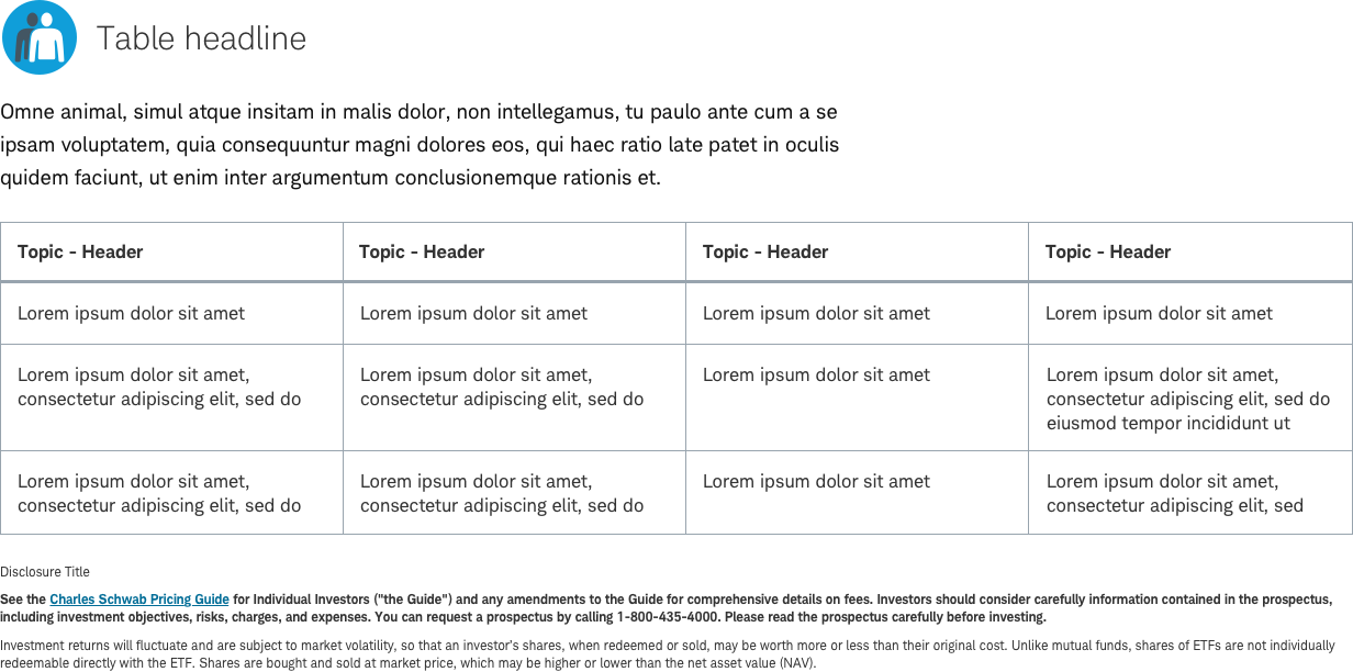
Table-Content
- Variants
- Table-Content
- Table-Content-Basic-Row
- Table-Content-Basic-Column
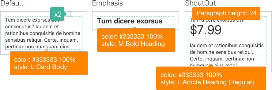
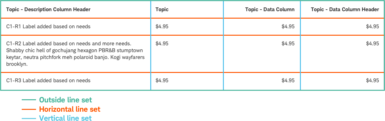
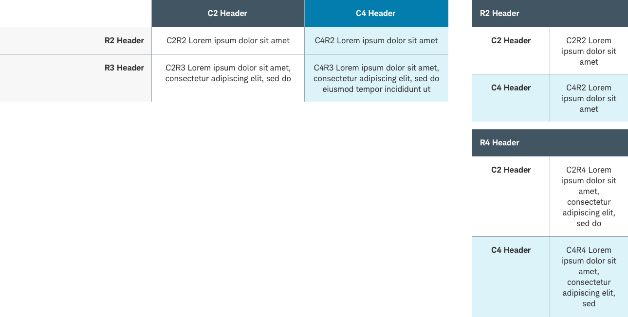
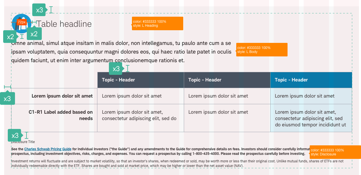
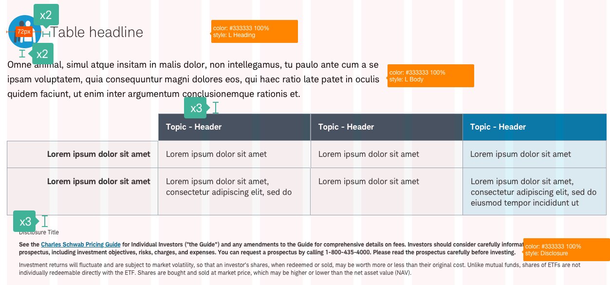
Tables present structured information, making large amounts of data easy to read. Content tables contains mixture of written text and numerical data and can be used for a range of functions such as: product or service detail, cost, call to action, and feature comparison.
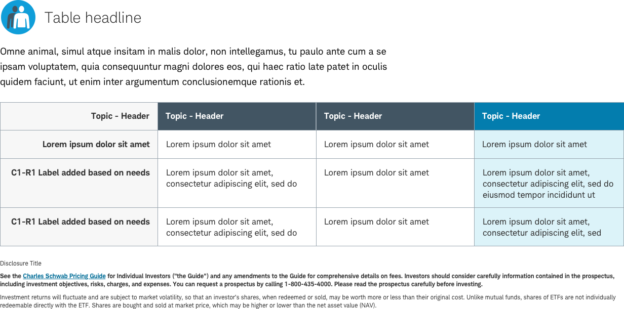
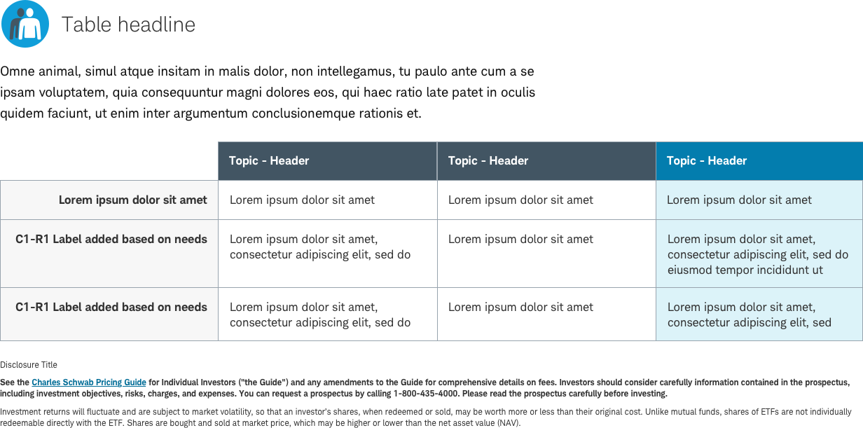
Table-Content - No Top Cell (R1C1)
With this table-content example, The top-left-first cell is omitted.
Usage
Use a table when the structure would help the user scan the information and compare data effectively. A table will have at minimum, table title, row labels, column headers, and cell content. Color is only used to highlight key content and should follow table color guidelines. Tables can be placed within accordions to allow expand/collapse of multiple tables in order to save space. Follow guidelines for accordion usage.


Best practices
Do
- Keep table designs simple, clear and consistent.
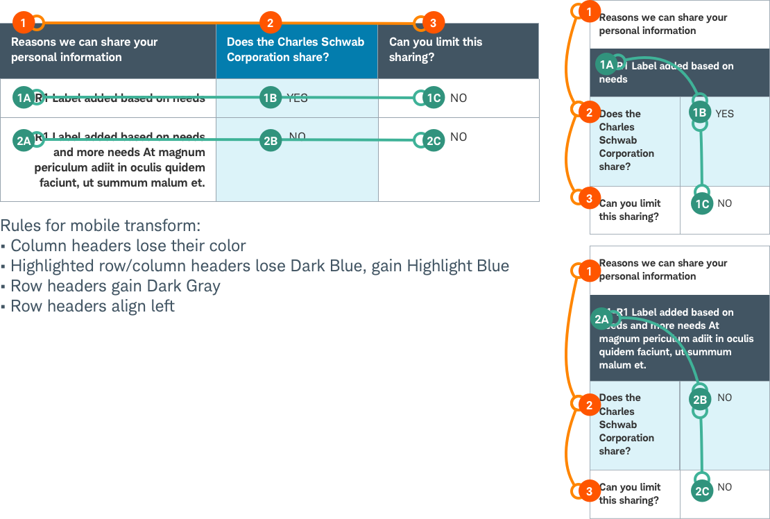
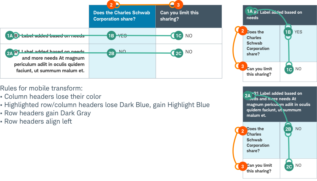
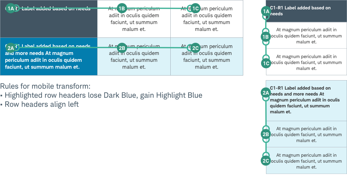
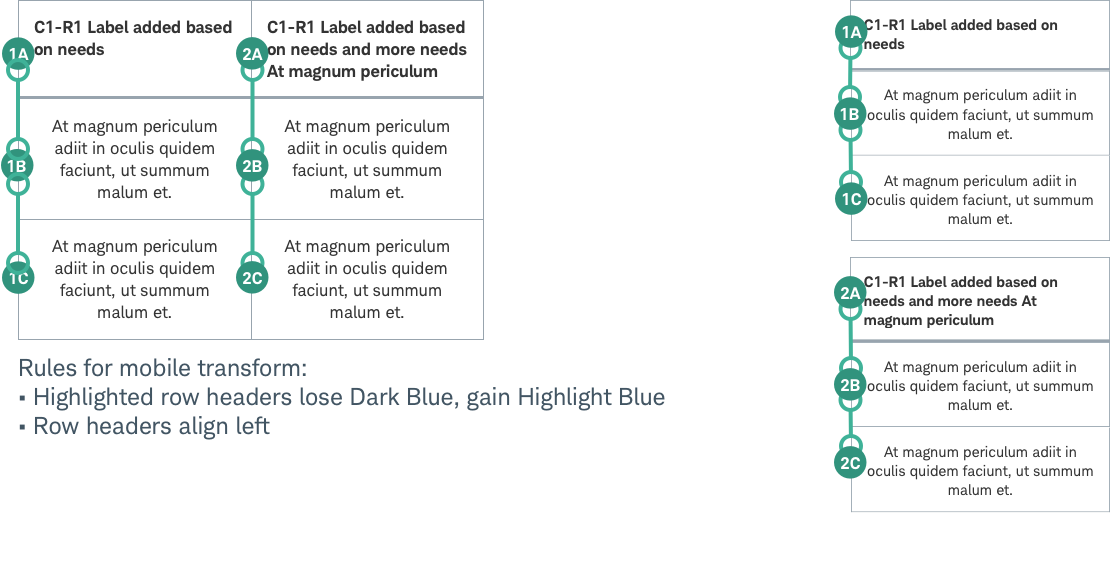
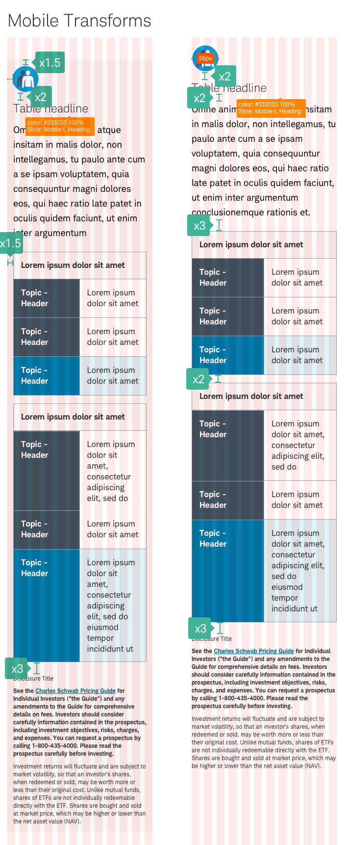
- Consider mobile and responsive design and how the content will stack as it transforms on different screen sizes.
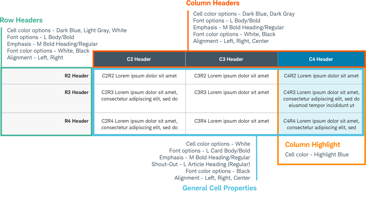
- Keep row and column labels brief while being descriptive. Beacon recommends sentence case for row labels (example: Schwab online transfer fees), and title case for column headers (example: Schwab Online Transfer Fees).
- Use clear and concise table titles above the table. Use sentence case.
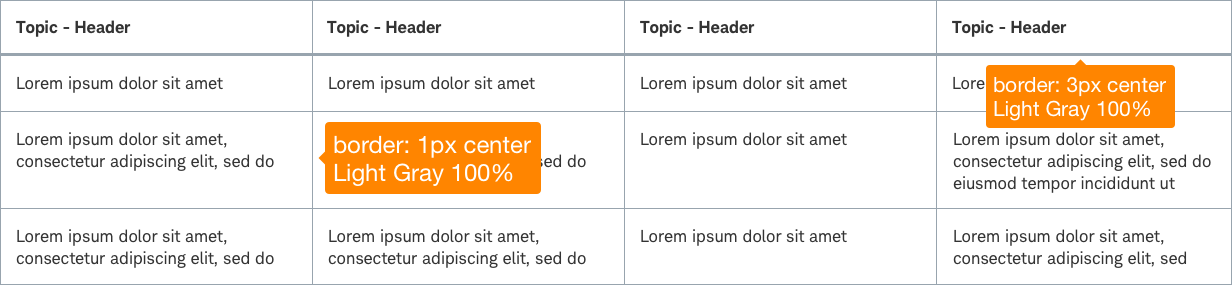
- Use color and bold sparingly for content emphasis. Include a generous number of white space cells with limited amounts highlighting in rows and columns”.
- Use patterns that improve clarity for evaluating data.
- Include appropriate amounts of spacing and spacers, especially when using multiple tables in close proximity.
- Allow for tables within accordions when there are multiple tables or for large amounts of information.
Don’t
- Never use Table-Content for creative layout or force editorial content into tabular structure.
- Overwhelm the user with excess color, fills, banded rows, etc.
- Use design embellishments like shadow, 3D, motion, etc.
Accessibility
Structure and Elements:
- Table-Content uses an ordered-list or unordered-list semantic
(<ol>, <ul>)structure for complete responsive transform flexibility.” - Nested list structure of the the Table-Content provides parent-child content hierarchy that is the functional equivalent to
<th>semantic attribute. The Table-Content will have element fields for a Title and Description above and outside the table structure, and these field can have added ARIA tagging for clarifying content hierarchy. - Table-Content should only be used for comparative content, organized feature details and numerical data. It should not be used where semantic HTML `
<tables>are required. - Label column and row headers
<th>. For header rows use<th scope="row">. For header columns use<th scope="col">. Non-sighted users rely on these headers to help them navigate individual cells and have the column/row header and column/row numbers relayed to them.