Tile
- Variants
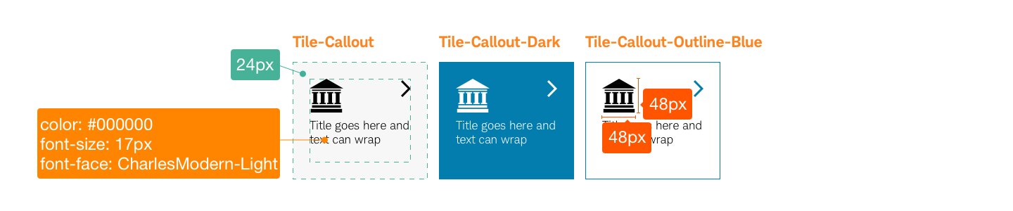
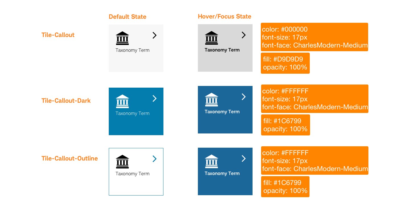
- Callout
- Callout Dark
- Callout Outline
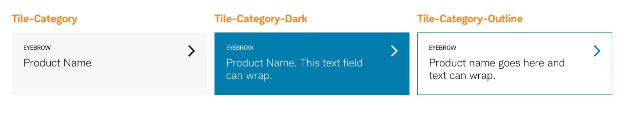
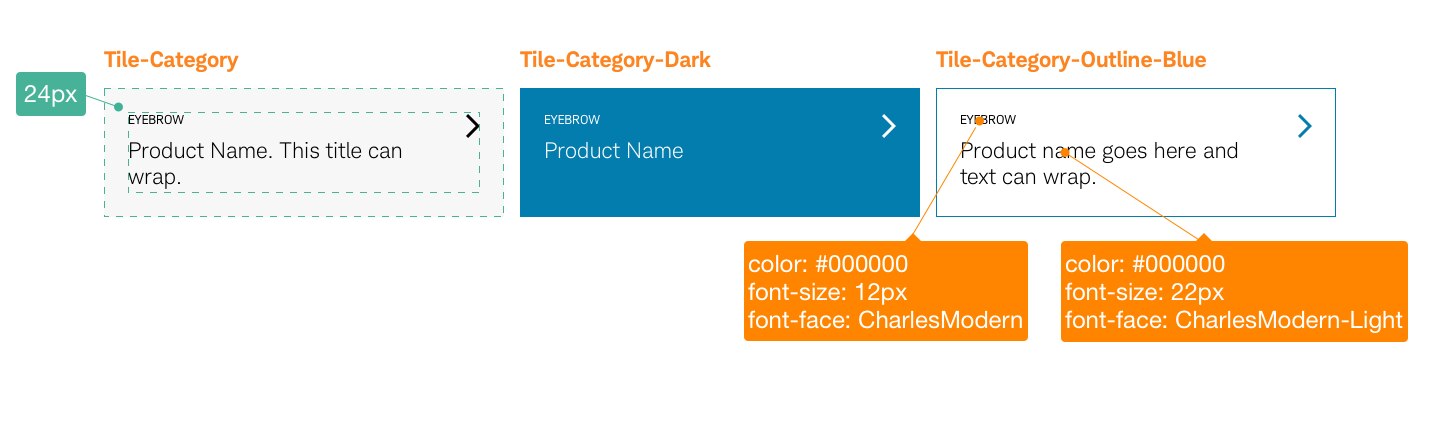
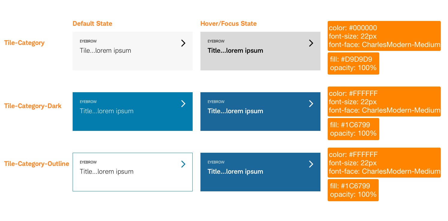
- Category
- Category Dark
- Category Outline
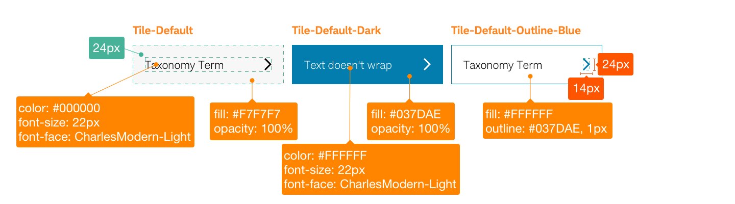
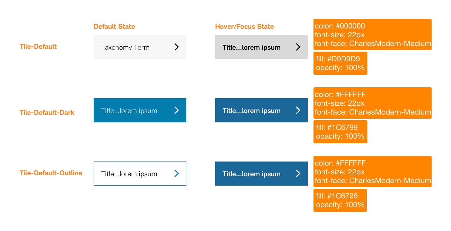
- Default
- Default Dark
- Dafault Outline
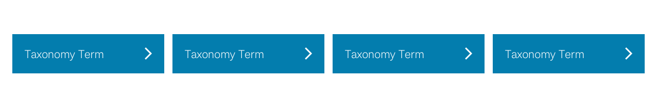
Tiles organize and present a related grouping of content in a container that users can easily scan and interact with. The entire tile container is fully tappable on mobile, or clickable on desktop, and does not need to include a standalone link. Just like cards, tiles can be grouped together within a deck.


Usage
Just like cards, the flexibility of tile placement inside and adjacent to other patterns within the system is a key aspect of this component. Tiles can appear within a background-filled or outline container and primarily within the body of a web page or mobile experience. The main attribute of a tile is that the entire container is clickable or tappable and does not require a standalone link.
In mobile experiences, the tiles transform into a deck-full with the tiles stacking vertically.
Design Specifications
Best practices
Do
- Keep tile content concise. If more content is needed, consider using a card.
- Use uniform tile container sizes when grouped within decks.
- Maintain a minimum tile width of 2 columns when scaled.
- Maintain a 24px padding inside each tile.
- Consider mobile experiences. Tiles will transform into a deck-full and the tiles will stack vertically.
Don’t
- Vary the height of tiles if the content across the deck is varied in size. Maintain uniformity across all tiles, using the longest or tallest tile as the base point.
- Use a single tile in a deck. Must include at least 2.
- Use shadowing or 3D effects.
Accessibility
Design will need to follow color/contrast requirements on Color Guidelines, follow link best practices, and Schwab Accessibility guidelines.