Tooltip
- Variants
- Default
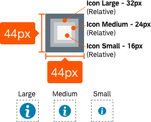
- Icon
- Long Form
- Mobile
- Text
- Titled
Tooltips provide contextual supplementary information on click, focus, or tap.
Tooltip-Default
The default tooltip features an underline and an icon on the right side of the tooltip link.


Usage
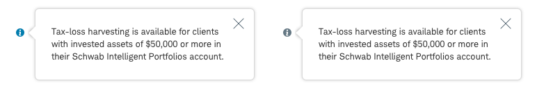
Tooltips should be used to provide additional help or to define an item or term and is used strictly to contain text. Tooltips are activated by click, focus, or tap and are persistent until dismissed by the close button or lose focus. Information displayed within tooltips should be supplementary information that helps bring clarity for the user, but is not critical to task completion.
Tooltips hover directly above, below, or to the left or right of the triggering link or icon. The default position should be to the right. On mobile, tooltips take the fullwidth of the screen while appearing directly above or below the content. The tooltip arrow should appear centered relative to the triggering element.
Design Specifications
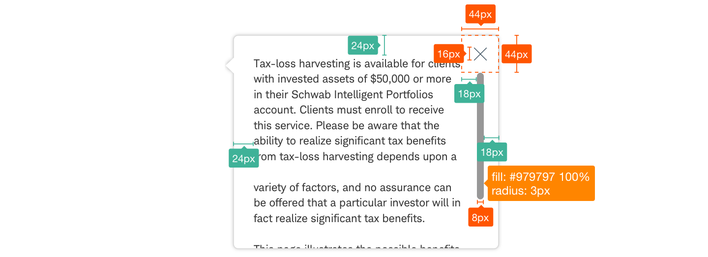
Tooltip-Default


Best practices
Do
- Use tooltips sparingly to display supplementary information or definitions.
- Keep content clear and concise.
- Use sentence case for the title bar.
- Limit the length of content within tooltips to avoid the need for excessive scrolling.
- Use specified drop shadow to help provide contrast between background and tooltip overlay.
Don’t
- Overwhelm users with too much content.
- Show media such as images, charts, or videos within tooltips.
- Produce new sizes or colors for tooltips.
Accessibility
It is important that focus moves to the tooltip content when activated and returns to triggering element upon close.
Ensure designs meet color/contrast requirements on Color Guidelines, follow link guidelines, and Schwab Accessibility guidelines.