What is a Design System
Our Approach
Schwab’s primary goal is to create an elevated digital experience by focusing on customer needs first. Our sites should reflect a marriage of design and functionality that combines industry best practices with a modern digital aesthetic. This relies on having a great foundation- a standardized system with defined processes- and systematic ways to direct and leverage our collective efforts across a growing number of devices and platforms. This allows multiple designers, developers and stakeholders to develop consistent and coherent experiences…
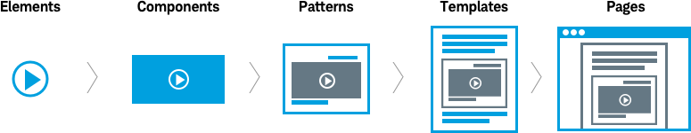
Our design system is set up by categories - guidelines, visual foundation, elements, components, patterns, templates, and themes - and is based on the foundation below.
Put the user’s needs first
Our mission is to elevate the consumer experience and level of trust by using consistent digital patterns that put the user’s needs first. Focusing on designing ‘through client eyes’ reduces stress or cognitive load for users, making our sites familiar and easier to navigate.
Schwab-branded digital experience
Our unified design strategy works across the Schwab master brand, sub-brands and product lines. The design system criteria are the same as the Schwab design criteria and follow our Brand guidelines. This standardized approach is the key to a great digital experience across Schwab websites.
Common language
In order to have effective and efficient design it’s critical that every member of the design team is speaking the same language, using the same vocabulary. This common language eliminates confusion and reduces redundancy. Review our design system vocabulary.
Component-Based Design
Beacon uses component-based design principles. Component design breaks sites into small manageable parts including elements, components and patterns. Components are created using elements that have been grouped together. Components are combined together to create visual patterns. Each component has its own definition, usage, functionality and location within the design system. Each component becomes reusable for any new project or website creation. From accordions and carousels to marquees, each design component is defined with a specific purpose in mind. This ensures consistent patterns where user interactions with elements (buttons, etc.) are the same from site-to-site.
Read about Beacon Design System Principles.
Best-in-class tools
The Beacon system includes a design toolkit so designers can hit the ground running with built-in styles, colors, typography, etc.
Sketch Application
One of the design systems foundational tools is the Sketch app. Sketch is the go-to app for UI and UX designers because it has built-in styles, symbols, templates and artboards.
Contact us
Help us create a best-in-class digital experience. Beacon relies on partnerships between our internal teams (Brand, UX, and Platform Services) and Schwab’s design agencies. The Beacon Design team welcomes input as the design system grows and evolves. Designers and developers can contribute new designs or share ideas on enhancing current assets in the library.
If you’re interested in submitting designs, follow the steps for contributing.
For feedback or ideas for the new Beacon Design System, email us at beacon@schwab.com.