Accessibility
Accessibility overview
Content on the web needs to be accessible to everyone, regardless of abilities. At minimum, our sites should meet all Web Content Accessibility (WCAG) 2.1 requirements. If this is not achievable, we should provide alternative options for consuming, and interacting with, our content. It is important that all users, regardless of ability and technology, can access the information on our sites and perform core tasks, without impassible barriers.
For a high-level overview of how accessible sites improve users’ ability to interact with our digital content, watch the video below.
Introduction to Web Accessibility and W3C Standards. Copyright © 2017 WAI, All Rights Reserved.
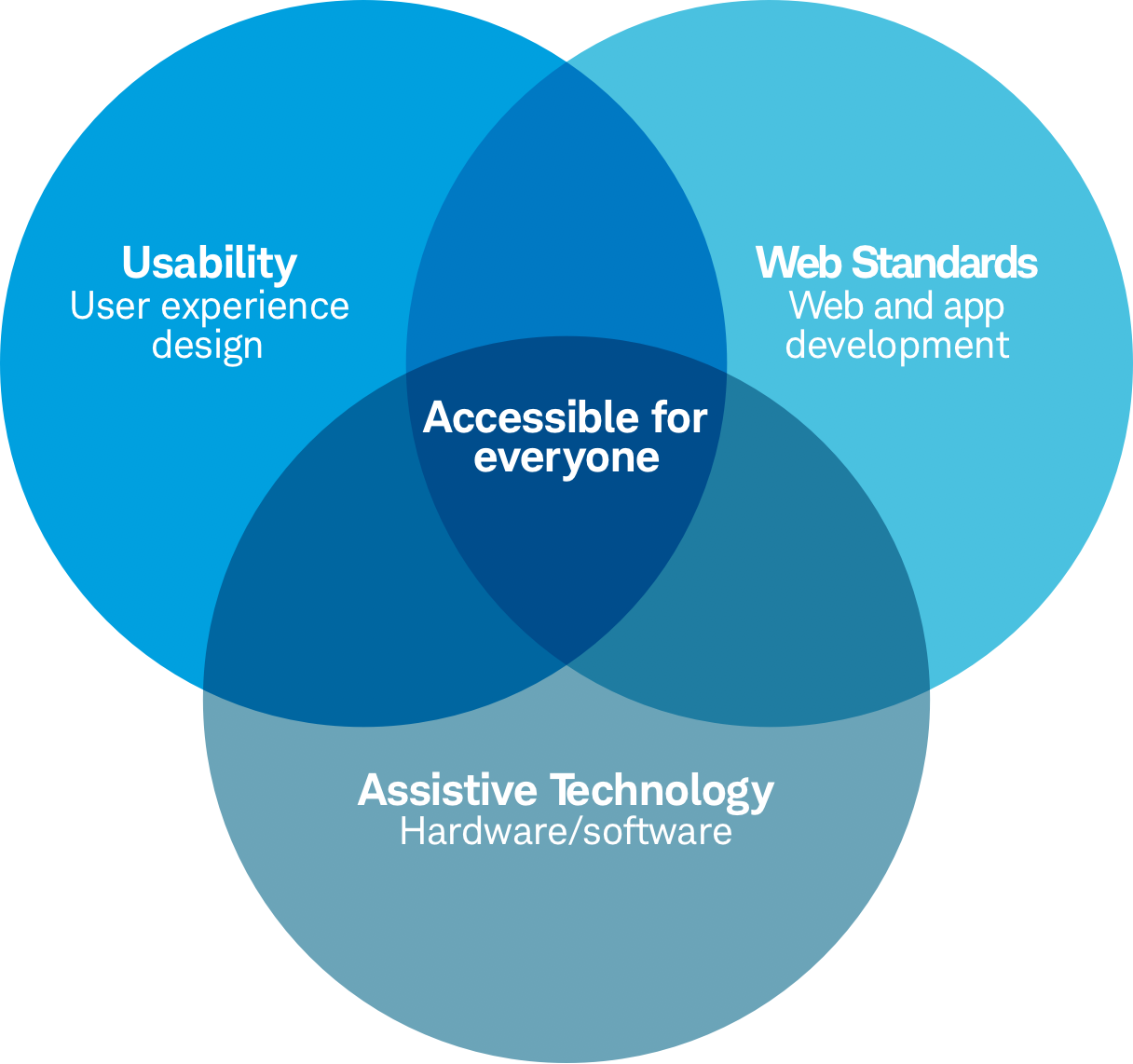
This diagram shows the relationship between design, development, and accessible web content.
Accessibility principles
The WCAG guidelines are based on the Americans with Disabilities Act (ADA) and the four principles of accessibility that lay the foundation for accessibility of web content. All web content must be perceivable, operable, understandable, and robust. If all these principles are not followed, users with disabilities might not be able to use our websites. For more detailed information, visit these sites:
General accessibility requirements
The Beacon Design System consists of reusable components. There are numerous benefits for both designers and developers, including faster product and site launches. By proactively following accessibility requirements in the initial stages, you waste less time and resources by having to start over if content is found to not be ‘accessible’. Remember that accessibility design is also good user experience design.
Visual design:
Color
Any information that’s conveyed by color differences should also be evident without the color differences. Don’t rely on color alone to define designs. Follow accessibility guidelines on the Beacon Color guidelines.
Text color contrast
Text, and images with text, require a contrast ratio of at least 5:1, unless the text is pure decoration. Larger images can have a contrast ratio of 3:1. If links aren’t underlined to show hyperlinks, the links and surrounding non-linked text must have a 3:1 contrast ratio. Check the accessibility of content with the WebAIM contrast checker. Follow accessibility guidelines on Schwab Typography.
Images and non-text content
All non-text content should have a text alternative that presents equivalent information, including control inputs (e.g. submit functions designed as images, rather than a submit button). Always add alt text when tagging images, if they are also links, to match the link label.
User interactions:
Interaction and user controls
Whenever content requires user input to interact with our content, we need to aim for clarity and provide clear labels and instructions for understanding what they need to do. Whether it’s a form, a table, or a CTA, it’s important to provide different ways that a user can interact with the content. Users should be able to pause or stop audio/video and control the volume independently from the system/device, through the use of assisted technology devices and keyboard alone. Every control needs to provide information to the screen reader for labels, states, and properties.
Keyboard focus
Users should be able to access, and interact with, our content (including links, form controls, videos, etc.) using the keyboard alone. No other device, or a mouse, should be required. All page functionality (including links, form controls, interactive elements like video controls) should be available from the keyboard. Page-specific shortcut keys and access keys shouldn’t conflict with existing browser and screen-reader shortcuts.
Screen readers
Screen readers are assistive technology software designed to read aloud website content for people who are blind or have low vision (or learning disabilities, age-related limitations, and more) so they can navigate our sites.
Proper coding for accessibility will allow the majority of screen readers to properly relay web content. Screen readers and other assistive technologies work in combination with browsers and most screen readers work only on certain operating systems. JAWS has many older versions and is the most widely supported screen reader, yet it’s only supported on PCs. NVDA is a free software and is popular. VoiceOver with OSX is bundled with IOS and works best with Safari. Talkback is used only on Android devices.
Component-specific best practices
In addition to the general accessibility best practices above, each component in the Beacon design system has specific accessibility guidelines that should be followed when developers are building these components. This will ensure designs meet the WCAG web accessibility requirements.
Examples include:
Forms
It’s important to associate a label with every form control and ensure descriptive labels or instructions are provided when content requires user input to reduce accidentally selecting the wrong item. Grouping related form controls makes forms more understandable for all users, as related controls are easier to identify. It also makes it easier for people to focus on smaller and more manageable groups rather than try to grasp the entire form at once. Grouping needs to be carried out visually and in the code, for example, by using the <fieldset> and <legend> elements to associate related form controls. Also, related entries of a <select> element can be grouped using <optgroup>. Read more information on grouping related form controls.
Video Player
All controls, such as play buttons, need to be accessible and transcripts and closed caption are required to ensure WCAG compliance. Users should have options for consuming content at their own pace via the pause control. Users should also have options for closing the video with a link, button, or the escape key.
See the available components in the design system and their specific accessibility best practices.
Mobile accessibility
There are important considerations for the accessibility of content on mobile devices. The small screen size has practical limits on how much information users can actually view at one time, especially for those with low vision. Customizing content for mobile and designing with a ‘mobile-first’ approach, will reduce the need to later modify content to meet accessibility standards. Mobile best practices include:
- Creating a mobile version of the site/page and adapting the content on each page, as compared to desktop and laptop versions.
- Using an accessible default size for content and touch controls/targets.
- Adapting the length of link text to the screen width.
- Positioning form fields below their labels, rather than beside them.
- Respecting the limited screen real estate when adding pinned controls (e.g. keep pinned items as small as possible or avoid using them)
The Schwab Mobile Accessibility document has further information that can help assess if your content is accessible on mobile devices.
Touch considerations
Designing and developing with touch screens in mind, is vital to usability and accessibility of our content. It ensures users understand where they can physically interact with touch targets. Proper touch affordance allows users of all abilities to select the intended target and avoid tapping the wrong element.
Example: Buttons must be large enough (or far enough away from other buttons/interactive elements) so they are easily clicked or tapped. Buttons should have a minimum 40px high/wide and 4px spacing between buttons (or 44px high/wide when touching/no margin).

Accessibility resources
Use the tools and documents below to help test your content for accessibility. The documents include checklists, validation, and rationale to ensure Schwab sites meet accessibility requirements.