Content Panel
- Variants
- Panel 50 Media, Text | Dice
- Panel 50 Image
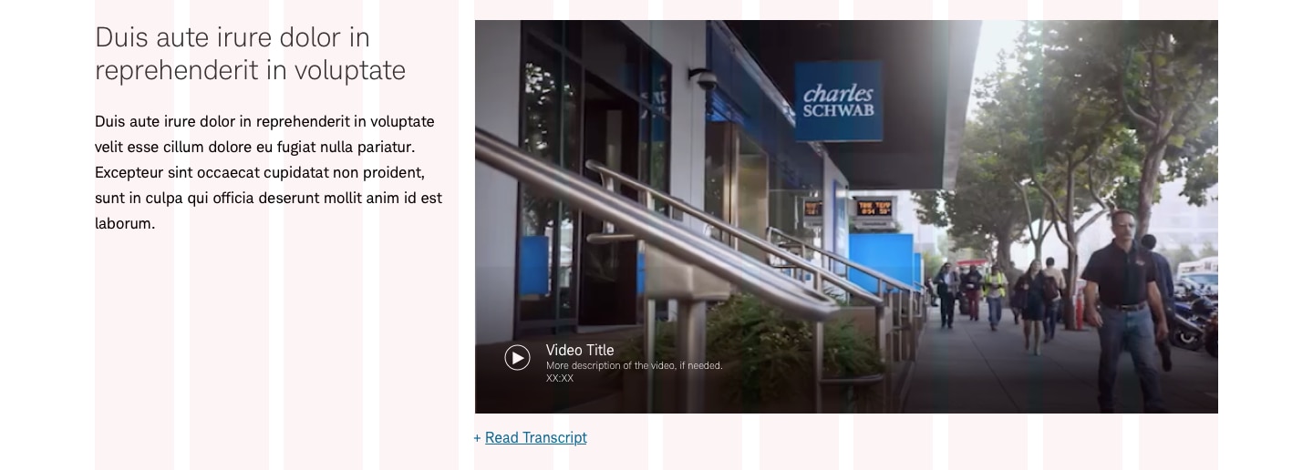
- Panel 50 Video
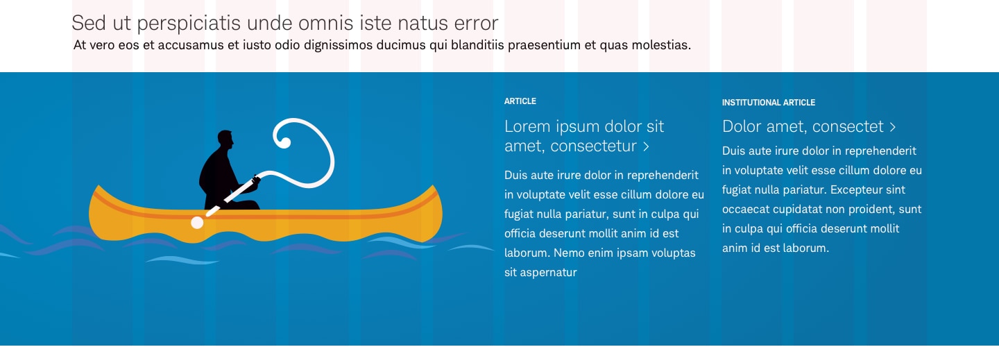
- Panel Long 66
- Panel 50 Text, Media | Dice
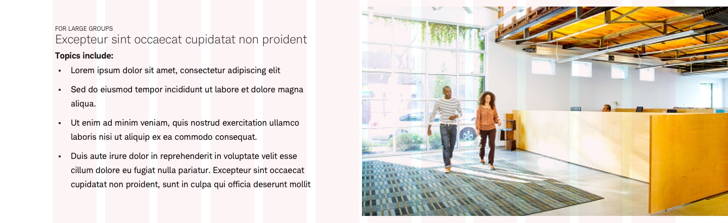
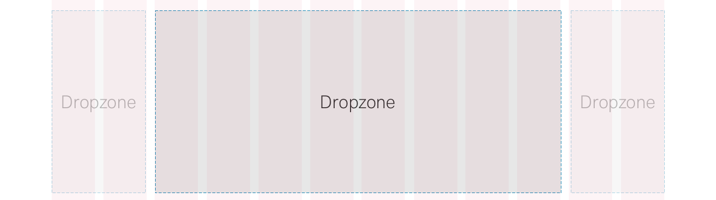
- Panel 17-83
- Panel 25
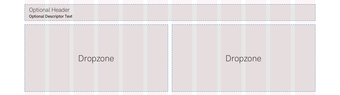
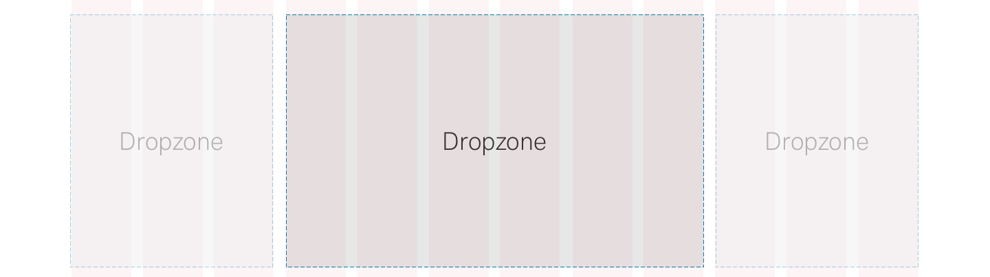
- Panel 25-25-50
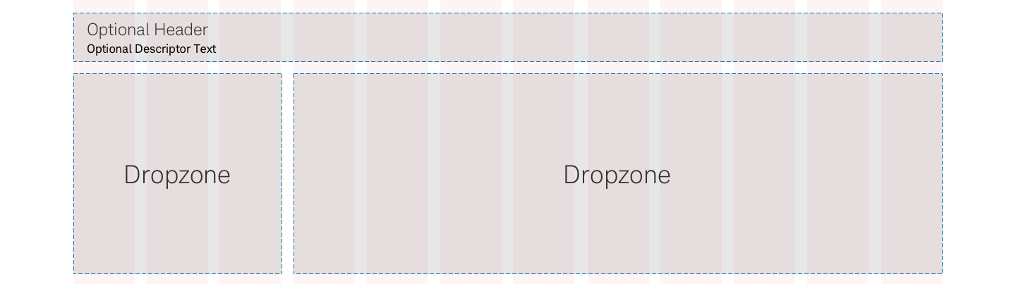
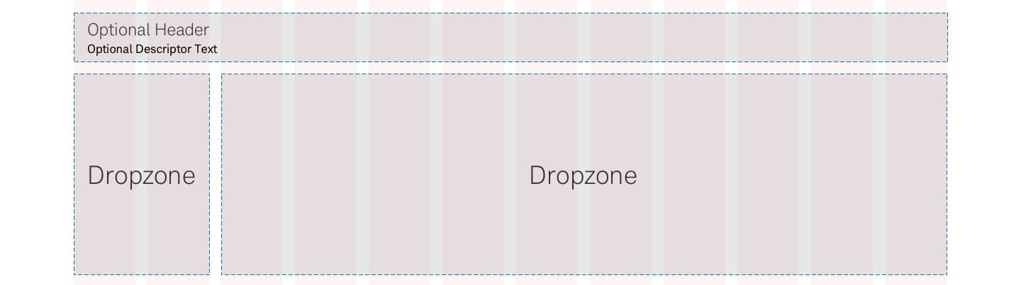
- Panel 25-75
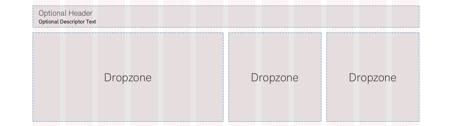
- Panel 33
- Panel 33-66
- Panel 42-58
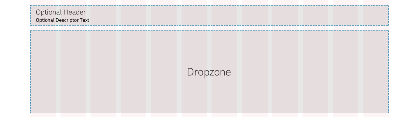
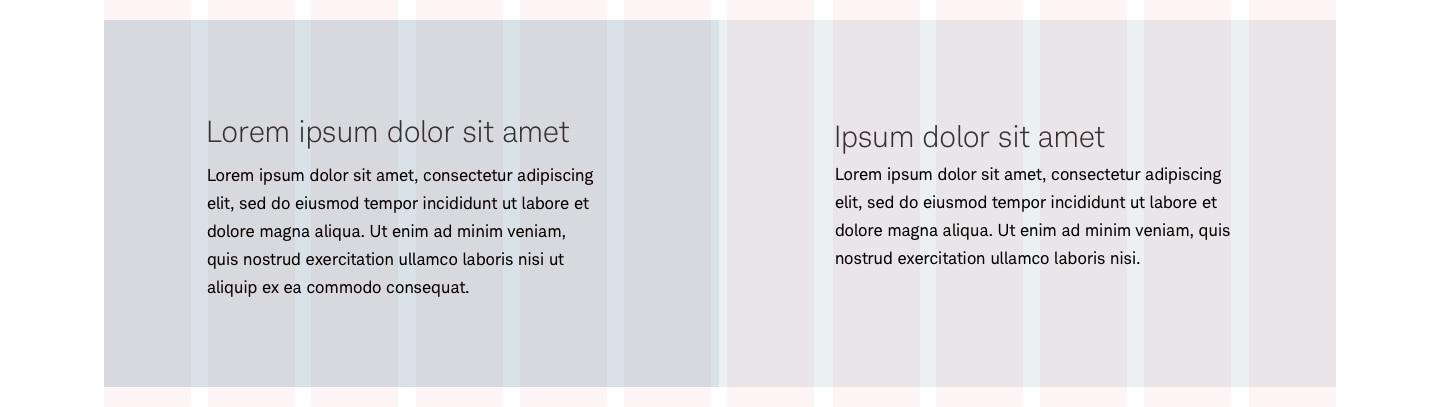
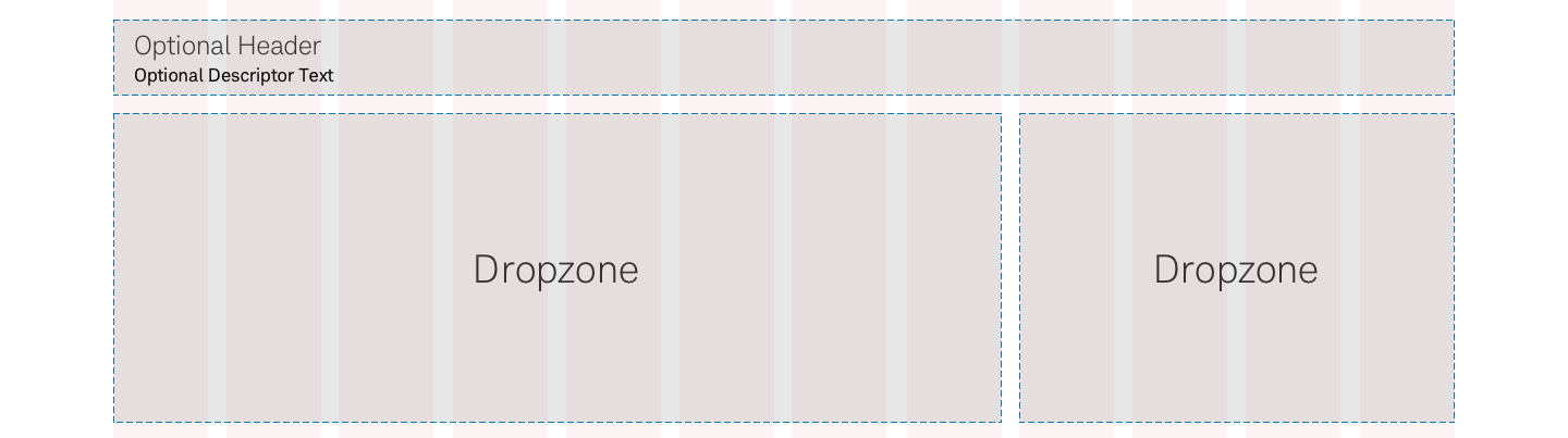
- Panel 50
- Panel 50 > Image, Blockquote
- Panel Long 50
- Panel Multi
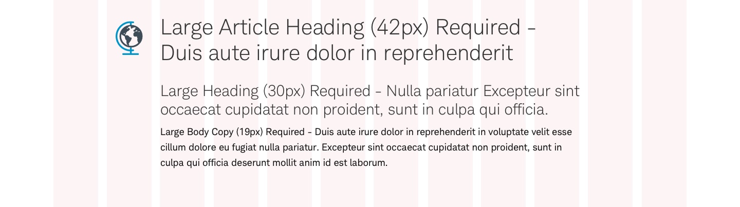
Content panels are common design patterns that are self-contained with reusable component combinations (cards, video, copy, and/or images.) These are customizable and can be placed almost anywhere on a page. The panels variations are guided by number of columns and grid alignment.

Panel
Panel-50
Panel-25

Panel-25-25-50
Panel-25-75
Panel-33
Panel-33-66
Panel-Long-66
Panel-Long-50

Panel-42-58
Panel-17-83
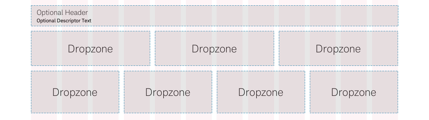
Panel-Multi
Usage
There’s a large variety of usage, layout, and content customization for content panels.
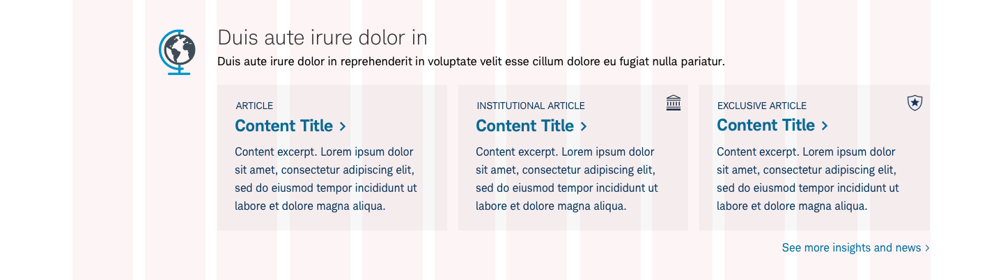
They can be placed anywhere on a page (at top, refer to Marque and at bottom, refer to Footer). There may be multiple content panels on a page with a mixture of content types: video, copy, images, card decks, articles, etc.
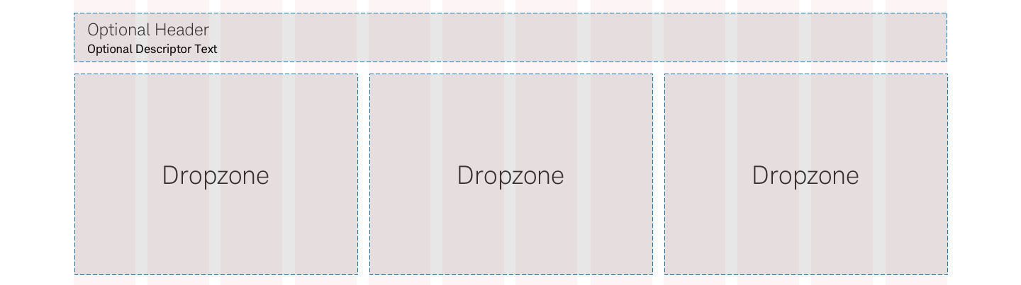
Panel Layout
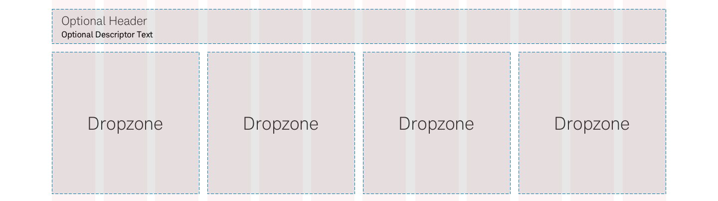
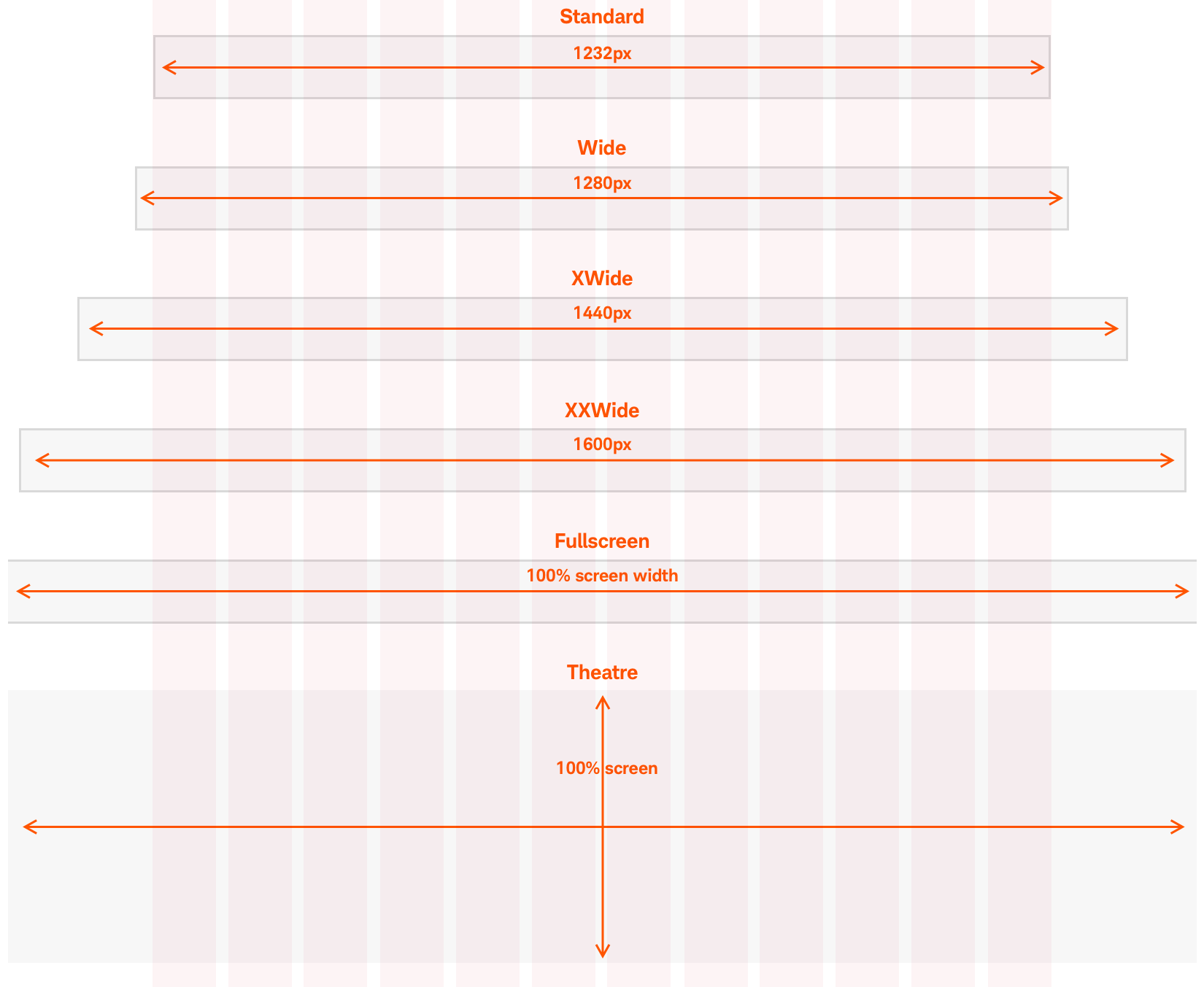
The layout can be modified within the 12-column grid structure. The height is flexible but the width of panel is defined, though panels content, such as images or color fields, can extend past the grid.
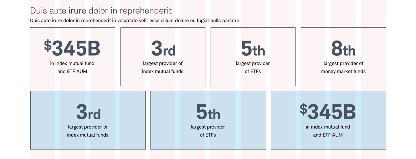
The variations of custom bleed is shown in the graphic below and should be consistent down the page. Custom bleeds should be noted in the name, (e.g panel-xxwide>deck-25>callout-cards.)
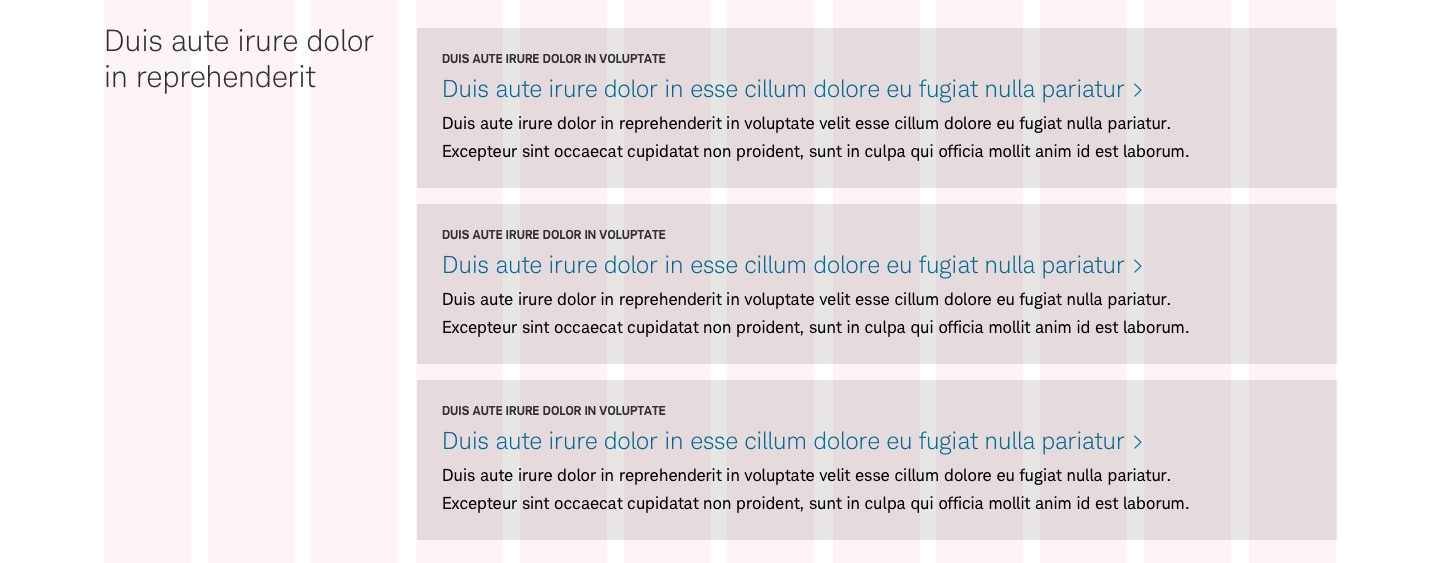
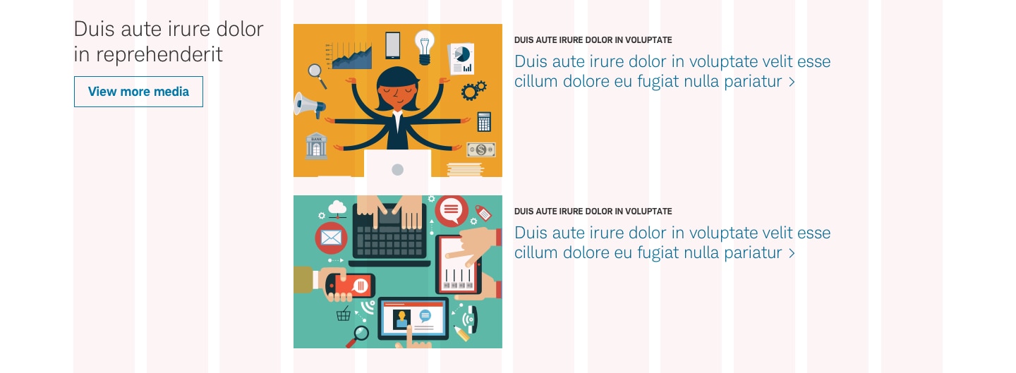
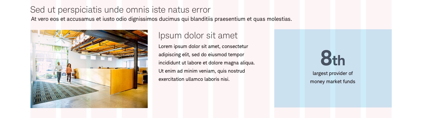
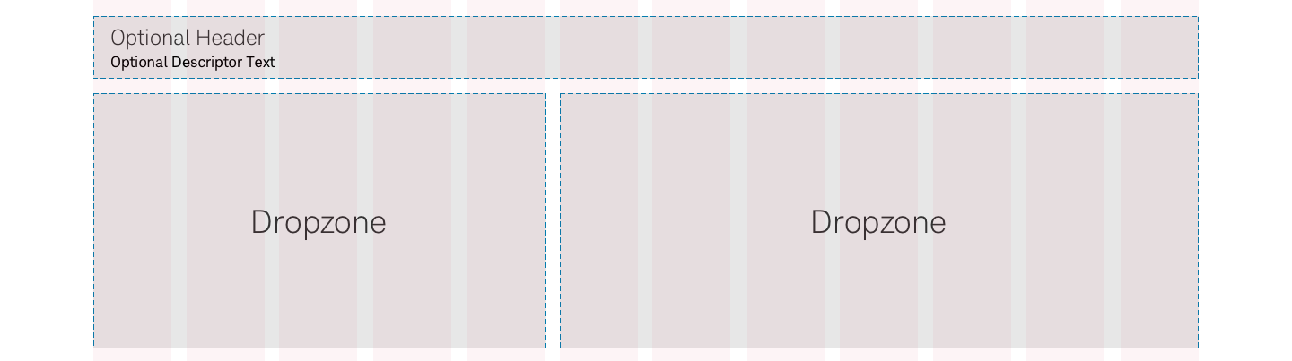
Content options
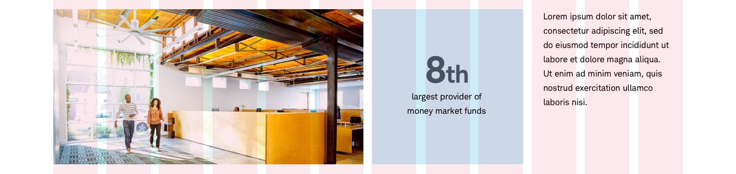
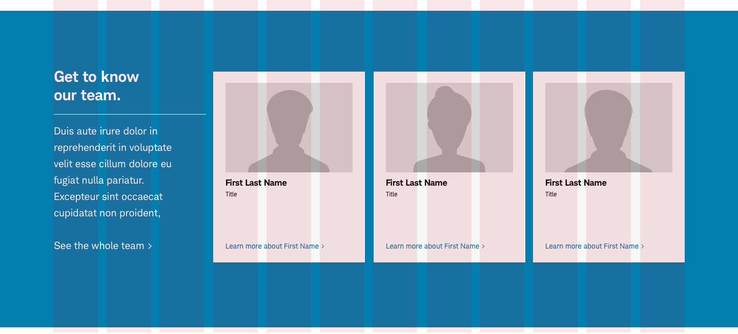
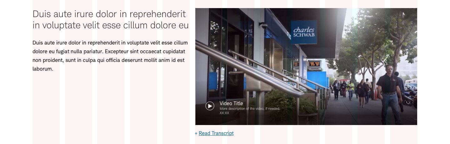
Options include heading, description, media, deck (can include cards, tiles, video etc.). These can be placed in any order. Note: Smaller videos will play in a modal, while larger (500px or higher) will play inline.
Best practices
Do
- Keep decks of cards in uniform sizing.
- Consider mobile and how complex panels will transform.
- Follow Beacon Video best practices.
Don’t
- Use card sizes that don’t have uniform size.
- Place panels within panels.
Accessibility
Design will need to follow color/contrast requirements on Color Guidelines, follow link best practices, and Schwab Accessibility guidelines.