Data Slider
- Variants
- Default
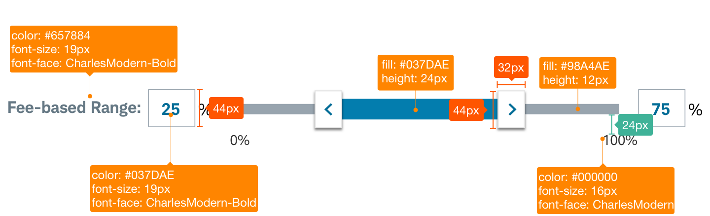
- Range
A slider is a type of data input that provides a visual indication of adjustable content that the user can specify by typing values, tapping accessible control keyboard keys or by moving the button-control along a horizontal track to increase or decrease a specific value.
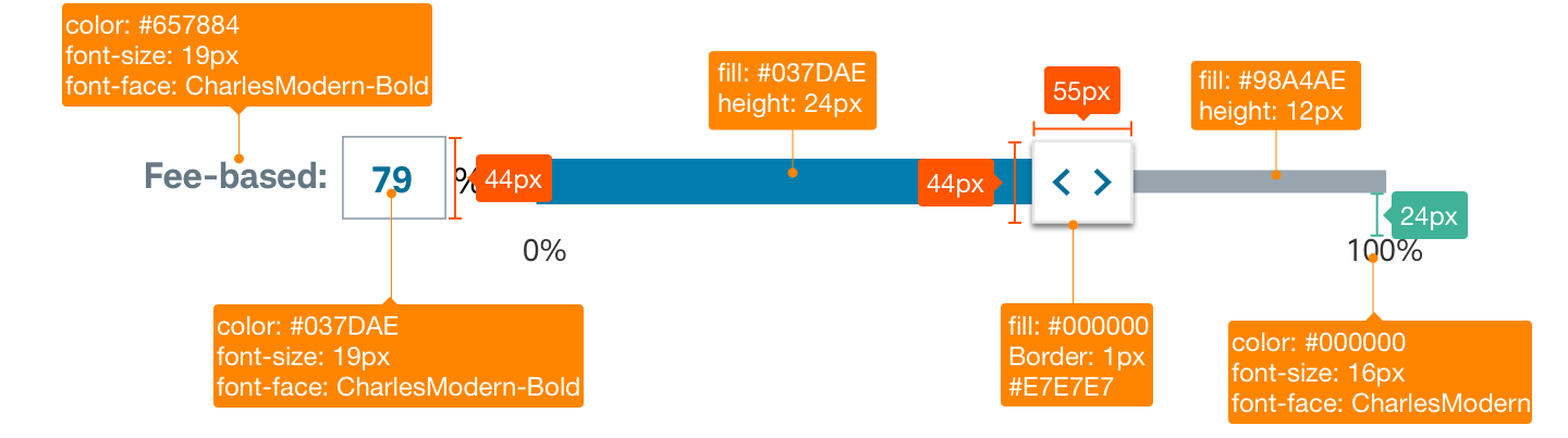
Data-Slider-Default


Usage
Sliders can be displayed on a page with one control element (standard) or as a data range with two slider button-control elements. Button-control placement functionally represents user data selections along a track. The Slider in its basic form should be accompanied by a label and a number input that can demonstrate the slider input’s increase or decrease.”
Design Specifications
Data-Slider-Default
Best practices
Do
- Keep in mind touch affordance. Slider control elements should maintain a minimum height of 44px.
- Include required accessibly control alternatives and tagging. Allow for taps on the slider track to reset the nearest button-control.
- Allow for sequential taps on track for date range slider to represent first and second selection respectfully in cyclical loop.
- Provide a comfortable track size to represent range and allow for easy finder touch & slide adjustments.
Don’t
- Use ranges that are extremely large (ex. 1-1000)
- Use ranges that are too small (ex. 1-3)
Touch affordance
Touch affordance allows the user to select an item on a touch screen interface and is important to ensure users easily understand where they can physically interact with touch targets. Proper touch affordance allows users of all abilities to select the intended target and avoid tapping the wrong element.
Example: Buttons must be large enough (or far enough away from other buttons/interactive elements) so they are easily clicked or tapped. Buttons should have a minimum 40px high/wide and 4px spacing between buttons (or 44px high/wide when touching/no margin).

Accessibility
Data Slider should have the correct size for visuals and copy to meet Schwab’s accessibility guidelines and a design that proactively supports most screen readers. Clearly describe input for users who might have visual limitations. Use appropriate text and code labels to allow quick orientation and movement between toggles.