Date Picker
- Variants
- Default
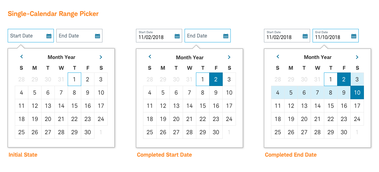
- Range
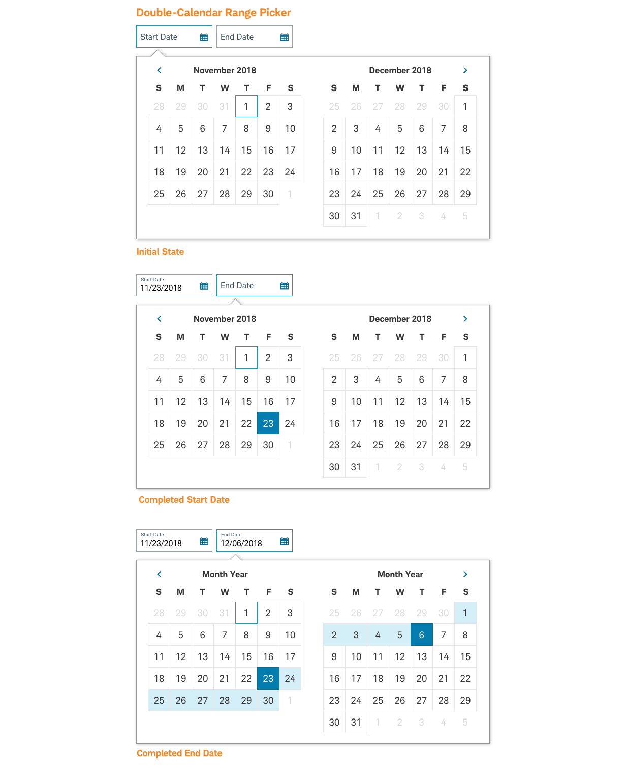
- Range Double
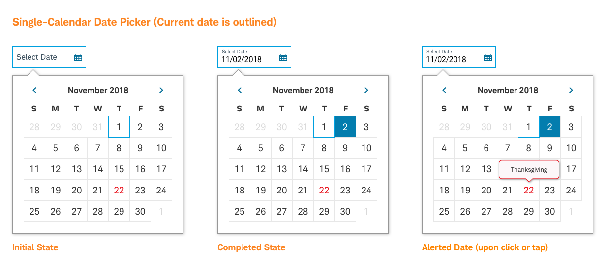
The date picker is a form pattern that allows users to select a date by typing or by using a visible calendar. The visible calendar appears when the focus is placed on calendar icon area of the text input field.
Date-Picker-Default

Usage
The date picker allows users to select a date using a calendar view. The calendar appears when the focus is placed on a date text field.
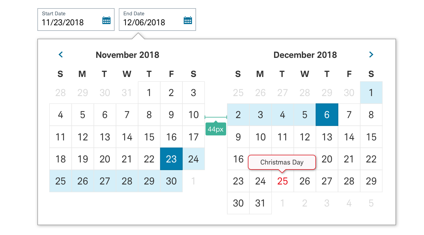
- The user can enter a date into the field, or select the calendar icon to view an entire month.
- Retap on date field icon after the start of interaction should function as a toggle to close the calendar view.
- Upon selecting a day, the calendar collapses.
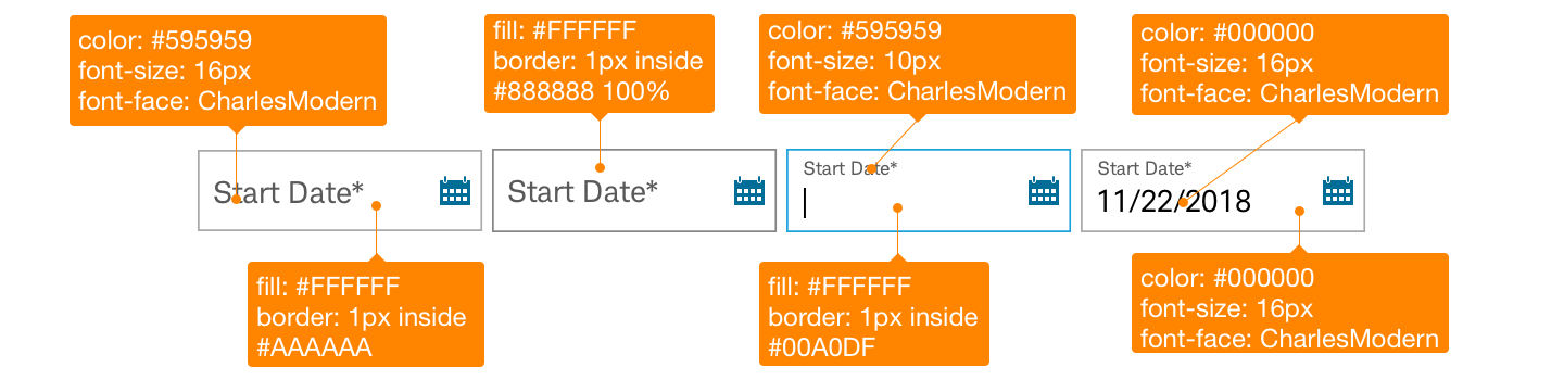
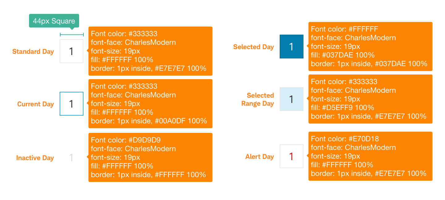
- The currently selected date appears with a blue border (Core Blue #00A0DF).
- When present, the optional alerted dates (such as holidays) appear in red (Error Red ##E70D18).
- On click or tap, a tooltip appears, containing a concise label for the corresponding special date.
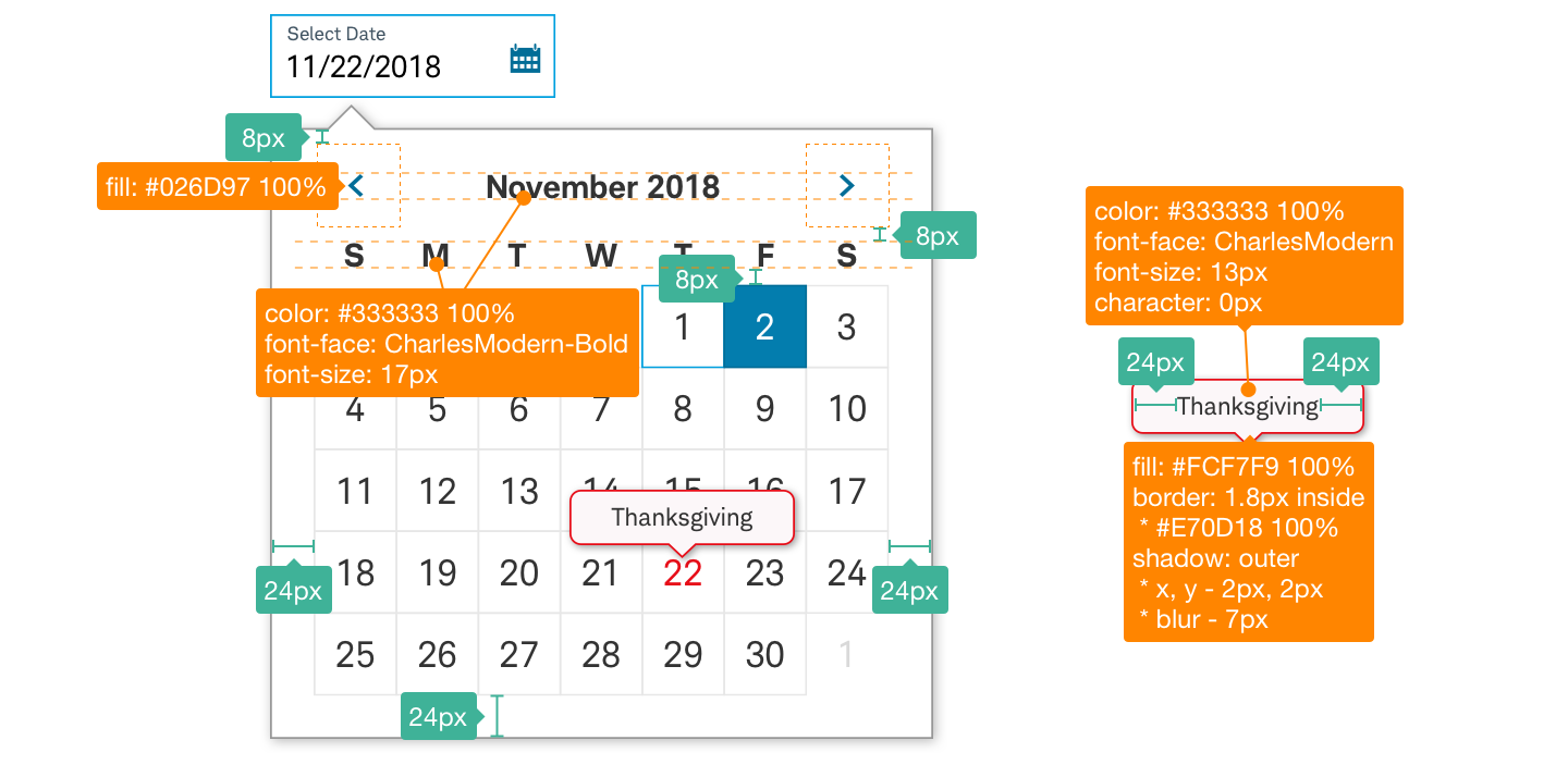
Design Specifications
Date-Picker-Default

Best practices
Do
- Keep in mind touch affordance. All targets should maintain a minimum height and width of 44px.
- Use smart defaults and highlight common selections (e.g. Today)
- Close after a single date is selected unless a range with a start and end date is required
- Set the start date on first click or tap and the end date on second click or tap if a range is required.
- Show dates in a MM/DD/YYYY format.
Don’t
- Use a Date Picker to enter a date that is many years in the future or the past.
Accessibility
The Date Picker should have the correct size for visuals and copy to meet Schwab’s accessibility guidelines and a design that proactively supports most screen readers. Clearly describe input for users who might have visual limitations. Use appropriate text and code labels to allow quick orientation and movement between toggles.