Filtering
- Variants
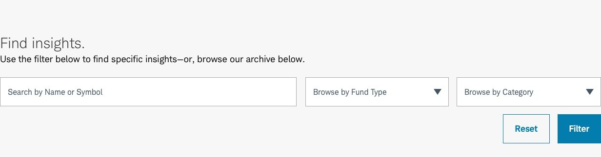
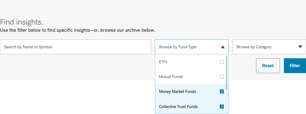
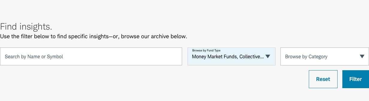
- Default
Filtering is a specialized pattern that enables the user to set search and filtering parameters to narrow results. Allowing to user to find the content they are interested in consuming.
Filter-Default
Usage
The Filtering should always appear at the top of the page, and should be used wherever a user might need to sort through large amounts of products or information.
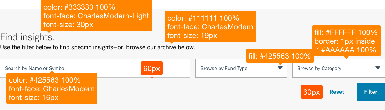
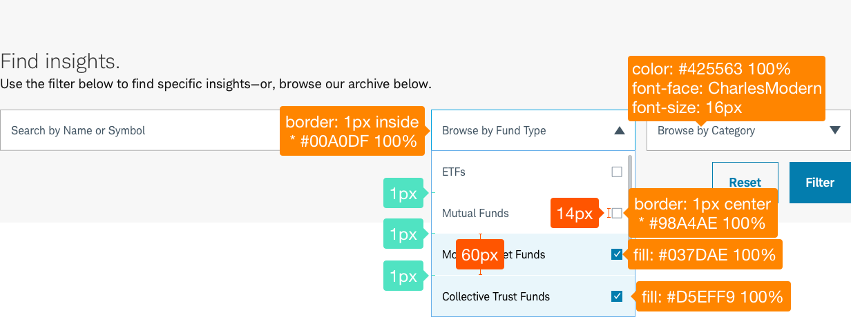
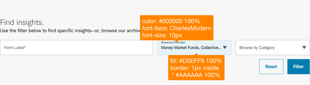
Design Specifications
Filter-Default
Best practices
Do
- Use title case for labels. (Example: Browse by Fund Type)
- Keep copy clear and concise for labels and messaging.
- Left align float labels.
- The search field should be no wider than 6 columns and should be positioned first in the array of fields.
- Selector fields should be 3 or 4 columns wide on desktop and should stack into a second row when needed.
- Messages should be directive and start with an action verb (“Search” or “Browse”). Use sentence case style for error messages.
- Use introductory text sparingly. Use if it clarifies why certain inputs are needed and how to use them.
- When using items in a list, show them in alphabetical order, frequency of use, or other organizing logic.
- Place form buttons right aligned on the screen to aid mobile tapping element.
Don’t
- Include introductions that only state that a user should ‘fill out a form’.
- Never center or right-align labels of form elements.
- Avoid optional elements labeling in a form.
Touch Affordance
Touch affordance allows the user to select an item on a touch screen interface and is important to ensure users easily understand where they can physically interact with touch targets. Proper touch affordance allows users of all abilities to select the intended target and avoid tapping the wrong element.
Example: Buttons must be large enough (or far enough away from other buttons/interactive elements) so they are easily clicked or tapped. Buttons should have a minimum 40px high/wide and 4px spacing between buttons (or 44px high/wide when touching/no margin).
Accessibility
- Ensure a proper intuitive programmatic focus/tabbing order exists following the visual flow.
- Ensure all controls are keyboard focusable and operable. If a custom control is used, ensure it mimics the equivalent native control’s interactions.
- Ensure labels are visible, meet contrast compliance, and accessible to screen reader users.
- Ensure special required input formats have a visual and accessible programmatic example for screen reader users.
- Ensure state is relayed to screen reader users. Use native controls when possible. Add a role attribute when necessary.
- Form submission should not occur unless focus is set on the form submission button.
- Ensure any error messaging is always relayed to the screen reader user.
- Ensure all anchor links are keyboard focusable and operable, have an intuitive accessible name, and link to the errored element that needs to be revised.
- Ensure the error text below the errored control is read after the label for screen reader users by utilizing aria-describedby.
Ensure links meet color/contrast requirements on Color Guidelines, follow link best practices, and Schwab Accessibility guidelines.