Grid
- Variants
- Responsive 12-Column Grid
- Breakpoints
- Spacing
Our pages use a responsive grid system that is the foundation for the structure and alignment of any web page layout and design. Grids bring order and consistency to a layout, enabling a designer to place content efficiently while providing good readability and a great user experience. They are also essential for mobile-first design and ensuring content translates well across devices.
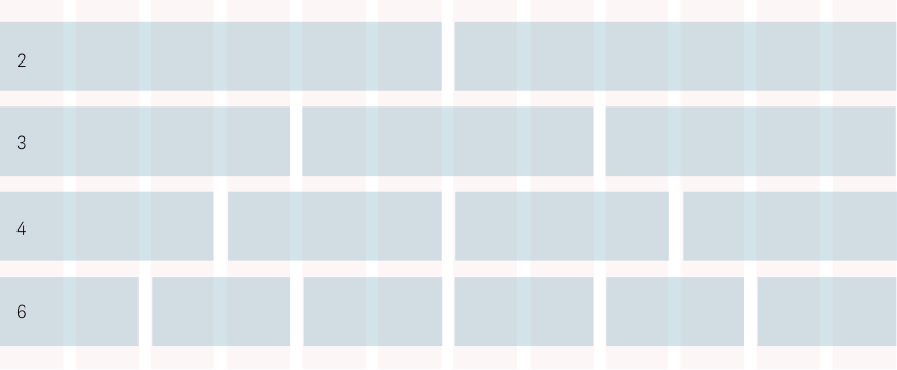
12-Column Grid Layout
We use a 12-column grid. This gives designers and marketers flexibility by allowing the content to break into two, three, four or six-column content blocks, or a combination. By using a grid, you can achieve alignment and consistency with little effort.
Responsiveness
Beacon uses a responsive grid to ensure content is represented consistently across a variety of user interfaces and screen sizes. Using a responsive grid ensures your website design looks beautiful and renders consistently on a variety of platforms, devices, and orientations.
Breakpoints
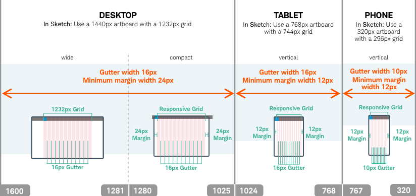
The Beacon system includes set breakpoints for the best readability for different user interfaces. The image above shows the content breakpoints based on which screen and orientation the user is on. You can download breakpoint specs in Sketch.
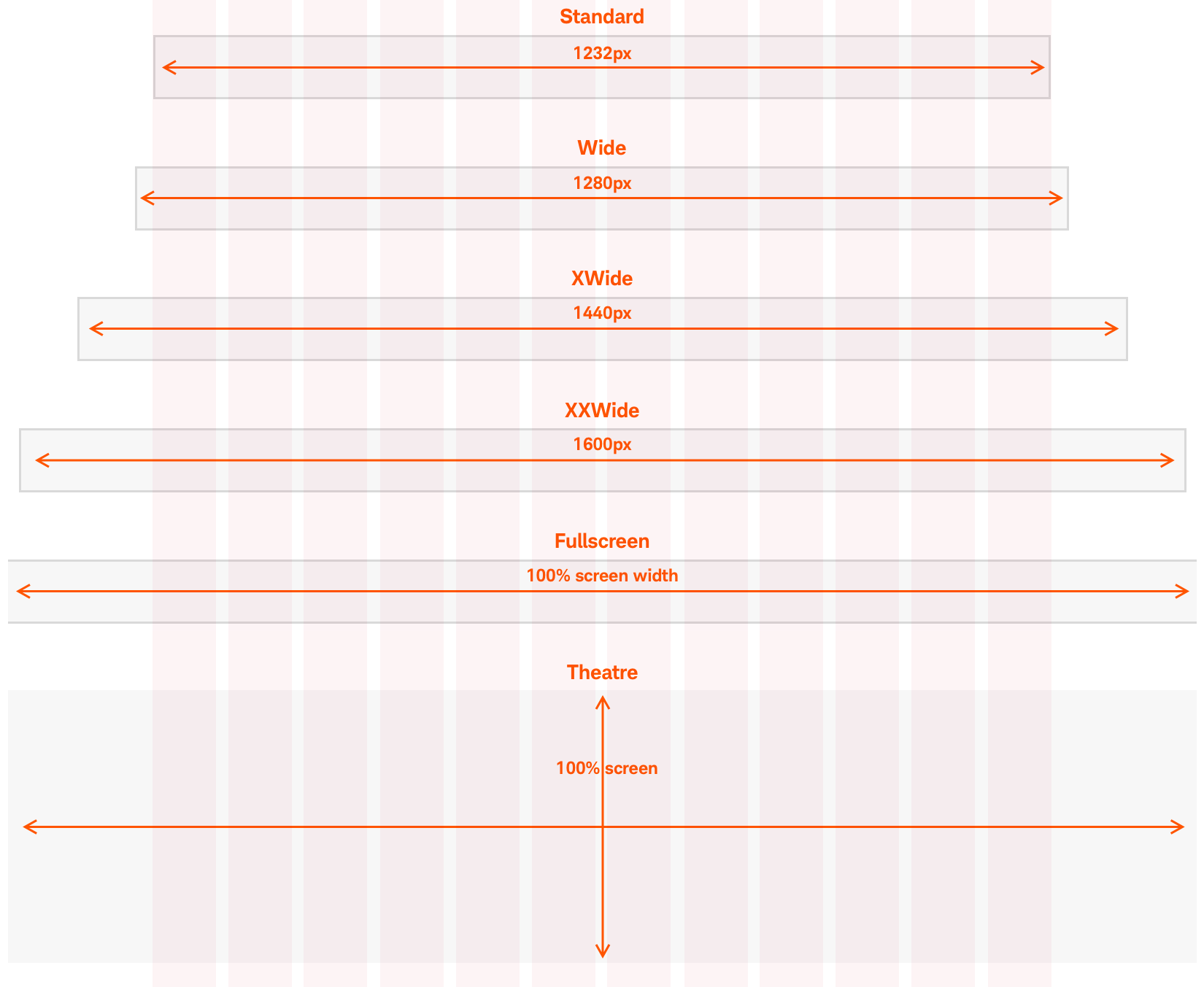
Bleeding beyond the grid
Though content must be contained within the grid, images or color fields can extend beyond. The variations of custom bleed are shown in the graphic below and should be consistent down the page. Custom bleeds should be noted in the name, (e.g panel-xxwide>deck-25>callout-cards.)
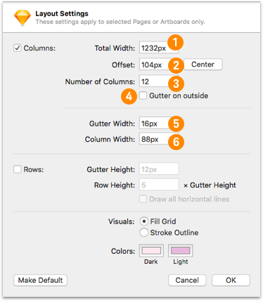
Setting up your grid in Sketch
From the view menu, select layout settings to bring up the dialog box, then follow the steps below.
Desktop
Set your artboard to the size of your bleed, be it Wide (1280), XWide (1440), XXWide (1600), Fullscreen or Theater-in-a-browser.
- Set your Total Width to 1232
- Center your offset
- Set Number of Columns to 12
- Make sure “Gutter on outside” is deselected
- Set Gutter Width to 16
- Set Column Width to 88
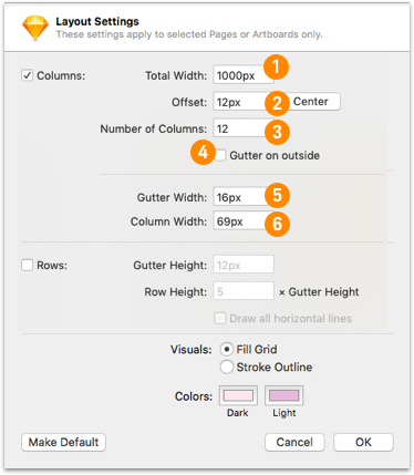
Desktop-Compact – artboard size 1028
(closest to 1024 in round numbers)
- Set your Total Width to 1000
- Set your Offset to 12
- Set Number of Columns to 12
- Make sure “Gutter on outside” is deselected
- Set Gutter Width to 16
- Set Column Width to 69
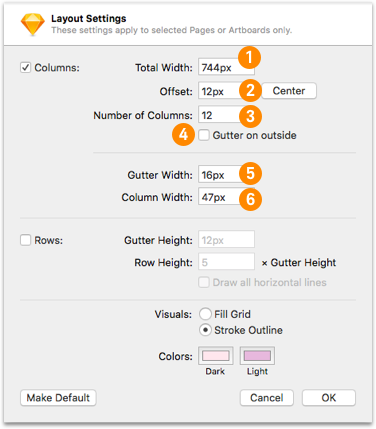
Tablet - artboard size 764
(closest to 768 in round numbers)
- Set your Total Width to 744
- Set your Offset to 12
- Set Number of Columns to 12
- Make sure “Gutter on outside” is deselected
- Set Gutter Width to 16
- Set Column Width to 47
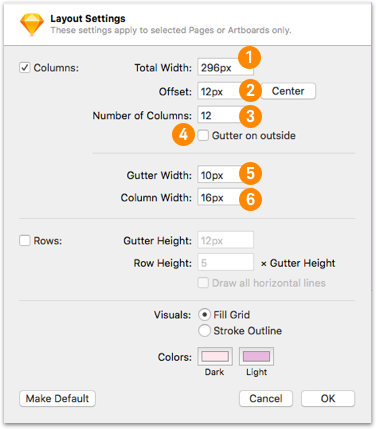
Mobile - artboard size 326
(closest to 320 in round numbers)
- Set your Total Width to 296
- Set your Offset to 12
- Set Number of Columns to 12
- Make sure “Gutter on outside” is deselected
- Set Gutter Width to 10
- Set Column Width to 16
Grid Margins
Margin sizes will vary depending on the screen width size and various user interfaces (desktop, mobile, etc.). For example, a screen larger than 1440px will have a margin of 104px and a 1440px screen width will have a 24px margin.
Spacing Considerations
Spacing needs to be used consistently across design projects. Use spacers between page elements to ensure the same spacing is used in similar situations creating a more unified user experience. Consistent spacing plays a crucial role in the success of the design system. For example, margins on containers should always be the same. This helps create consistent user interfaces and flows.
Beacon spacers use increments of 8px, with the exceptions of 4, 12, 20, and 44px. The 4px increments are used to fine-tune the spacing in compact designs and allow for touch-affordance.
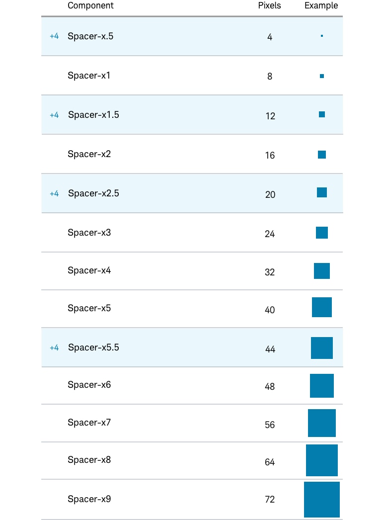
Examples:
- Spacing between a text field and a button always uses the same ratio with actual size varying depending on screen
- Spacing between a CTA and an image always uses the same ratio