Spacing
- Variants
- 8x Spacers
- Gutters
- Margin
- Inset
- Feature Inset
- Cap
- Stack Spacer
Visual spacing creates the rhythm between ideas and reinforces the relationships between elements on a page. Consistent use of spacing across design projects creates a more unified user experience, and persistent spacing plays a crucial role in the success of the design system. For example, margins on containers should always be the same. This helps create logical user interfaces and flows.
Spacers, along with the 12-column grid, help to create that uniform design.
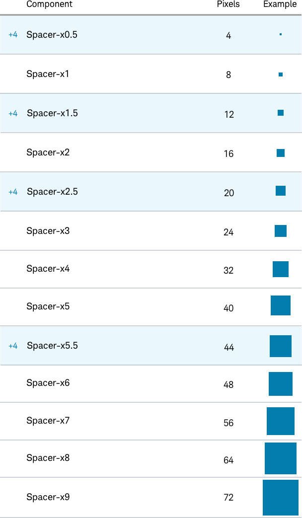
On the Eights
Beacon spacers use increments of 8px, with the exceptions of 4, 12, 20, and 44px. The 4px increments are used to fine-tune the spacing in compact designs and to allow for touch-affordance.
The Space Between Things
Spacing helps create clusters of related information, encapsulating a thought or idea. Larger spacing helps to add white space to increase focus, further segmenting information into easily-consumable pieces and lessening the cognitive load on the user.
There are six main types of spacers the Beacon system uses, along with the 12-column grid, to keep a uniform alignment on all layouts.
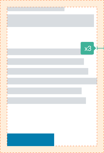
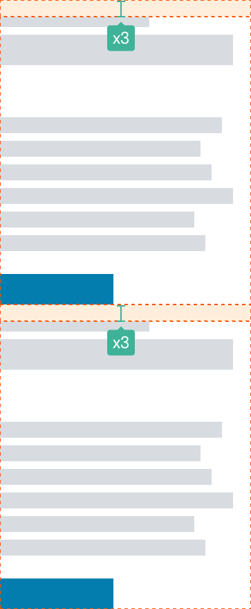
Inset
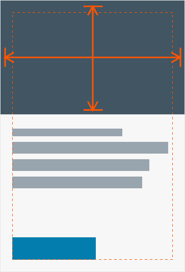
The spacing within any component between its border and its content, like a card, deck or panel. Inset Spacer is spaced from outer edge of component expanding inward and is 24px in the Beacon theme. This space runs to the outer edge and not 1px inside the exterior (it’s a true 24px inset.)
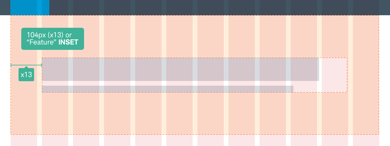
Feature Inset
As a variation of the inset, the Feature Inset can be used to create a more substantial 104px space (the width of a column and a gutter) between the edge of the grid and the beginning of text in a marquee or panel. This is especially useful when the that component does not bleed outside of the grid, and a mere 24px inset is considered to be too close to the edge.
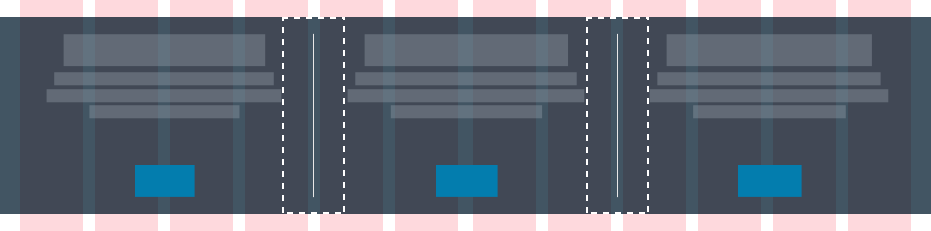
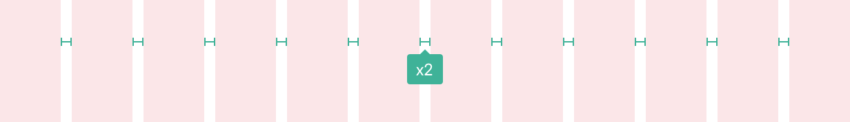
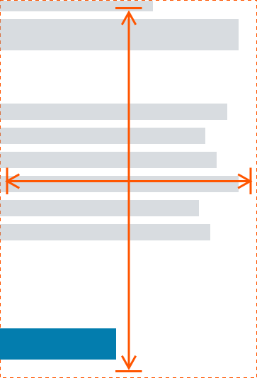
Gutter
The consistent 16px (x2) spacing between columns and most groups of horizontal containers. Gutters reduce to 10px on mobile screens. When items like cards stack, the vertical space between them is equidistant to the gutter (16px on desktop and tablet, 10px on mobile).
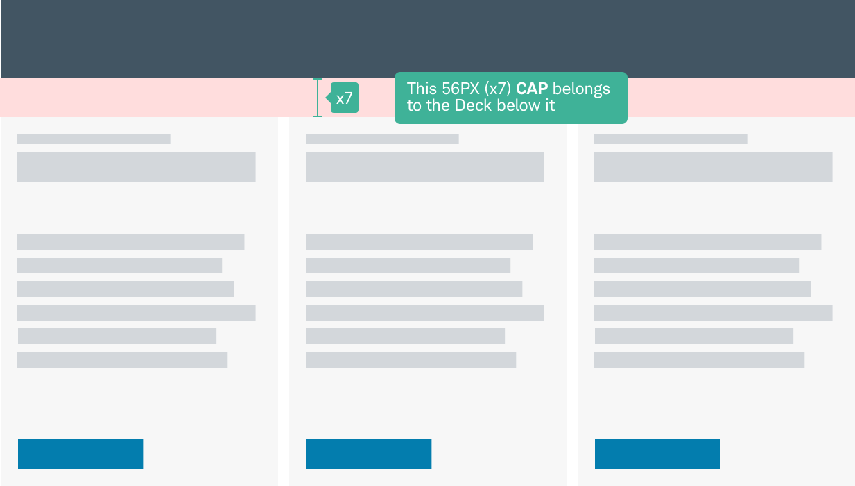
Cap
Components and patterns have a spacer above them that is inherent to them. If the component or pattern is removed, so goes it’s spacer. Page Spacers (caps) are controlled by the theme uniformly with a 56px (x7) spacer for Beacon, and are dynamically inserted above any given component. The top elements of header and marquee have a special page spacing cap of zero (0px) to make them flush with the top of the browser.
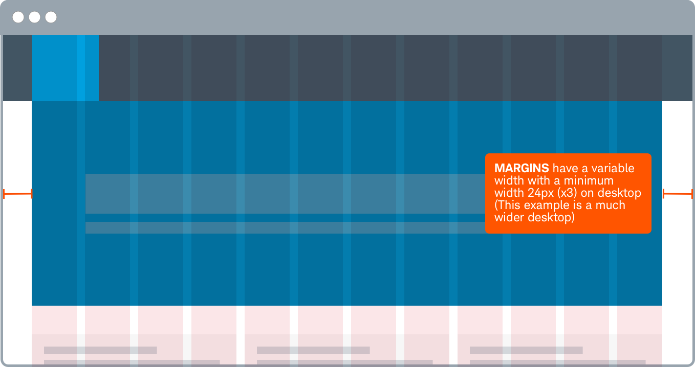
Margin
24px (x3) is the minimum allowable space between the browser’s window edge and the grid. On tablets and mobile the margins are reduced to 12px (x1.5).
Stack Spacer
A page spacer that allows for deviation from the page spacer size. this is especially useful if the components have their insets removed, as is the case with clear components. A stack spacer helps seperate these components into clearer groupings.
Making Exceptions
There are stylistic exceptions that are available to create a more open layout on the page and remove the visual constraints of the traditional inset that is applied to many components by default.
Bleed
Media ignores the inset and extends the fill space of the component, or extend beyond the grid. Note Text should never bleed beyond the 12-column grid.
Clear
Clear is defined in Beacon as no background color and the loss of the default inset spacing (updated now to be a removal of all inset except for in special cases).
Clear is the default configuration for Marquee, Panel and CTA-Panel, not deck card containers and other components. Clear forces Split Insets for any column divisions for these components (see bolow for Split Insets).
Grid-Spacer Modifications
When used in con junction with the 12-column grid, some modifications are allowed to keep a consistent alignment down the page.
Split
When the gutter between sections is shared equally.
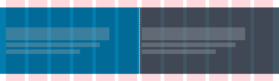
Split Inset
When the gutter is split, a 24px inset is applied on either side and keeps content from sitting flush with the divide. Split Insets is 32px (X4) added on opposing sides of dropzone splits

Divide
When a divider separates items. This is typically used with clear, centered cards in clear or dark decks. Divides come with a split buffer.